To me, that sounds like a cop-out.
The ONLY comparison that I can make between the MOS and Batman suits is that both have a grounded explanation for both FORM and FUNCTION.
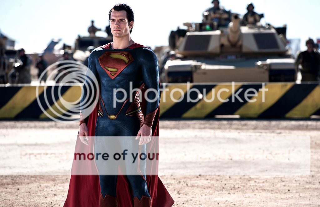
To say that Superman's suit is "a darker look" for MOS just doesn't make sense to me based on everything I've seen with this film, and I'm talking its reinterpretation of Kryptonian culture.
Just in the
writing system they use, you can tell that there's a vivid authenticity, and so the suit has to be treated in the same way.
So, for me, to say "oh, they went for a darker look like they did with Batman" is, quite simply, bull*****


 , now that we have what we have I hope they stick with it