If they had done that first, I'd've been cool.
But I'm with Shield and Young

, now that we have what we have I hope they stick with it
Yeah, just wishful thinking. I'm much more of a fan of consistency than change for the sake of appeasing the audience....which is why I have a major problem with Spidey's new costume. It seems like the changes that were made were, for the most part, to appease the fans...but it's quite a different direction than the first ASM suit.
No, that looks awful. If they were making a different movie where he's supposed to look like a toy, maybe. People don't get that they're trying to make the suit feel natural in a sci-fi context. It's not a garish costume. It's foreign clothing.
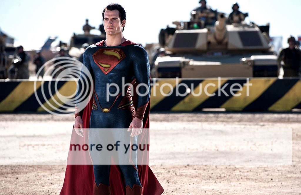
Thing is though, I feel that the way they designed the suit is a little TOO foreign and a tad TOO alien. I understand that they are trying to show how the government would react to an alien revealing himself, but they would do react that way regardless of what Supes is wearing. With red piping, instead of blue, it kinda keeps the alien/sci fi feel but in a more welcoming/cool image.
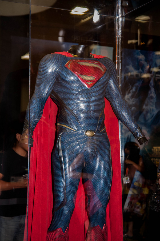
The point of the detail isn't to "break up the blue". That's a made up by brief defenders. They don't have to break up the blue at all. The point of the detail is to direct focal points.
So the focal point is his codpiece? The focal point should be his shield...which it will ALWAYS be since it's the biggest and least busy part of his costume. Everything else is detail. That being said, I believe they used the piping as a way to compensate for ridding Supes of his iconic trunks. If they had no piping at all that entire region would feel naked.
That doesn't make sense because it's also blue. It doesn't break up the blue at all. It directs focal points. It contours the body shape. But it has nothing to do with blue or color. The suit could be in black a white and the details still serve the same visual function.
They didn't use the piping to break up the blue, but they definitely used it to add something ELSE other than an oval. It makes no sense to have a yellow belt buckle if there's nothing guiding it to his waist. The piping is used not only to give the oval a sense of purpose, but also to break up the negative space from getting rid of the trunks. The piping was definitely to compensate for lack of trunks, they just colored it blue instead of red.
UUgghh, that red detailing looks horrendous. It looks like an obvious attempt to break up the blue using only colours in the Superman palette because it is a fan manip that can't look at things objectively from a design perspective.
We all carry a certain bias, so please don't act like your an exception. Do you honestly mean to tell me that if they revealed the suit to be THOSE colors, you would thinking to yourself "they should've made the piping blue instead!"? Also, I have been designing concepts for costumes and attire for roughly a decade, on top of that, I design a plethora of other things...so I am most definitely looking at the suit from a design perspective. And of course, it's an attempt to break up the blue using colors in the Superman palette. I don't think green or pink would suit (pun intended) him very well.
Also, the primary yellow looks just plain bad.
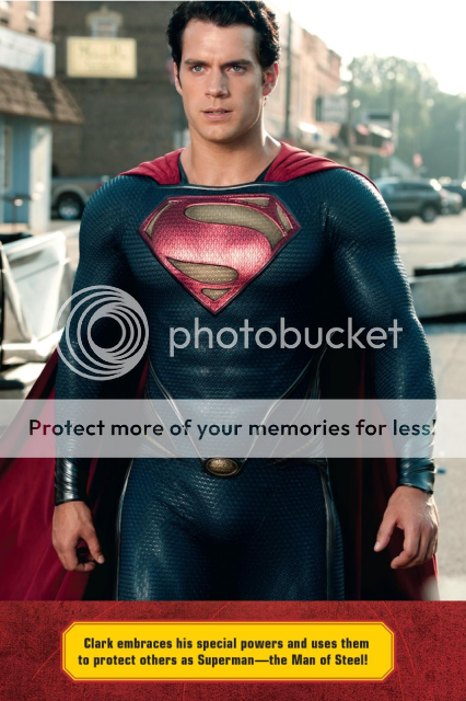
Thing is, we've had few official images that show the shield and oval actually looking yellow/gold. Most official images make them look silver.
Seriously, the colours used remind me of kitsch playground equipment.
Well, Supes has always been a colorful hero. It wasn't until SR that they dulled the colors and fans complained about the colors even up till now. Unfortunately, as great as the suit currently looks, Snyder and co. also decided to use duller colors. Maybe they're trying to show that Superman isn't black and white (primary colors) and has shades of grey (struggling with his morality) but once he decides to fight the good fight, his ethics are pure, just like his colors should be.......IMO.
Nice job. While I wouldn't have minded that look so much, in comparison to the MOS suit, I feel like it's trying to hard to keep the concept of the trunks. It's a little busy.
Thanks Krumm, I don't feel it's too busy. As I stated earlier in this post, the centerpiece of this suit will always be the shield and when looking at the design as a whole that's what you should be looking at to determine whether or not the rest of the suit works. Once you start analyzing the details, it kinda falls apart. I could name several things that is "wrong" with the design but because when I look at it as a whole, I still see "a bad out-fit!" WOOOO!!!!!


")