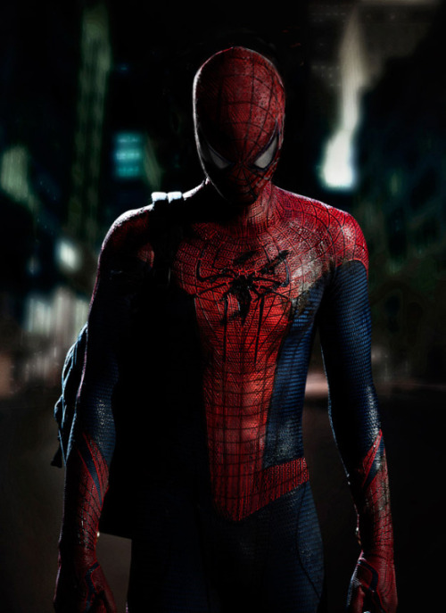
Well that just makes no sense considering basketballs don't have hexagonal patterns on them
The thing that makes it look like a basketball is the webbing since it's black, flat and the pattern is more like straight grid sporty looking instead of it looking like a web
Also, the hexagonal pattern is raised on that suit whereas the brick pattern on Raimi's suit is not. So a non raised more subtle hexagonal pattern might look neat


 You all know how I feel about that suit. Let's just say I don't care for the design.

