
You are using an out of date browser. It may not display this or other websites correctly.
You should upgrade or use an alternative browser.
You should upgrade or use an alternative browser.
Mattchew's fanart thread 3.0... *****ing out, hardcore style.
- Thread starter Mattchew
- Start date
Syncos
ROFLICIOUS
- Joined
- Apr 5, 2006
- Messages
- 3,855
- Reaction score
- 1
- Points
- 58
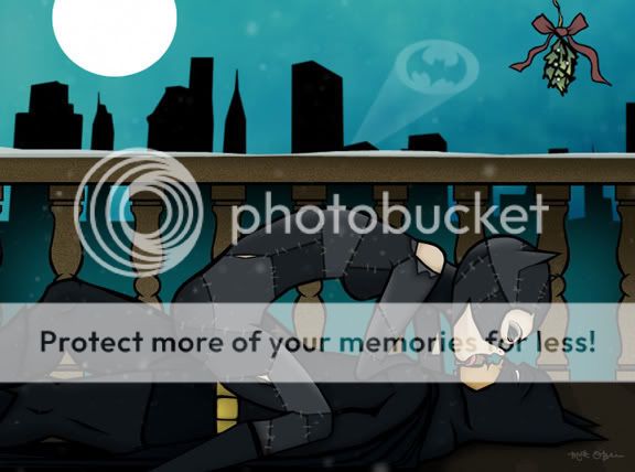
Like someone else mentioned, Catwoman's legs look way too short for her body. Other then that, awesome.
Her legs aren't too short, you're just not seeing her legs above the knees because they're hidden by her body.
Hey Matt
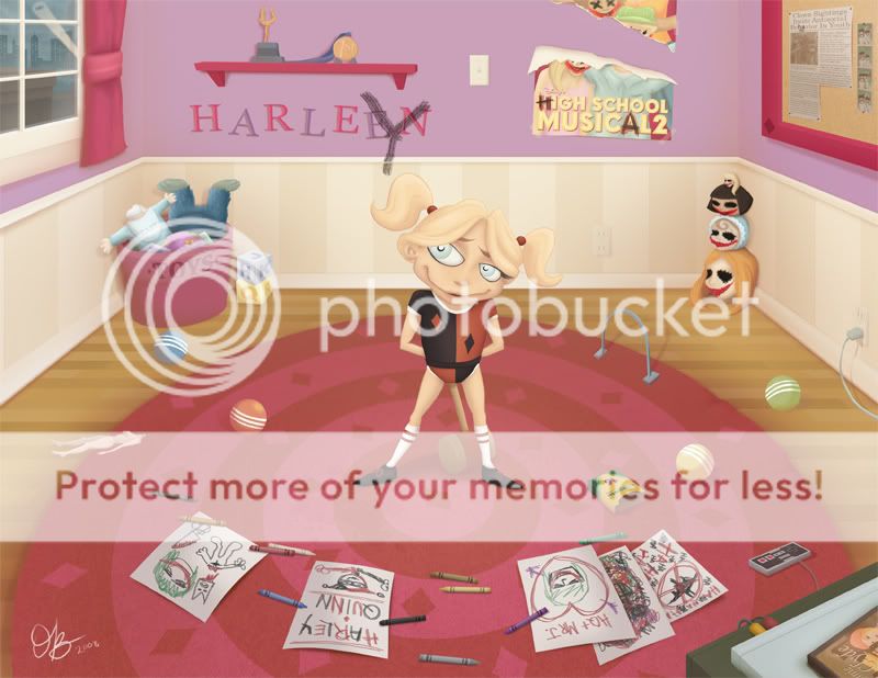
I must have missed these two... Harley is absolutely gorgeous, and as some with your great steampunk Futurama too, the pic is packed full of fun and interesting details... aahhhhh... she's adorable!! and as KAD said, that slight change from your normal angle of perspective really gives it a lot of depth
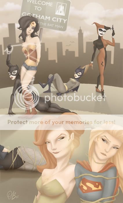
on the other hand, the Batman villainesses beating up the heroines... don't get me wrong, i love it, BUT... the depth in this one seems forced... i mean those weird hills in front of each other... i don't think that works. the detail on the characters on the other hand: sublime as ever. looking more illustrational perhaps than graphic... your style here could make for an amazing illustrated children's book. and i love wonderwoman's hair!!
great job Matt... keep it up!!
Ace of Knaves
Avenger
- Joined
- Jun 19, 2008
- Messages
- 31,200
- Reaction score
- 1
- Points
- 31
This is amazing man, truly outstanding. I love you interpretations of the characters and the little nods to the show.

Mattchew
Sidekick
- Joined
- Nov 3, 2005
- Messages
- 4,990
- Reaction score
- 0
- Points
- 31
[/center]
Hey Matt
I must have missed these two... Harley is absolutely gorgeous, and as some with your great steampunk Futurama too, the pic is packed full of fun and interesting details... aahhhhh... she's adorable!! and as KAD said, that slight change from your normal angle of perspective really gives it a lot of depth
on the other hand, the Batman villainesses beating up the heroines... don't get me wrong, i love it, BUT... the depth in this one seems forced... i mean those weird hills in front of each other... i don't think that works. the detail on the characters on the other hand: sublime as ever. looking more illustrational perhaps than graphic... your style here could make for an amazing illustrated children's book. and i love wonderwoman's hair!!
great job Matt... keep it up!!
Thanks. I agree, the perspective was COMPLETELY forced. I'm not the best at it (clearly) so I'm playing with it, and its really helpful to hear criticism about that particularly.
This is amazing man, truly outstanding. I love you interpretations of the characters and the little nods to the show.
Thanks so much.
Mattchew
Sidekick
- Joined
- Nov 3, 2005
- Messages
- 4,990
- Reaction score
- 0
- Points
- 31
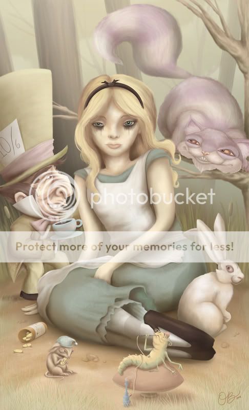
This picture took a LOOOOONNNNNGGGGG time.
I decided to force myself to do a picture with a lot of figures, clothes, hair, fur, etc. to get some tablet experience...
After thinking about what might fit the bill, I came up with the idea of doing a Wonderland picture.
I was in search of more experience with my tablet, and boy did I get it. At a certain point I kinda gave up for a few months.
Anyway, it is done. DONE! Here's the final...
I'd love to hear thoughts, if you get the chance
Last edited:
Ace of Knaves
Avenger
- Joined
- Jun 19, 2008
- Messages
- 31,200
- Reaction score
- 1
- Points
- 31
Thats awesome man, I really dig your style. Would you be interested in drawing a comic? I have an idea for a Joker story. Let us know.
The Navigator
Avenger
- Joined
- Jul 22, 2004
- Messages
- 15,735
- Reaction score
- 1
- Points
- 31
This picture took a LOOOOONNNNNGGGGG time.
I decided to force myself to do a picture with a lot of figures, clothes, hair, fur, etc. to get some tablet experience...
After thinking about what might fit the bill, I came up with the idea of doing a Wonderland picture.
I was in search of more experience with my tablet, and boy did I get it. At a certain point I kinda gave up for a few months.
Anyway, it is done. DONE! Here's the final...
I'd love to hear thoughts, if you get the chance
I like it except for Alice's eyes.
spideyboy_1111
Young Avenger
- Joined
- Sep 14, 2001
- Messages
- 66,458
- Reaction score
- 11
- Points
- 33
dude i love it, quite possibly your best work yet. It shows you took a long time, the detail is amazing.
Mattchew
Sidekick
- Joined
- Nov 3, 2005
- Messages
- 4,990
- Reaction score
- 0
- Points
- 31
I have been volunteering hardcore for my candidate of choice, and have been REALLY stress of late.
The result: I decided to do a really fun cartoon-y piece to decompress. I decided to do a pic, of Michelangelo... Who is, indecently, my LEAST favorite turtle, but I'm REALLY fried right now and wasn't up to tackling the more complex characterizations of the others.
Action poses are not traditionally my strong suit, so I appreciate comments on the pose.
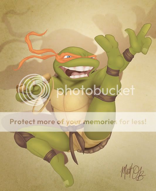
Anyway, hope you like it!
The result: I decided to do a really fun cartoon-y piece to decompress. I decided to do a pic, of Michelangelo... Who is, indecently, my LEAST favorite turtle, but I'm REALLY fried right now and wasn't up to tackling the more complex characterizations of the others.
Action poses are not traditionally my strong suit, so I appreciate comments on the pose.
Anyway, hope you like it!
spideyboy_1111
Young Avenger
- Joined
- Sep 14, 2001
- Messages
- 66,458
- Reaction score
- 11
- Points
- 33
must do turtle cast!!!!
and i'm still waiting for glenda!!!
and i'm still waiting for glenda!!!
spideyboy_1111
Young Avenger
- Joined
- Sep 14, 2001
- Messages
- 66,458
- Reaction score
- 11
- Points
- 33
hey mattchew, that alice design wouldnt be inspired by Mark Ryden's work would it? he rocks. http://i36.photobucket.com/albums/e32/Wendella1/buffy_mark_ryden.jpg
Mattchew
Sidekick
- Joined
- Nov 3, 2005
- Messages
- 4,990
- Reaction score
- 0
- Points
- 31
must do turtle cast!!!!
and i'm still waiting for glenda!!!
hey mattchew, that alice design wouldnt be inspired by Mark Ryden's work would it? he rocks. http://i36.photobucket.com/albums/e32/Wendella1/buffy_mark_ryden.jpg
I might do some of the other 'TMNT' characters like Splinter in time, but i probably won't do the other turtles.
As for Glinda, that might be next for me... Thanks for staying on me about that idea!
In response to your question about the Wonderland picture, that was not an influence although I have checked him out since your post and am really digging his stuff... I intend to use it as something to reference in the future, when working in the neighborhood of that style... As something to strive towards in terms of technique. It really is a much more refined version of what I am going for.
In terms of content, the wonderland pic was more based on a few ideas. I heard the song 'White Rabbit' and I just was thinking about the whole 'one pill' thing in that song in reference to anti-depressants so I wanted to do a picture of Alice looking really glazed over and numb, with the wonderland characters looking slightly menacing... Like you could see them as being helpful, but also a little tinge of danger. This is clearly well worn territory in terms 'Wonderland' characterization, but that was just my motivation. In terms of style, I was just going for a kind of painted, nursery-rhyme-book feel to again contrast the darker slightly-tone of the picture.
The final result doesn't quit convey what I want because countless people have reacted saying that Alice's expression is too glazed over, but there's always next time, right?
FINALLY, just wanted to say I dig the anti prop 8 shout out in your signature. I've seen a lot of polls showing it passing over the past month, but just yesterday I finally saw a poll showing a shift in the other direction. Here's hoping it fails.
The Navigator
Avenger
- Joined
- Jul 22, 2004
- Messages
- 15,735
- Reaction score
- 1
- Points
- 31
I like Mikey.
KAD
Sidekick
- Joined
- Oct 20, 2004
- Messages
- 4,390
- Reaction score
- 0
- Points
- 31
I have been volunteering hardcore for my candidate of choice, and have been REALLY stress of late.
The result: I decided to do a really fun cartoon-y piece to decompress. I decided to do a pic, of Michelangelo... Who is, indecently, my LEAST favorite turtle, but I'm REALLY fried right now and wasn't up to tackling the more complex characterizations of the others.
Action poses are not traditionally my strong suit, so I appreciate comments on the pose.
Anyway, hope you like it!
Very well done no longer the flat stanley of the boards I see.
Seriously though your work is just leaps and bounds beyond where you began
- Joined
- Apr 29, 2004
- Messages
- 75,013
- Reaction score
- 9,479
- Points
- 218
cowabunga
spideyboy_1111
Young Avenger
- Joined
- Sep 14, 2001
- Messages
- 66,458
- Reaction score
- 11
- Points
- 33
I might do some of the other 'TMNT' characters like Splinter in time, but i probably won't do the other turtles.
As for Glinda, that might be next for me... Thanks for staying on me about that idea!
In response to your question about the Wonderland picture, that was not an influence although I have checked him out since your post and am really digging his stuff... I intend to use it as something to reference in the future, when working in the neighborhood of that style... As something to strive towards in terms of technique. It really is a much more refined version of what I am going for.
In terms of content, the wonderland pic was more based on a few ideas. I heard the song 'White Rabbit' and I just was thinking about the whole 'one pill' thing in that song in reference to anti-depressants so I wanted to do a picture of Alice looking really glazed over and numb, with the wonderland characters looking slightly menacing... Like you could see them as being helpful, but also a little tinge of danger. This is clearly well worn territory in terms 'Wonderland' characterization, but that was just my motivation. In terms of style, I was just going for a kind of painted, nursery-rhyme-book feel to again contrast the darker slightly-tone of the picture.
The final result doesn't quit convey what I want because countless people have reacted saying that Alice's expression is too glazed over, but there's always next time, right?
FINALLY, just wanted to say I dig the anti prop 8 shout out in your signature. I've seen a lot of polls showing it passing over the past month, but just yesterday I finally saw a poll showing a shift in the other direction. Here's hoping it fails.
glad i was able to help
") i love your style and you're definately my favorite artist on the boards.
i love your style and you're definately my favorite artist on the boards.Dr. Fate
Avenger
- Joined
- Jan 9, 2005
- Messages
- 12,736
- Reaction score
- 1
- Points
- 31
Gotta love the Mikey.I have been volunteering hardcore for my candidate of choice, and have been REALLY stress of late.
The result: I decided to do a really fun cartoon-y piece to decompress. I decided to do a pic, of Michelangelo... Who is, indecently, my LEAST favorite turtle, but I'm REALLY fried right now and wasn't up to tackling the more complex characterizations of the others.
Action poses are not traditionally my strong suit, so I appreciate comments on the pose.
Anyway, hope you like it!
union_jak
Licky licky
- Joined
- Dec 2, 2005
- Messages
- 12,692
- Reaction score
- 5
- Points
- 58
SweetHere's my entry for July's contest where the idea was to do a take on an iconic moment from a movie or comic...
Similar threads
- Replies
- 231
- Views
- 20K
- Replies
- 676
- Views
- 87K
Users who are viewing this thread
Total: 1 (members: 0, guests: 1)
Staff online
-
 Lily Adler🎄 Peppermint Mocha 🍫
Members online
Total: 6,783 (members: 13, guests: 6,770)
Latest posts
-
-
 🌎 Discussion: Illegal Immigration, Immigration Reform, and Other Citizenship Issues II (7 Viewers)
- Latest: Morg
-

-
-