Mattchew's fanart thread 2.0... The *****e just got *****ier!

... I think you rock! Awesome style, and a great eye! The shading is spot on so far.
 
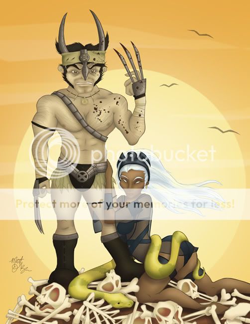
Well I think I reply to all of these in one go, as they are similarly themed. For one, thanks for the kind words. Secondly, I fully intend to add more body hair (on Logan, not Storm). Having said that, I scrapped the chest hair for the time being until I can try out some other methods of getting the right look in photoshop. We'll see if I have any success getting a look better than that. Thanks, as always, for truly constructive criticism.

---------------------------------------------

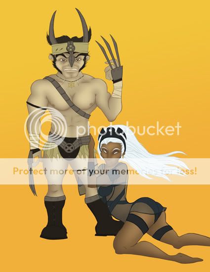
Update... I shaved the chest hair and added the first pass of shading (so far only to their skin).

warrior_08.jpg


Let me know what you think.

Wow, sexy...:wow:

I think, though... the shading wasn't necessary (sp. on Wolvs). The previous step followed the "abstract" style better... but that's just my opinion. You're doing a great job.


Lol "on Logan, not on Storm". I'm sure in those ages women weren't worried about hair. :p
 
... I think you rock! Awesome style, and a great eye! The shading is spot on so far.

Thanks!

Wow, sexy...:wow:

I think, though... the shading wasn't necessary (sp. on Wolvs). The previous step followed the "abstract" style better... but that's just my opinion. You're doing a great job.


Lol "on Logan, not on Storm". I'm sure in those ages women weren't worried about hair. :p

I know my style is VERY much in the cartoon category, but I gotta say, the fun of these pics for me is the shading, so while I completely understand you point, it wouldn't be worth it to me to stop at the stage with just flat color.

Ultimately, when its in a shaded environment it may look a bit more consistent, but there's no denying that the my style is what it is and that's anything but realistic.

Regardless, thanks for the notes.

------------------------------------------------

Update. Storm is basically done except for shadows and stuff that will tie her into the setting. Logan got a second pass on the shading of his skin, but the rest of him hasn't been touched yet.

warrior_09.jpg


Got rid of the color in the background so I have a blank pallet to fill.

Let me know what you think! ;)
 
Looking good so far...looking forward to seeing it finished with background
 
Looking good so far...looking forward to seeing it finished with background

Thanks... I have an idea for the full background, but it will have to wait till tomorrow.

---------------------------------

Update... Logan is fully shaded and I through in some blood for good measure. I still need to add some body hair. I added the sky in the background. I still need to add the ground and a few other details...

warrior_10.jpg


Let me know what you think!
 
Well...

Had my 2nd kidney-stone-related ER visit since my last post. I can't WAIT to pass the f-ing thing!

Anyway...

Update: Here's the the concept for the setting. They're on top of a mound of bones and there's a massive snake wrapped around Storm (just because those old movies of the Conan era always seemed to crowbar in giant snakes... just an observation).

warrior_11.jpg


The bones, snake, and ground are obviously just flat color, so when I'm done shading and all that will be pretty much it.

Next post will be the final, most likely.

As always, let me know what you think!
 
Love it man! Looks awesome. The snake is a great addition and I like that Logan's body hair is very subtle.
 
I like the body hair this time than the little patch he had before.
 
Love the Conan theme, maybe I would have gone with a storm cloud in the back instead of the sun, or maybe a driving rain..and the would be standing on some old school looking Sentinal heads, but regardless excellent work..
 
Love it man! Looks awesome. The snake is a great addition and I like that Logan's body hair is very subtle.

thanks... the hair was a bit of an experiment. glad you liked it.

I like the body hair this time than the little patch he had before.

thanks!

Love the Conan theme, maybe I would have gone with a storm cloud in the back instead of the sun, or maybe a driving rain..and the would be standing on some old school looking Sentinal heads, but regardless excellent work..

well... ALL of those ideas would have been bada$$. wish I'd of thought of them!

Great work. :up:

thanks!

------------------------------------------------

back to working on my x-mas card. here's the final on the design. gonna do some shading over the course of this week.

santa_08.jpg


Let me know what you think!
 
Very funny card design. I especially like the missing tooth. I'm not crazy about the black background though. It just doesn't seem to help the overall feel of it. Maybe a pale blue would work better, or some indication in the background that he's in a mall.

Nice work.
 
Very funny card design. I especially like the missing tooth. I'm not crazy about the black background though. It just doesn't seem to help the overall feel of it. Maybe a pale blue would work better, or some indication in the background that he's in a mall.
Nice work.

Thanks! Glad you found it funny... no worries on the black background. In the end, I'll be cutting this out so it will amount to a black outline... I was actually thinking of throwing a storefront window in the background with post-christmas sale signs.

I love this! Very well done Mattchew.

Thanks!

---------------------------------------------

Update... Santa's shaded.

santa_09.jpg


Let me know what you think.


Oh ok. Sounds great. When you said "here's the final on the design" I thought you meant it was finished. Lookin' good.
 
Oh ok. Sounds great. When you said "here's the final on the design" I thought you meant it was finished. Lookin' good.

Yeah. That wasn't very clear.

-----------------------------------------------------------------------------------

FINAL final on the full design. I'll post a pic of the final constructed card when I have one done.

santa_11.jpg


Let me know what you think... Also, I was thinking about throwing on some gray arm hair... thoughts?
 
Yeah. That wasn't very clear.

-----------------------------------------------------------------------------------

FINAL final on the full design. I'll post a pic of the final constructed card when I have one done.

santa_11.jpg


Let me know what you think... Also, I was thinking about throwing on some gray arm hair... thoughts?​

A$$ Kickin sweet
 
Hahaha very nice. My only suggestion would be to darken the outlines on the lighter objects. The sign for instance, or his hair (armpit particularly) blend a lot with the background and tend to get lost. That could especially be a problem when it's printed (I've had it happen, it's most disappointing).

The spilled booze on his clothes is a nice touch.
 
A$$ Kickin sweet

Thanks!

Hahaha very nice. My only suggestion would be to darken the outlines on the lighter objects. The sign for instance, or his hair (armpit particularly) blend a lot with the background and tend to get lost. That could especially be a problem when it's printed (I've had it happen, it's most disappointing).

The spilled booze on his clothes is a nice touch.


Thanks! The spilled booze was an 11th hour addition. As for stuff blending, all of the pieces aside from the background will have a thick white (or black... haven't decided yet) border so they won't bend. It will all make sense when you see the finished card.

--------------------------------------------------

Started a new pencil sketch, based off some random fashion ad in a magazine.

guy_01.jpg


Let me know what you think!
 
Update...

Altered the head (eyes, nose, brows and ear in particular). Started shading the body.

guy_02.jpg


This is just the first pass of shading on the body and I still have work to do on the head.

Let me know what you think.
 
Hey man I just caught your stuff (I am new to the boards) Very sweEeet! I am also new to illustrator, only about a month using it, Your work is inspiring!

Keep it up!
 

Users who are viewing this thread

Back
Top
monitoring_string = "afb8e5d7348ab9e99f73cba908f10802"