My Mom Made It For Me: The Superman Suit Thread

Do you like the suit?

  • Yes

    Votes: 18 54.5%
  • No

    Votes: 7 21.2%
  • Meh

    Votes: 8 24.2%

  • Total voters
    33
Cavill's suit wasn't my idea of perfect, but it did have elements I liked.

I really liked the shield, one of my favourite takes on the logo, also really liked the velvet look the cape had in Man of Steel no clue why they moved away from that in the subsequent films, I thought it looked great.

Also liked the boots, I've never really liked the bulky physical looking boots some other Supermen suits have had. I think it's probably because they always look out of place with the rest of the suit. Corenswet's is actually probably the only suit that's had the bulkier boots & look good, it's probably because his is the only suit that hasn't been spandex so it looks less out of place.
The S and the boots were perfect to me.
 
While Reeve will always be my Superman, I never liked the S logo on his suit. Why did they go for that design? I thought it was a joke when I first saw it. It looked like someone stepped the logo or it was smashed by a train. Why is it in the opening credits, they used the standard S logo, but in the film used such a mediocre S logo on the suit?
 
I thought Cavill's best suit was Mos. IMO, they went downhill in the order of his films, with the JL suit being the worst (especially the theatrical version).
I wasn't initially on board with some of the design choices for David's suit but I'm looking forward to seeing it on screen.
 
While Reeve will always be my Superman, I never liked the S logo on his suit. Why did they go for that design? I thought it was a joke when I first saw it. It looked like someone stepped the logo or it was smashed by a train. Why is it in the opening credits, they used the standard S logo, but in the film used such a mediocre S logo on the suit?

My least favourite logos from the live action Supermen (so far) have been Cain's (post-pilot) L&C & Routh's Superman Returns logo.

Cain's looked out out of proportion & looked a little crooked/wonky & Routh's was more a take on the classic logo I didn't really care for, his wasn't helped by the 3D qualities it had either on screen or in the promotional material.
Arguably Hoechilin had the best logo being the one the resembles closest to the official one. I just wish that one was used on film. While the official trademark logo will always be the definitive Superman logo for me, I did like Cavill's logo too as looked slightly more closer to the TM logo.

Kirk Allen and George Reeves' were from another time, but don't like those logos either. I've hated the Superman Returns logo, for the most part. It looked awful to say the least. But maybe I hated the promotional images for the S more. Awkward and ridiculous are two words that come to mind. It looked unenthusiastic and complicated. The dark shading I think is what I hated the most about it. It almost looked like there was a mustache. While Smallville adapted that version of the logo, they adjusted it, and I kind of like the Smallville version of the 'Returns' logo.

Back to Christopher Reeve's S logo. It looked fine on the cape, the yellow version. I just never liked the way it looked on his chest. It looked sloppy and out of proportion. It looked FAT.

However, I kind of did like the Cain 'S'. But again, the only version I really like is the trademark official logo.
 
  • Like
Reactions: B
I have a couple nitpicks with the new suit. The boots and the cape attachment.
It's Not a deal breaker tho, and I'm sure I'll like it just fine once I see it in motion.
 
We may not get an explanation on the how or where since he's been in action for years.
 
Just gunna leave this rightchea! 😎

I would like to see a low-budget/homemade suit but only for Clark's beta testing or a test run as Superman, ala Tony Stark's mach 1 suit. I really want to see the classic proportions but updated with a sleek and shiny feel that modern kids would consider "cool".

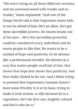
My head cannon while designing the suits I posted earlier is that Clark watched a lot of wrestling as a kid, so he started dressing up like them and that evolved into his classic suit. Naturally he would want to use athletic materials while evolving the suit. Not only is this a cool way to explain the suit, but it also utilizes the real world inspiration behind his suit - early 1900s muscle men/wrestlers/circus performers.

I thought I couldn't be happier with the cast, but dayum! David just get's it!
 
Looking at that new character Instagram sticker...I think the suit now looks worse.

I liked the look of the suit okay in the set photos, although not entirely. In that new promo motion sticker, I think it looks worse.

The lining on the waist just looks bad. It's a downgrade for me.

I like bringing back the simplicity though, the red and blue costume, being a more simple uniform, and less advanced looking like Cavill or Hoechilin's, but looking at this suit again, I don't think it needed to be baggy, and there was no reason, it couldn't be tight, or even show muscles, especially when Corenswet put a lot of work into his body.

Go for something more 'Superman', not a version, it should look more authentic.

Hard to compare and contrast. I don't know if I could say I like Routh's first costume better by comparison, but analyzing some of the basics, for Routh, the S looked better despite its significantly small size. Routh's blue tights look better in contrast to those ridiculous padding and lines on Corenswet's outfit. The texture of the cape and color on Routh's suit looked awful, but it more ways than one, I think Routh's suit still looks better than Corenswet's suit...or I should say James Gunn's Superman suit. Gunn/Corenswet's colors on the suit are just better when comparing it to Bryan Singer's design for Routh's.

Yeah, I feel like such a debbie downer still talking about the suit when so much about the trailer is promising, and Supes totally deserves any and all positivity right now.

But the film can still be great with a bad costume. It's like the design philosophy behind it was, how can the Guardians and Justice league International suits fit Superman's costume, rather than starting from scratch, and seeing what could be created for a Superman suit. The lines and padding are shared by all the costumed heroes and villains in the film.

The colours are perfect. And not just the colours; the colour blocking, with the red in the middle brought back by the trunks. Its those elements, plus how good David looks as Superman, that are doing all the heavy lifting, in my opinion.

But the film is still going to be the best written Superman for the big screen, so there's that. :tongue:
 
I see the costume almost like a baseball outfit, it has this classic Americana feel to it.
 
Yeah, I feel like such a debbie downer still talking about the suit when so much about the trailer is promising, and Supes totally deserves any and all positivity right now.

But the film can still be great with a bad costume. It's like the design philosophy behind it was, how can the Guardians and Justice league International suits fit Superman's costume, rather than starting from scratch, and seeing what could be created for a Superman suit. The lines and padding are shared by all the costumed heroes and villains in the film.

The colours are perfect. And not just the colours; the colour blocking, with the red in the middle brought back by the trunks. Its those elements, plus how good David looks as Superman, that are doing all the heavy lifting, in my opinion.

But the film is still going to be the best written Superman for the big screen, so there's that. :tongue:
I wish the 'S' could have been different...at the very least. Honestly though, I think, 'just get rid of those unnecessary linings and paddings at the very least!' Gunn had to go for a goofy look.

To me, I've always looked at Frank Miller's Batman character design or even Superman design as alternative versions, and not the definitive looks of the character. I can never understand they one would want to go with the Frank Miller Batman logo, that looks anti-bat shaped, and practically more like a large, black rectangle.

'Superman VS The Elite' was a good Superman movie with a TERRIBLE design of Superman, particularly his face. (Superman: Doomsday was a close second with those scar-like lines on Superman's face)
The animation in Supes v The Elite was so damn strange...unless I missed something I do not know why Supes looked the way he did.
 
I dont think GotG costumer was the right person for the Super suit. Its so GoTG....but more basic.
Marvel-Studios-Guardians-of-the-Galaxy-Volume-3-Official-Trailer-01-120122-3b52642d616b4971af5dec2fed483bdd.jpg

HCM_52875_R.jpg
 
The costume definitely takes some getting used to, but I'm cool with it by now. Honestly the main thing that always bothered me was the S...because it doesn't actually look like an S. But looking at the whole suit together--the explicit texturing, the collar, the thickness of the fabric and the loose fit, the "S" that actually just looks like some weird symbol--it all gives the vibe that he's wearing an alien spacesuit. Perhaps a spacesuit that was modified with a cape and trunks, so as to be less intimidating. But, like, take those two things away and you've basically got the suits from GotG3, except with somewhat softer texturing and a different alien symbol on the chest.
 
I thought Cavill's best suit was Mos. IMO, they went downhill in the order of his films, with the JL suit being the worst (especially the theatrical version).
I wasn't initially on board with some of the design choices for David's suit but I'm looking forward to seeing it on screen.
The square "buckle" seemed okay, but why did they make his shield smaller? His hair was never the same again. When they finally tried to make Henry's hair more like Superman in Black Adam, it had thinned and receded too much to look good.
 
The square "buckle" seemed okay, but why did they make his shield smaller? His hair was never the same again. When they finally tried to make Henry's hair more like Superman in Black Adam, it had thinned and receded too much to look good.
the-office-mindy-kaling.gif
 
I find the Guardians suits a really bland imagining of a solid design from the comics. The Superman suit rocks, imo. Too many lines for my taste, but I like the sense of being fabric while not being flimsy, the lack of overt padding, the colours.
 
Back
Top
monitoring_string = "afb8e5d7348ab9e99f73cba908f10802"