Symbol change

Goddamn_Batman

Civilian
Joined
May 24, 2006
Messages
144
Reaction score
0
Points
11
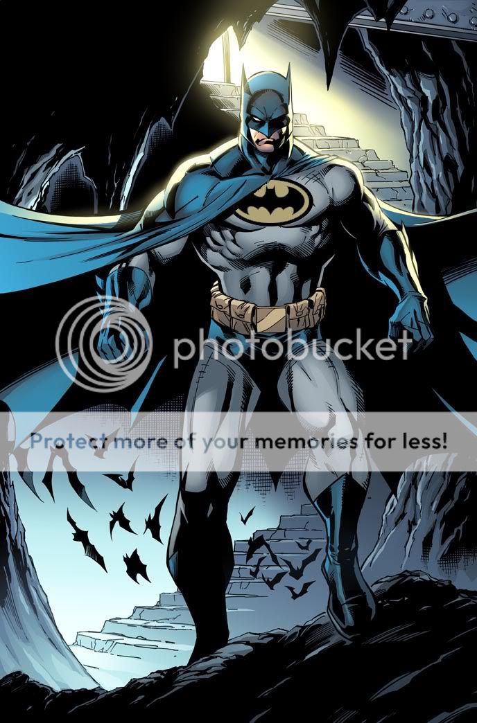
Hey, random question here, but in the comics, when did the symbol change from the bat in the yellow oval to the straight bat-on-costume symbol? Did it happen gradually over time, or is there a 'Tec or Batman issue where it officially debuts?
 
Batman dropped the oval after No Man's Land.
The oval debuted in '64 (I think) when DC learned they could not copyright a bat, but they could a bat in a yellow oval.
 
Hmmm.....I didn't know about the copyright thing. Good to learn.
 
That's what I hate about the yellow oval. It's only purpose is because it was easier to copyright (and dont give me that crap about a target offering extra protection, that's nonsense). Not to mention the black bat just looks cooler.
 
Katsuro said:
That's what I hate about the yellow oval. It's only purpose is because it was easier to copyright (and dont give me that crap about a target offering extra protection, that's nonsense). Not to mention the black bat just looks cooler.

The "target" aspect came about as a rationalization as to why he did it. It's bright and gives shooters something to aim at. Obviously, he'd put more armor under it so to not be harmed. Also, it has been mentioned to draw bad guys' attention away from "the kid" (Robin).
As far as I'm concerned, that's believable -in book- rationalization.
 
I never hated the oval; some artists make it look real cool.

Also, thanks for the additional information snipe. :up:
 
Oval is the most iconic bat symbol....

i hope it comes back someday
 
I hate the oval and i dont care how iconic it is. I dont want it back ever unless the yellow is grey.
 
Huh, wow. I never considered how it would look if it were grey...but on a suit that is grey behind the emblem that would prove pointless. Also, I bet on a blue suit the grey would look dumb as well.

Perhaps someone could make 'lil noob/easy' manips of the Bat-oval emblem with different bg colors. :O
 
I hate the oval and have always hated the oval. It looks horrible.
 
Leave the oval out this, even Batman Begins one looks "cooler".
 
I dunno.....SOME artists can make it look cool. Others just crap it out.

Then there's the sixe of the oval. Sometimes it looks too small, other times too big.

Personally, I don't buy it.....atleast not for the CURRENT Batman. He's not crazy, and not as depressed as before, and Robin can handle his own.....so, rationally....it wouldn't make sense to bring back.

Then again, it doesn't make sense that he wears tights, either, instead of an actual armor suit....so, who knows.
 
trustyside-kick said:
Huh, wow. I never considered how it would look if it were grey...but on a suit that is grey behind the emblem that would prove pointless. Also, I bet on a blue suit the grey would look dumb as well.

Perhaps someone could make 'lil noob/easy' manips of the Bat-oval emblem with different bg colors. :O

Meh, I guess I will try it out with photoshop...I'm bored anyway.

ChrisBaleBatman said:
I dunno.....SOME artists can make it look cool. Others just crap it out.

Exactly.
 
I think making it an artist by artist thing, instead of a DC trend thing.
 
Well I tried a lot of colors besides yellow but none worked except for this:

dyellowbatman.jpg


The original picture has a black bat logo instead of the oval. I made the oval a very dark yellow or at least more like the color of his utility belt and I think it looks cool; not too bright but still ionic and looks great. Also I tried different sizes and a big oval is what looked best IMO. If you have a small emblem it looks just plain old ******ed.
 
It just seems like the bat in the oval is a trademark stamped on his chest.
 
ampersand said:
It just seems like the bat in the oval is a trademark stamped on his chest.

Well duh, all I did paste it. The whole point was to show the oval can work if the right color or shade of a color and the right size. I made it for all those haters that absolutely hate the idea of him having the oval on his suit.
 
Oh, I know. I didn't mean it like that, I meant that it always looks like a trademark stamped on his chest. It looks more like a corporate logo with the oval.
 
Oh ok. Well, like ChrisBaleBatman said: 'SOME artists can make it look cool. Others just crap it out.'
 
I think this is an example of what me and Trusty were talking about:

Neal Adams, mkaes the oval look cool.

batman_illustrated_neal_adams_vol_3_2.jpg
 
ChrisBaleBatman said:
I think this is an example of what me and Trusty were talking about:

Neal Adams, mkaes the oval look cool.

batman_illustrated_neal_adams_vol_3_2.jpg

Actually that looks very crapped out to me.
 
I'm not a big fan on the oval merely because it's on oval. Visually, I don't think it works well on the costume. My personal favourite bat-symbol is the Alex Ross version (also sometimes called the Year One Symbol, and used by the artist in recent issues of Detective Comics). Like Superman's S shield, it's dynamic and enhances the shape of the chest.

However, were the yellow shape to make a return, I would be very interested to see it as a circle rather than an oval (like the batsignal). I think a circle is a stronger shape to use as an icon, and would work well if the circular belt buckle made a return, also.
 
How dare you.....Neal Adams can make ANYTHING look like Gold.....

Honestly, that's the best I can find.

My advice?

Forget the oval EVER existed, erase it from the history books....and keep the Giant Black symbol of the bat.
 

Users who are viewing this thread

Back
Top
monitoring_string = "afb8e5d7348ab9e99f73cba908f10802"