Webfoot Hero
West Coaster
- Joined
- Mar 28, 2012
- Messages
- 13,033
- Reaction score
- 2,233
- Points
- 103
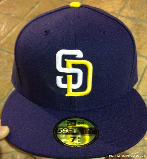
Never said all teal was an option but having some more teal accents on the pants and jerseys would have helped.Don't think teal was an option for Jags with the Titans in columbia blue, it'd be too similar.