The Batsuit Thread

Status
Not open for further replies.
There is no point having a symbol unless it is visible. What is the symbol for if not to be seen?

The second is an innovation of Grant Morrison's, and plays to the idea of the symbol's visibility: it can be illuminated as Batman goes into an attack, letting his prey know exactly who it is they are dealing with.
This is why I love the oval. Batman works in the dark, but the yellow oval can be seen clearly by a crook.
 
I think it is funny how many people don't like the armored suits because they think Batman should be more stealth while ALSO wanting Batman to have a bright yellow oval on his suit. Makes sense...

You have confused two completely different principles. Wearing heavy armour impedes Batman's agility which prevents him doing "Batman-ish" things. While stealth may be one of these, the more obviously excluded categories are fighting and acrobatics. His ability to use stealth is cited as a reason that he does not need to dress as Robocop, I don't think anyone has argued that the armour negates stealth as such, though I am willing to advance that point as well.

The yellow oval makes little difference to Batman's 'camouflage', if that's what you mean, because he isn't very camouflaged anyway. He remains hidden by sticking to the shadows and using ninja skills. If somebody sees him, they will see him. A 3" x 5" yellow disk won't make much difference.

Again, I ask what the point is in a symbol that isn't meant to be seen? I don't think there is one. Batman could just omit it altogether. In that respect, the black-on-black symbol preferred by Nolan is impractical and unrealistic.
 
I've never been a fan of the yellow oval. The only reason that design came about was because DC wanted a trade-marketable logo for batman, since i suppose the original black bat was too vague an image?

I know it sounds silly to justify a comic book character but i never thought wearing that oval fit with the batman character in the comics or screen.
 
I would like to see the yellow oval, because I like the design, and it wold also set it apart from TDKT.
 
Just a question: Did the yellow oval originate in the comics or the Adam West series?
 
The comics- Adam West's costume was a fairly accurate (though clumsy) representation of what Batman was wearing in the comics at the time.
 
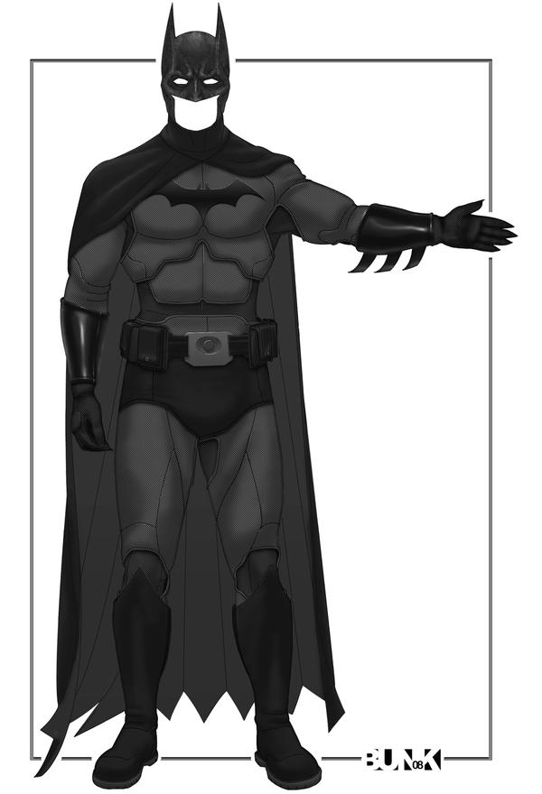
This is what the next Bat-Suit should look like. {Minus the trunks} This design was made by Bunk2 on deviantART.
Final_Batsuit_I_Swear_by_Bunk2.jpg
 
It's fine, but it is really just the classic Batsuit with the belt made black.
 
This is what the next Bat-Suit should look like. {Minus the trunks} This design was made by Bunk2 on deviantART.
Final_Batsuit_I_Swear_by_Bunk2.jpg

This. The clothe texture and the segmentation that actually makes sense (I'm looking at you TDK suit). I want this to happen. get rid of the trunks, though. :yay:
 
I really like the Arkhamverse suit but I can't figure out why Batman has kickpads like a MMA guy or wrestler would wear.
 
I do like the Bunk manip but I'm also a big fan of the yellow oval.
 
I think it is funny how many people don't like the armored suits because they think Batman should be more stealth while ALSO wanting Batman to have a bright yellow oval on his suit. Makes sense...

I don't know if that was aimed at me but I don't give a fig about functionality in a superhero costume, not when it compromises the aesthetics. I just want something that looks cool and I'm so utterly sick of being told what's right and what's wrong, and that the yellow oval is wrong, so wrong in fact that they go back and erase it from old comics (The Killing Joke).
 
I don't know if that was aimed at me but I don't give a fig about functionality in a superhero costume, not when it compromises the aesthetics. I just want something that looks cool and I'm so utterly sick of being told what's right and what's wrong, and that the yellow oval is wrong, so wrong in fact that they go back and erase it from old comics (The Killing Joke).

Not aimed at a specific person.
 
I roll my eyes everytime someone complains about the Oval.

Especially when they try to tie it to camp Batman. As if he didnt wear it in the Burton Films.

Or TAS.

Or the entirety of the 70's, 80's, and 90's...which weren't camp at all.

The worst when someone complains about Batman having a yellow circle, but its cool for him to have a bulky yellow belt
 
Last edited:
I roll my eyes everytime someone complains about the Oval.

Especially when they try to tie it to camp Batman. As if he didnt wear it in the Burton Films.

Or TAS.

Or the entirety of the 70's, 80's, and 90's...which weren't camp at all.

The worst when someone complains about Batman having a yellow circle, but its cool for him to have a bulky yellow belt

Not the entirety of the 80's or 90's. It was Frank Miller's groundbreaking works that decade that brought back the black bat look in addition to bringing back batman to relevance.


Batman-Year-One.jpg


dark-knight-returns-comic-01.jpg


Batman had a black symbol in some of his depictions in the 90's as well (although the movies probably influenced things a lot there).


The-New-Batman-Adventures-image.jpg


I actually always preferred this costume to the original TAS costume when they started the new series in the late 90's.
 
Both are perfectly valid, but whichever is chosen needs to be visible. If the plain black stamp is used then the costume has to be a much lighter grey than that which could be offset by the yellow oval.
 
Not the entirety of the 80's or 90's. It was Frank Miller's groundbreaking works that decade that brought back the black bat look in addition to bringing back batman to relevance.


Batman-Year-One.jpg


dark-knight-returns-comic-01.jpg


Batman had a black symbol in some of his depictions in the 90's as well (although the movies probably influenced things a lot there).


The-New-Batman-Adventures-image.jpg


I actually always preferred this costume to the original TAS costume when they started the new series in the late 90's.

I realize the black bat showed up here and there during the 80s and 90s, but the yellow oval was easily the predominant logo, showing up in monthly comics set in the present time.

Both are perfectly valid, but whichever is chosen needs to be visible. If the plain black stamp is used then the costume has to be a much lighter grey than that which could be offset by the yellow oval.

I agree. The yellow oval is ideal for the all black suit.
 
Last edited:
I love the yellow oval. It's as iconic as Superman's S symbol. I never liked the symbol on the The Dark Knight and the TDKR suits because you can hardly see it.
 
...that was one of my big hangups with with the TDK and TDKR suits. The symbol on those suits seemed like more of an afterthought and like it was forced. I thought the Begins suit was pretty good aside from the huge neck.
 
Status
Not open for further replies.

Users who are viewing this thread

Staff online

Members online

Latest posts

Forum statistics

Threads
202,358
Messages
22,090,901
Members
45,886
Latest member
Elchido
Back
Top
monitoring_string = "afb8e5d7348ab9e99f73cba908f10802"