You are using an out of date browser. It may not display this or other websites correctly.
You should upgrade or use an alternative browser.
You should upgrade or use an alternative browser.
The Daily Planet Vol. 2: Superman News and Speculation Thread (🚨TAG SPOILERS🚨)
- Thread starter Lily Adler
- Start date
AndrewGilkison
Superhero
- Joined
- Dec 30, 2002
- Messages
- 9,189
- Reaction score
- 5,005
- Points
- 103
When is the last time we even got freeze breath in a Superman/DC movie? Did Cavill ever even do it?
- Joined
- Jun 16, 2007
- Messages
- 57,823
- Reaction score
- 66,914
- Points
- 218
I hate that I know this because I never even watched the thing, but....in the Snyder Cut.When is the last time we even got freeze breath in a Superman/DC movie? Did Cavill ever even do it?
Superark
The Purveyor of Good
- Joined
- Jan 2, 2005
- Messages
- 7,117
- Reaction score
- 1,269
- Points
- 103
I did NOT just hear Clark utter the phrase "What the hey, dude!"
Finally seeing his Super Breath! Lots of cool new shots in that trailer.
That Krypto ending was a bit of what they showed at Cinema Con.
AndrewGilkison
Superhero
- Joined
- Dec 30, 2002
- Messages
- 9,189
- Reaction score
- 5,005
- Points
- 103
I hate that I know this because I never even watched the thing, but....in the Snyder Cut.
Oh now I remember. He did it to Steppenwolf right before WW cut his head off.
Herolee10
No More Miracles
- Joined
- Aug 31, 2007
- Messages
- 30,212
- Reaction score
- 6,774
- Points
- 103
When is the last time we even got freeze breath in a Superman/DC movie? Did Cavill ever even do it?
JUSTICE LEAGUE (2017)

ZACK SNYDER'S JUSTICE LEAGUE (2021)

Herolee10
No More Miracles
- Joined
- Aug 31, 2007
- Messages
- 30,212
- Reaction score
- 6,774
- Points
- 103
I hate that I know this because I never even watched the thing, but....in the Snyder Cut.
Would you watch the Snyder Cut if it meant getting an early viewing of "Superman" followed by a lunch-in with David, Rachel, and James?
- Joined
- Aug 24, 2011
- Messages
- 76,607
- Reaction score
- 43,570
- Points
- 118
Whedon reminded Snyder of its existence.JUSTICE LEAGUE (2017)

ZACK SNYDER'S JUSTICE LEAGUE (2021)


MAN O STEEL
Sidekick
- Joined
- Dec 22, 2007
- Messages
- 3,200
- Reaction score
- 554
- Points
- 73
Disagree. Personally, I prefer the "standing on the S" and "simple headshot of Superman crossing his arms" posters.View attachment 139615text less version. This is the absolute best poster released. Hands down
- Joined
- Jun 16, 2007
- Messages
- 57,823
- Reaction score
- 66,914
- Points
- 218
Thankfully this choice is never in danger of existing.Would you watch the Snyder Cut if it meant getting an early viewing of "Superman" followed by a lunch-in with David, Rachel, and James?

But if James stays home, then sure.

Goodness, international trailers are always the best. I really wished I missed this one. Supes vs Kiju is fire…… I heard that people will be emotional at the end of the movie. I am starting to get the impression that will be because Krypto will be going with Kara and leaving Clark. Those dam dogs……
Last edited:
- Joined
- Jun 16, 2007
- Messages
- 57,823
- Reaction score
- 66,914
- Points
- 218
Despite using the wrong tagline, this remains my favorite poster:

Followed by this:


Followed by this:

Herolee10
No More Miracles
- Joined
- Aug 31, 2007
- Messages
- 30,212
- Reaction score
- 6,774
- Points
- 103
For me this is followed by this:Despite using the wrong tagline, this remains my favorite poster:


It's simple and elegant, yet has something truly iconic about it, and that certain attaboy/"That's SUPERMAN!" quality
- Joined
- Jun 16, 2007
- Messages
- 57,823
- Reaction score
- 66,914
- Points
- 218
Hard to describe but this first snippet of dialogue is like the absolute perfect combination of a dork trying to be smooth and kinda failing but also being so endearing as to circle all the way back around to smooth, I can't handle it. 

Herolee10
No More Miracles
- Joined
- Aug 31, 2007
- Messages
- 30,212
- Reaction score
- 6,774
- Points
- 103
Am I the only one that feels like we're seeing several slightly different S emblems in this film?


In case some of you are wondering what I'm talking about, the lower-right line of the emblem is thicker in some shots (thus making it look more like an S as opposed to just a straight line) and identical to everything else in other shots.


In case some of you are wondering what I'm talking about, the lower-right line of the emblem is thicker in some shots (thus making it look more like an S as opposed to just a straight line) and identical to everything else in other shots.
dhandler01
Hug someone you care about...and be safe friends!
- Joined
- May 31, 2014
- Messages
- 12,256
- Reaction score
- 9,505
- Points
- 103
"Banging action!"
David is a dork
David is a dork

Gu3ree
Sidekick
- Joined
- Dec 25, 2013
- Messages
- 1,644
- Reaction score
- 213
- Points
- 73
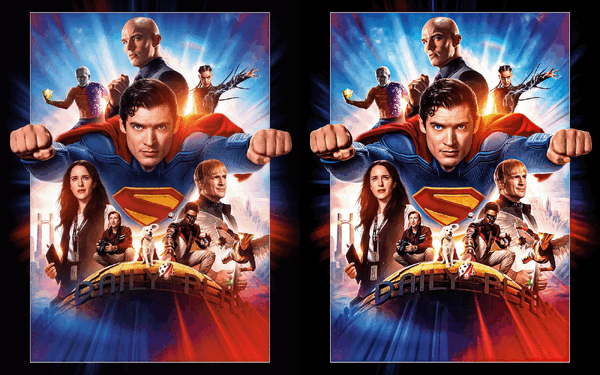
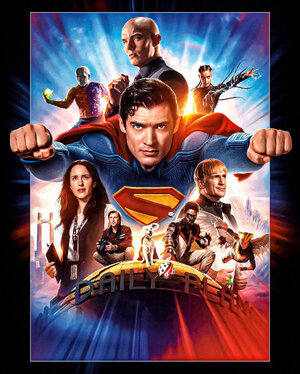
The Chinese poster is the best poster, hands down. I wish this was the main poster, or "domestic" poster if you will. By domestic, it's from the US, and an American film, so...whatever, but China gets this exclusive poster when this should be the main poster. But I also like the Superman stance poster with the Donner-Superman-inspired style of the original 1978 posters which included individual photos of the characters.
I don't know if anyone is like me--I'm not sure if anyone likes movie posters as much as I do, granted, we're all here discussing the posters here. I've always loved the art and detail on a poster for a movie. It's the image of the movie. It's the cover and face of the movie. The posters can say so many things about a movie. What the story is. Usually it's done well when the poster has a lot of mystery to the plot including the characters shown on the poster. After seeing the movie, then you look at the poster again and have a clear idea of who every character is. I prefer this over the Superman arms-crossing poster. It was just too simple for me. Not that I can speak for others, but marketing wise, I don't think that poster does enough to really excite audiences that are non-Superman fans. They might know Superman, but they may have no interest.
However, I must say that Warner Bros hasn't made any good movie posters for a long time. They have, however made pretty good teaser posters. They've made several cheap-looking posters that look so poorly done with very little effort. The Dark Knight Rises poster for example--it was just an older photo of Batman from The Dark Knight (2008) pasted on the original teaser poster with the illusion of the bat logo in the skyline with the buildings. The color was adjusted. That was about it. The film still made money anyways and that was guaranteed either way. Regardless, the poster was lame in every aspect.
I love the detail with Luthorcorp in the background. Even the Fortress is included, and the other characters, Daily Planet globe, and other characters sitting on the globe. Excellent Superman flying pose in the middle. The poster feels larger than life. Personally however, I would have added a small image of Superman fighting the Hammer of Boravia in the background header. Maybe the flag with the S logo. I love that the poster shows objects or scenes that will happen in the movie, but we don't know exactly how it will happen. It's the same for any other poster.
Speaking of freeze breath though, remember how Smallville put off using freeze breath for 6 whole seasons? The creators clearly didn't seem to have interest in ever using that power until season 6. They didn't seem to be a fan of flying either, even though that was what made Smallville work, (No tights, no flights) but they clearly seemed to be against the idea of freeze breath.
Additionally, in Smallville, it's astounding to me how low their budget was after season 4, but the frequency of Clark using x-ray vision, and heat-vision (from S2) in the first four seasons was done on a regular basis compared to season 5 and beyond, although there were other characters that used heat vision. He did it 7 times in season 6. But it was even more astounding to me how in season 7 and 8, Clark used his heat-vision 3 times each season, and in season 9 there was an increase (in at least 7 episodes, but twice in some of the episodes plus Zod and other characters) but then it went from that amount to just twice in the final season...what a ratio that is.
But on super breath, introduced in 6x02, Clark didn't use it again until 6x15. Then for a season-long, he didn't used it again until 8x05 (which some just happened to miss) then 4 times in season 9, and at least once in season 10.
I thought Snyder wasn't going to use heat vision, but was surprised he did use it in JL. I didn't really mind the absence of freeze breath though. It can be cheesy.
Gu3ree
Sidekick
- Joined
- Dec 25, 2013
- Messages
- 1,644
- Reaction score
- 213
- Points
- 73
Yes. The neckline is also different. In the second one, his neckline collar is straight-round. I think in the BTS where David is in costume standing next to Nicholas Hoult--you can also notice the same thing about the S, as well as the neckline.Am I the only one that feels like we're seeing several slightly different S emblems in this film?


In case some of you are wondering what I'm talking about, the lower-right line of the emblem is thicker in some shots (thus making it look more like an S as opposed to just a straight line) and identical to everything else in other shots.
I think the emblem simply has a "3d effect" going where it looks slightly different depending on the angle (due to the logo being emboldened) :Am I the only one that feels like we're seeing several slightly different S emblems in this film?


In case some of you are wondering what I'm talking about, the lower-right line of the emblem is thicker in some shots (thus making it look more like an S as opposed to just a straight line) and identical to everything else in other shots.
AverageMan
Fighting for Average men
- Joined
- Oct 18, 2016
- Messages
- 2,034
- Reaction score
- 929
- Points
- 73
Not watching itGoodness, international trailers are always the best. I really wished I missed this one. Supes vs Kiju is fire…… I heard that people will be emotional at the end of the movie. I am starting to get the impression that will be because Krypto will be going with Kara and leaving Clark.Those dam dogs……
Not watching it
Not watching it
AverageMan
Fighting for Average men
- Joined
- Oct 18, 2016
- Messages
- 2,034
- Reaction score
- 929
- Points
- 73
Routh did it too to put out the gas explosion in Metropolis.When is the last time we even got freeze breath in a Superman/DC movie? Did Cavill ever even do it?
J.Drangal
Sidekick
- Joined
- Jun 14, 2013
- Messages
- 2,304
- Reaction score
- 3,238
- Points
- 103
The collar is also changing shape and I really wonder what motivated these adjustments.Am I the only one that feels like we're seeing several slightly different S emblems in this film?


In case some of you are wondering what I'm talking about, the lower-right line of the emblem is thicker in some shots (thus making it look more like an S as opposed to just a straight line) and identical to everything else in other shots.
The differences are so subtle that I doubt they are played in the film as a “new costume”, as they would have made more significant changes to it.
You know, to make it really obvious to normal people too (those who don't spend 3 hours a day for a year scrutinizing every detail of an upcoming film...
 ).
).J.Drangal
Sidekick
- Joined
- Jun 14, 2013
- Messages
- 2,304
- Reaction score
- 3,238
- Points
- 103
I'm generally pretty critical of a lot of modern posters for this kind of film, and while I hadn't yet seen anything fundamentally bad or particularly good for this film, this one pleases the old fart in me.View attachment 139615text less version. This is the absolute best poster released. Hands down
I'll just say that, for me at least, it still has one foot in “photoshopped floating head” territory, and would probably work better with an even more “painterly” rendering to really tap into classic imagery...
So, of course, I couldn't resist experimenting a little (maybe not super obivous on a tiny screen though)...

HD jpeg below, if anyone is interested...
Similar threads
- Locked
- Replies
- 25K
- Views
- 1M
- Replies
- 111
- Views
- 10K
- Replies
- 29
- Views
- 7K
Users who are viewing this thread
Total: 4 (members: 0, guests: 4)
Staff online
-
DKDetectiveBoo Boo Bubbles (he/him)
Latest posts
-
-
-
-
🇺🇸 Discussion: Congress, The Senate, The House of Representatives - Part I (5 Viewers)
- Latest: blueharvest
-
🌎 Discussion: Illegal Immigration, Immigration Reform, and Other Citizenship Issues II (4 Viewers)
- Latest: blueharvest


