• Super Maintenance

    Xenforo Cloud upgraded our forum to XenForo version 2.3.4. This update has created styling issues to our current templates.

    Starting January 9th, site maintenance is ongoing until further notice, but please report any other issues you may experience so we can look into.

    We apologize for the inconvenience.

The Official Costume Thread - - - - - - - - Part 17

Status
Not open for further replies.
Updated my city picture. Now it's back to his normal hair and suit colors with the updated cape-to-collar section (built from the official pic).

hc9J7.jpg


And here's a new one for you guys... obviously a manip, built from all existing photography.

Watch out for Mo-Cap Man! Hope you like.

T0JOt.jpg
 
Though I'm sure that this has been discussed a lot elsewhere, but I haven't been able to keep up; I'm just curious:

Based on all of the complains and criticisms that the costume designs for Superman has gotten from films like SR and Tim Burton's approach, especially for them not being "faithful" or something to that effect, why is that a majority of fans seem to be more open to his design when it's perhaps one of the boldest designs for the costume period?
 
well, see, all the trunks haters. removing away the trunks doesn't make people take superman seriously. it makes people talk more about his crotch and joke about it's size!

as i say, once the marketing start, the crotch talk will be more ferocious. all the night show talks will begin with the joke on superman crotch. but i guess they are ready for it.
 
It's not the lack of trunks the concern me for this new design, so much as the design of the lines placed on his waist and legs, as they really come off as unappealing for me personally, and to a good amount of people who have voiced their opinions maturely online as well.
 
Though I'm sure that this has been discussed a lot elsewhere, but I haven't been able to keep up; I'm just curious:

Based on all of the complains and criticisms that the costume designs for Superman has gotten from films like SR and Tim Burton's approach, especially for them not being "faithful" or something to that effect, why is that a majority of fans seem to be more open to his design when it's perhaps one of the boldest designs for the costume period?

It is a very good question...

The only thing that I can say, is that the majority of people will universally recognise and accept when something looks good - regardless of whether it is faithful, or how they pictured it in their mind.

I mean, sure, most of us before we have any clue what the suit is going to look like, will express what side we are on (traditional or modern). But it's not going to make it impossible for us to appreciate a costume that looks good, even if it doesn't fit our mind set image. Equally, anyone will admit when something DOESN'T look good too.

For instance:

superman_returns2.jpg


Traditionalists still hated the SR costume. It is MUCH more faithful than this new suit... but it didn't look good. It looked plasticy, the t-shirt collar and cape attachment was horrible, the belt, the maroony colour, the boots... how the entire team behind designing it didn't see it looked bad is beyond me, because the majority of fans knew it looked nothing close to cool.

reign045-3.png


Modernists (I know, I know, not a word :p) as well, still hate the Burton concept design. Because it is hideously ugly, despite it being a modern concept.

super1.jpg


Now we have this new design. Not faithful in every way, but not modern in every way either. It has a great open neckline, cape attachment and boots. We have a style of 's' that is reminiscient of past 's's but not the most recognised version. We have a colour scheme that reflects the opposite of SR's (dark blue, brighter red), we have no 's' curl (so far), and last but not least, we have no trunks.

Beyond that even further, we have a silver pattern design in place of the trunks. Something we have never seen before.

And all the majority of us can say is that it works. It simply is what no other Superman costume design has been before - it's cool. It looks good.

I know a lot of it is down to the man in the suit. I really really don't think i'd have liked it as much if i'd seen Routh in it first.

But mostly it's just because the design is sweet. Period.

well, see, all the trunks haters. removing away the trunks doesn't make people take superman seriously. it makes people talk more about his crotch and joke about it's size!

as i say, once the marketing start, the crotch talk will be more ferocious. all the night show talks will begin with the joke on superman crotch. but i guess they are ready for it.

TBH, as a girl, I see nothing funny about the crotch... It's enough to make any girl blush :p :hrt:
 
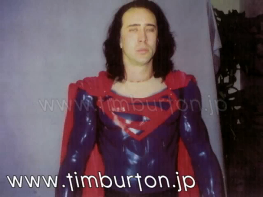
Well, hopefulsuicide, you nailed the thoughts on SR's suit. The Superman Lives costume was just plain ridiculous. The neckline was far too big and wide, the shield didn't have spacing of its own, and the abdomen area looks like plastic molds. Not to mention of course that Nicholas Cage would have never come across as a believable Superman. There's a reason he pretty much invented his own genre of films...

Still agree on the MOS suit too. I can't see how this possibly couldn't work. The crotch never bothered me either. I could foresee other people whining about it, just like most others could, but it never bothered me. Superman's costume hasn't looked this good on film in ages.
 
well, see, all the trunks haters. removing away the trunks doesn't make people take superman seriously. it makes people talk more about his crotch and joke about it's size!

as i say, once the marketing start, the crotch talk will be more ferocious. all the night show talks will begin with the joke on superman crotch. but i guess they are ready for it.

You and the other haters are the only ones talking about it.
 
It is a very good question...

The only thing that I can say, is that the majority of people will universally recognise and accept when something looks good - regardless of whether it is faithful, or how they pictured it in their mind.

I mean, sure, most of us before we have any clue what the suit is going to look like, will express what side we are on (traditional or modern). But it's not going to make it impossible for us to appreciate a costume that looks good, even if it doesn't fit our mind set image. Equally, anyone will admit when something DOESN'T look good too.

For instance:

superman_returns2.jpg


Traditionalists still hated the SR costume. It is MUCH more faithful than this new suit... but it didn't look good. It looked plasticy, the t-shirt collar and cape attachment was horrible, the belt, the maroony colour, the boots... how the entire team behind designing it didn't see it looked bad is beyond me, because the majority of fans knew it looked nothing close to cool.

reign045-3.png


Modernists (I know, I know, not a word :p) as well, still hate the Burton concept design. Because it is hideously ugly, despite it being a modern concept.

super1.jpg


Now we have this new design. Not faithful in every way, but not modern in every way either. It has a great open neckline, cape attachment and boots. We have a style of 's' that is reminiscient of past 's's but not the most recognised version. We have a colour scheme that reflects the opposite of SR's (dark blue, brighter red), we have no 's' curl (so far), and last but not least, we have no trunks.

Beyond that even further, we have a silver pattern design in place of the trunks. Something we have never seen before.

And all the majority of us can say is that it works. It simply is what no other Superman costume design has been before - it's cool. It looks good.

I know a lot of it is down to the man in the suit. I really really don't think i'd have liked it as much if i'd seen Routh in it first.

But mostly it's just because the design is sweet. Period.


TBH, as a girl, I see nothing funny about the crotch... It's enough to make any girl blush :p :hrt:
:awesome:
icon14.gif
 
It's funny, how when allowed had were the blurry pics from far away, there was a fair amount of rage over the missing trunks. Now that we have clear pics, the rage is almost gone.

Also, let me take a second to toot my own horn. I have said that the S was the most important part of the suit. More so than the trunks, cape, boot, even the colors. Well, most of the pics show a trunkless, capeless (I know their just between takes.) Superman with not so traditional colors. And a lot of people like it! I feel pretty good about my statement.
 
It's not the lack of trunks the concern me for this new design, so much as the design of the lines placed on his waist and legs, as they really come off as unappealing for me personally, and to a good amount of people who have voiced their opinions maturely online as well.

The thing is that what you have been seeing mostly is set photos, just about every costume looks silly and debatable in set photos if batman wasn't such a "good production" then wed still be going on about over designed and strange cowel/neck line and whatnot. The spiderman suit looks horrendous on set, but it looks great in the trailer and even better in promo pics.

Now look at superman, it's set photos have garnered mixed to good with some bad reactions. and it's promo pic got nothing but praise(with the main problems being the hair of the actor(fixed now)). My point, just wait till you see it in motion under proper photography, that's what matters and like all these movies I have no doubt it will be be a non issue come that time.

seriously the spiderman suit with it's disco colours and dirty crouch area...
 
It's funny, how when allowed had were the blurry pics from far away, there was a fair amount of rage over the missing trunks. Now that we have clear pics, the rage is almost gone.

Also, let me take a second to toot my own horn. I have said that the S was the most important part of the suit. More so than the trunks, cape, boot, even the colors. Well, most of the pics show a trunkless, capeless (I know their just between takes.) Superman with not so traditional colors. And a lot of people like it! I feel pretty good about my statement.

The amazing boots this costume has too helps as well. :p
 
It's funny, how when allowed had were the blurry pics from far away, there was a fair amount of rage over the missing trunks. Now that we have clear pics, the rage is almost gone.

Also, let me take a second to toot my own horn. I have said that the S was the most important part of the suit. More so than the trunks, cape, boot, even the colors. Well, most of the pics show a trunkless, capeless (I know their just between takes.) Superman with not so traditional colors. And a lot of people like it! I feel pretty good about my statement.
ummmm wrong...... There is still rage and disappointment that there isn't trunks or at least the red belt that is in the new comics.

Now we have clearer pics, and see it up close, now we know it's for real and there is no turning back.
 
I just don't get how he fits this under his work suit. His 3 piece even on a hot day helps but that smallville shirt and tie get up just won't make sense.

...the red belt would have been awesome btw.
 
ummmm wrong...... There is still rage and disappointment that there isn't trunks or at least the red belt that is in the new comics.

Now we have clearer pics, and see it up close, now we know it's for real and there is no turning back.

Well considering that it was barely mentioned in big movie sites/blogs and the comments for the overwhelmingly majority agreed that it looked pretty good.

The trunk debate has only had a presence in specifically SH fandom areas of discussion and even then it has been very small to say the least.

Even Kurosawa who is a diehard adamant of utter reverence has taken a liking to the costume.

Personally I was 100% for the trunks but somehow even though they removed them they made a design that IMO looks more regal and alien and doesn't take a bit of the visual essence that is Superman.
 
Is the costume perfect? No.

Does it look good and satisfy me as a "Superman" suit looking at it? Yes.

One of the biggest things we also have to consider is that with the movie lighting and camera angles it may look even better.

Snyder has a history of adding lots of color and other elements to his films after primary filming, and this will likely enhance how it looks even further.

This is the most built Superman on film ever, and I have to say; It looks great
icon14.gif
.

I've always felt that Superman should be as muscular as possible while still being able to pass for human as Clark. As if 1 more pound of muscle would be too big, right on that line without crossing it.

His build definately helps the suit a lot.
 
Well considering that it was barely mentioned in big movie sites/blogs and the comments for the overwhelmingly majority agreed that it looked pretty good.

The trunk debate has only had a presence in specifically SH fandom areas of discussion and even then it has been very small to say the least.

Even Kurosawa who is a diehard adamant of utter reverence has taken a liking to the costume.

Personally I was 100% for the trunks but somehow even though they removed them they made a design that IMO looks more regal and alien and doesn't take a bit of the visual essence that is Superman.

That's what I was referring to. The overall change of tune many here had.

And thumbs up to those who, after seeing the clearer pics, gave the suit a chance.
 
Traditionalists still hated the SR costume. It is MUCH more faithful than this new suit... but it didn't look good. It looked plasticy, the t-shirt collar and cape attachment was horrible, the belt, the maroony colour, the boots... how the entire team behind designing it didn't see it looked bad is beyond me...

I didn’t mind the SR boots at all.

Point #1: Bright red, calve-length boots are a tricky fashion statement for a grown man to pull off. :cwink: A burgundy “biker style” at least approaches something that could be called masculine.

Point #2: Conventionally, Supes’ boots match his trunks and cape. So if his boots are burgundy, the other elements need to match. (They fudged a bit on the cape. If light was shining through it, it brightened considerably.)

That said… Cavill’s tall, “dusty rose” boots seem to be working quite well. I approve. :yay:
 
What an exquisite color for the cape, he truly looks like Kryptonian royalty here. I can't imagine how beautiful it will all look in motion.

problem is... he isn't a royalty. :o
 
Now that I FINALLY have my power back (5 days without power or water after Hurricane Irene... :cmad: ) I am here to voice my opinion on the suit.

Looking as the suit on a whole it is a great design... but not for Superman. The seams down the legs and the gauntlets on the wrists are way too much. I think the seaming at the waist is okay, but would have been nice with some color added (like the gold in the middle seam I saw in one of the manips on the last thread).

To me, you can't just take a skin-tight blue suit, slap a \S/ shiled on it and call it Superman. I agree that this is some type of mesh between Superman, Spiderman, Batman and then they threw in the Wonder Woman gauntlets. I have lovingly (or hatingly) named this suit the Super-Spidey-Bat-Wonderman suit.

And the shots of him without the cape... that just breaks my heart. It's bad enough with no red trunks, but with no cape?

Bad Superman said:
No. I didn't "lump" the non-classic designs together as if they are the same suit. I just showed how much the Burton concepts look like Snyder's. I didn't focus on just one. The suit has elements and/or similarities with both concepts.

No joke. That's why I posted the concepts. There's no denying there are elements taken from those designs.

Check out the color between Cage's and the MOS suit. Its similar. The suit design in general is similar. As for the second picture, the MOS suit has a weird tribal spiderman like design from the rib area, thighs and back. And finally, neither the Cage suit nor the "robo" suit has the trunks.

I agree that it looks as though the colors were inspired by the Burton Suit and the flourishes on the suit (all the lines/seams) seem to be inspired by the second picture.

Bad Superman said:
To me and others it is.
El Payaso said:
Both one piece dark blue suits, no trunks, long deep red cape. As I said before, Cavill's is a mix between classic and that Burton idea. NOT that Snyder based anything on Burton's work. But they have a number of similarities.
Agreed
 
I love this suit, but really it doesn't matter too much. Wait for official photos after post production, because that's what it will look like in the film. That's what people still don't understand. I understand why they dislike it because of lack of trunks, but don't make full judgment just yet.
 
camp Blood said:
see I see differently because I see it as a mix of classic and the one flyby concept I posted earlier

Oh and I wouldn't ignore those similarities either.


well, see, all the trunks haters. removing away the trunks doesn't make people take superman seriously.

Which wasn't the reason for the trunk removing.

it makes people talk more about his crotch and joke about it's size!

Yeah, like the trunks didn't make people talk and joke about it.

as i say, once the marketing start, the crotch talk will be more ferocious. all the night show talks will begin with the joke on superman crotch. but i guess they are ready for it.

And I guess we shouldn't design a suit absed on some people's supposed stupidity.


reign045-3.png


Modernists (I know, I know, not a word :p) as well, still hate the Burton concept design. Because it is hideously ugly, despite it being a modern concept.

Not to mention that that is just a fake and not Burton's final design. Which was never fully made btw.


Well, hopefulsuicide, you nailed the thoughts on SR's suit. The Superman Lives costume was just plain ridiculous. The neckline was far too big and wide, the shield didn't have spacing of its own, and the abdomen area looks like plastic molds.

The abdomen area looks like it's a toy with Nicolas Cage's face pasted over it: Which is what it is. That picture is not real.


To me, you can't just take a skin-tight blue suit, slap a \S/ shiled on it and call it Superman. I agree that this is some type of mesh between Superman, Spiderman, Batman and then they threw in the Wonder Woman gauntlets. I have lovingly (or hatingly) named this suit the Super-Spidey-Bat-Wonderman suit.

Snydewr is well known for taking bits of many other previous designs and applying them to his movies.
 
Last edited:
Status
Not open for further replies.

Users who are viewing this thread

Users who are viewing this thread

Latest posts

Forum statistics

Threads
201,243
Messages
21,929,063
Members
45,725
Latest member
alwaysgrateful9
Back
Top
monitoring_string = "afb8e5d7348ab9e99f73cba908f10802"