
It's a Bird, It's a Plane, It's the Superman Costume Thread! - Part 3
- Thread starter Thread Manager
- Start date


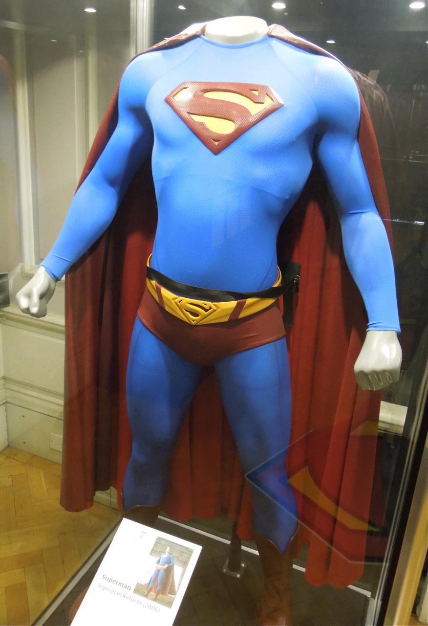
 when I looked at it. Completely befuddling design choice.
Similar threads
- Locked
- Locked
Users who are viewing this thread
Staff online
-
 squeeknessI'm a poor lost puppy
 -
 Lily Adler🔥 Hot Scoops 🍨
Latest posts
-

-
 DC Animation ‘Batman: Caped Crusader’: Animated Series From Bruce Timm, J.J. Abrams, Matt Reeves Greenlit (6 Viewers)
- Latest: Shinobi Shaw
-
-
 Elon Musk Buys X (formerly Twitter): Just Use Bluesky, Threads, or Mastodon Instead (6 Viewers)
- Latest: blueharvest
-
