• Xenforo is upgrading us to version 2.3.7 on Thursday Aug 14, 2025 at 01:00 AM BST. This upgrade includes several security fixes among other improvements. Expect a temporary downtime during this process. More info here

Homecoming Marvel's Spider-Man Costume!? - Part 7

Status
Not open for further replies.
Seems like I'm barging in the middle of a debate here, but —

I think of both the TASM and Civil War suits as quite comic book accurate. There's aspects of both costumes that make them great IMO, and due to Spider-Man's evolution over five decades, being handed around different writers, artists, etc., and the fact that comic book costumes are often open to interpretation by people who are making a comic book movie, there's no "correct" definition of a comic-book-accurate Spider-Man suit to begin with.

The suit in The Amazing Spider-Man 2 was quite nice. I mean, it got the gist of Spider-Man's basic costume layout (though hm, daddy long-legs spider), and the raised webbing, which might restrict Spider-Man's mobility but helps convey his authenticity as a hero. The bug eyes in my opinion hearken back to the idea of a friendly neighborhood Spider-Man.

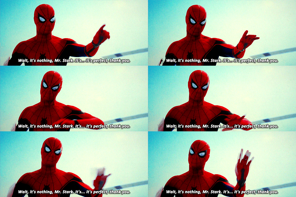
Meanwhile, the Civil War suit's also a beauty. The color scheme isn't too different from ASM2's (but it's brighter! nice), and it's also a much more obvious callback to Spider-Man's history as a comic book character, with classic tick spiders and all of that. The mechanical eyes are a smart way to honor the artists who drew Spidey — especially his eyes! The black bands, though seemingly pointless at face value, kind of remind me of the Scarlet Spider. The lack of raised webbing gives Spider-Man a more sleek, flexible vibe.

I see why they made the necessary changes to Spider-Man for Civil War, though — although a 100 percent comic book accurate Spider-Man would be nice, it wouldn't exactly fit the atmosphere and mood of the Marvel Cinematic Universe, which not only respects the source material but also cooks up great ways to make the costumes more practical without deviating too much. Spider-Man is no exception. The black bands (although some may think of it as unnecessary), the web cartridges on his belt, the inverted space between the webbing, and the redesigned chest spider give Spider-Man an aerodynamic, authentic, governmental feeling. Also, the webshooters probably look a bit large on purpose. It was important for Peter Parker and Tony Stark to get the core technology of those shooters down before they can think of compressing them and even hiding them under Peter's suit (which they might).

Just throwing my two cents out here.

TL; DR: Spider-Man suits in all movies where Spidey was featured are good in their own right. To each their own, however.
 
Last edited:
The X-Men leather suits and whatever the hell those guys were wearing in Fant4stic were more accurate than Marvel's Spider-Man. :o
 
WHAAAATTT?? :wow:

Civil War suit is easily the most comic accurate one to date: small chest spider, fat back spider, curved spaced out flat black webbing, Romita/Ditko lenses, emotive eyes, etc.

Not every design of the Spider-Man suit has spaced out webbing and a small chest spider so that's irrelevant. Especially because the spider logo is so ugly and looks nothing like the ones from the comics.

The TASM2 and Raimi suits are very accurate, every single design choice is based on already existing elements from the comics. The web pattern and back logo are done differently but its still just a different way to execute the classic elements. The black bands on the Civil War suit are NEW, they are a change in the design and therefore more inaccurate than anything on the TASM2/Raimi suits.

Btw he didn't have emotive lenses in the comics or cartoons either, in the context of his stories they were just regular lenses but because of the nature of animation they were allowed to emote.

Even the color choices for the red & blue are perfect. And Holland's build really helps the whole look of it too. Only thing they could do without are those black bands, but everything else is Spidey to a T.

Just look at my avi. :oldrazz:
The colors are by far my favorite aspect of the suit, I think they look perfect and hopefully they never change them.
 
Actually he did have emoting lenses. It was explained in one the Lee/Ditko era books (if I remember correctly) that the lenses are made of flexible 1-way mirror type material therefore allowing him to squint.
Which if you look closely into the Civil War suit, the one way mirror is there, you can see at some points the glare of light.
 
Btw I do love the reflective lenses, that's one of the few aspects I really wanted :woot:
 
Not every design of the Spider-Man suit has spaced out webbing and a small chest spider so that's irrelevant. Especially because the spider logo is so ugly and looks nothing like the ones from the comics.
Actually it closely resembles the Mcfarlane chest spider in shape, as well as the Alex Ross paintings. And you make a citation for the previous suits using elements from the traditional suit but changing them yet you point out how the CW chest spider 'looks nothing like the comics'. And most Spider-Man designs DO have a smaller chest spider.
The TASM2 and Raimi suits are very accurate, every single design choice is based on already existing elements from the comics. The web pattern and back logo are done differently but its still just a different way to execute the classic elements. The black bands on the Civil War suit are NEW, they are a change in the design and therefore more inaccurate than anything on the TASM2/Raimi suits.
I guess you could also say TASM2 suit is a change in the design because the Webshooters aren't inside of the suit, although it's nowhere near as drastic but still, that's change from the traditional pallete. Also TASM2 suit has lines going down the back and sides of the crotch area, so that's also NEW design element.

Btw he didn't have emotive lenses in the comics or cartoons either, in the context of his stories they were just regular lenses but because of the nature of animation they were allowed to emote.
Actually he did have emoting lenses. It was explained in one the Lee/Ditko era books (if I remember correctly) that the lenses are made of flexible 1-way mirror type material therefore allowing him to squint.

The colors are by far my favorite aspect of the suit, I think they look perfect and hopefully they never change them.
Agreed. Finally get away from the subdued colors from TASM2/Raimi suits.
 
Last edited:
Alex Ross drawing or Civil War suit? :sly:

tumblr_o7fnsmFxds1rvufhzo1_500.gif

That suit looks like it's made of rubber not cloth and or spandex already the other suits look more "Ross-like" than it for that reason alone.
Also wth is with those added nonsensical details...?

Other than the eyes there aren't any real similarities to this...
tumblr_n1en34L7lu1qhpx4lo1_1280.jpg


The spider looks off the fabric or lack there of
 
Last edited:
What suit also has several unnecessary black additions, exterior web-shooters, and an exterior belt? Civil War suit? Okay, then.

He said it's one of the LEAST accurate. And it is. No one said it wasn't accurate. Just less than the Raimi suits and ASM2.

Which is fact.

I know that's a harsh word to throw around here, but it is. The CW suit has many small changes which puts it farther from the comics than Raimi or ASM2 which are literally only web color away from perfect.


Thank you all for having my back bro fives all around!:woot:
Bring in the webbed armpits, ditch the black accents, and we are in business.

:up:
 
One thing I will say about the suit is it look so much nicer in all these gifs where the saturation and contrast are kicked up. Vibrant colours look better.
 
That suit looks like it's made of rubber not cloth and or spandex already the other suits look more "Ross-like" than it for that reason alone.
Also wth is with those added nonsensical details...?

Other than the eyes there aren't any real similarities to this...
tumblr_n1en34L7lu1qhpx4lo1_1280.jpg


The spider looks off the fabric or lack there of
Nah, both Raimi and TASM2 look nothing at all like Romita or Alex Ross paintings. Civil War having flat jet-black webbing alone brings it closer to Ross's artwork. And the web patterns on the suits are very similar.
 
The moving eyes were ok, but they still weren't exactly "emoting" like Deadpool's eyes were. Because the eyes are mechanical, I didn't feel Peter's expression from them, I just saw mechanical movement. So I hope their intention wasn't to emote with them, because it added nothing like that
 
This from the official merchandise release, the suit is easily the best representation of Spidey in film.
2zi0brq.jpg
 
The Spider-Tracers are actually one of the most useful items. I'm surprised they haven't use them yet, specially to avoid plot holes like "hey, how did he know where to find him/her?".
 
For being so comic accurate neither raimi's or tasm's suits ever really looked like it came out of a comic book. The raised silver webbing, the colors being off, the shape of the eyes and the overly detailed spider logos (not to mention skinny back spider) all throw it off from a classic look. Even with the added details I think the CW suit looks waayy more accurate to what comic spider-man looks like. What they do different makes a huuggge difference
 
For being so comic accurate neither raimi's or tasm's suits ever really looked like it came out of a comic book. The raised silver webbing, the colors being off, the shape of the eyes and the overly detailed spider logos (not to mention skinny back spider) all throw it off from a classic look. Even with the added details I think the CW suit looks waayy more accurate to what comic spider-man looks like. What they do different makes a huuggge difference
Exactly. :up: take away the black stripes and it's easily the most comic-accurate to date due to the accurate webbing, lenses, back/front spiders and colors.
 
I like all spidey suits. There has been always small changes from comics compared to whats happening with other superhero suits.

I loved CW suit... Probably will look better if Tom Holland wears instead of CGI suit.

Now i wish black parts weren't there but it's not big deal. Also there is always minor changes in these movies. Maybe it'll change in Homecoming. I think blue & red is enough.
 
The moving eyes were ok, but they still weren't exactly "emoting" like Deadpool's eyes were. Because the eyes are mechanical, I didn't feel Peter's expression from them, I just saw mechanical movement. So I hope their intention wasn't to emote with them, because it added nothing like that

I kind of disagree, I reckon it added some emotion to him, also the practical use for them are because he say's they help him focus more because of how his senses have been "dialed up to 11"
 
I like the black trim. It matches with the eyes nicely.
 
Status
Not open for further replies.

Latest posts

Forum statistics

Threads
201,960
Messages
22,042,931
Members
45,842
Latest member
JoeSoap
Back
Top
monitoring_string = "afb8e5d7348ab9e99f73cba908f10802"