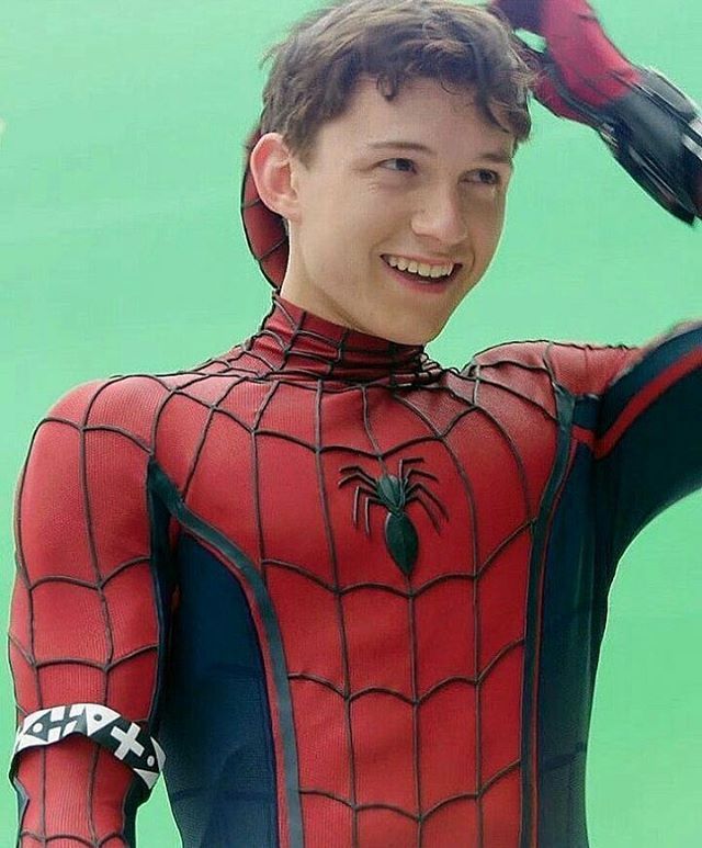
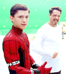
Is this from Civil War? Where are the black bands around the shoulders and why is he wearing mo-cap fabric around his arms?
They had not finalized the suit. They decided to replace the whole suit with a CGI suit like Black Panther once they did. The downside to this for me is that they are obsessed with with CGI Spider-man and Black Panther. That worked for Iron Man and is so so with these guys.
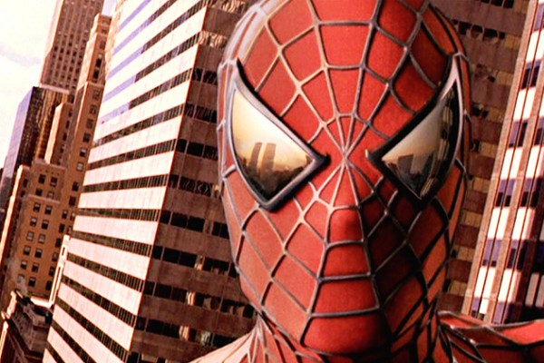
The eyes don't hold up very well.
I can't really agree with you. First and foremost you are taking pictures that aren't from the final film with the exception of the last one. They are mostly promo stuff.
Even then I don't see how they failed to hold up.I still think they are the best action Spider-man eyes. But overall I think each suit has done a good job with the mask. Even TASM suit I feel was a great mask.
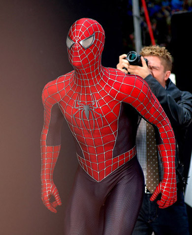
Now the webbing of the Raimi suit. The coloring is gun metal. That means that it's not black. It does mean that in the light it can come off as silver and in less lit scenes we get a nice range of tones which I think made it pop
Looking back at the suit with CGI. Yes the raised webbing made the CGI model much better. It generally avoided the plastic doll look that is very apparent in Homecoming at times.
Also I know people hate the suits being darker but once again this is the reality of lighting. By being a darker suit, the CGI really popped nicely in well lit situations. The Raimi suits simply always looked good thanks to texture and color.
The Homecoming suit also has great things going for it but there is way too much faith put in the CGI without accounting for the suits design. Sony realized in TASM2 why the Raimi suit didn't need to be changed for 3 films. Marvel is on the "Different for difference sake" without going into TASM territory.
There is a balance that can be struck but it requires them to dissect the Raimi suit and improve on it. Not make changes for changes sake.
Not having raised webbing is seriously a negative change for me. It works in a comic but in CGI it just creates a plastic look. Also raised webbing would fix the CGI head issue.
Really the lessen is this. Perfectly smooth things that are humanoid look very fake in CGI.
Raimi fixed that with raised webbing and a very clear cell pattern on the blue and red.
Webb fixed it by copying the Raimi suit but chose thinner webs and not using gunmetal black. Plus having a visible texture.
Deadpool avoids it by accepting the curves of the actors face and letting seams create that texture.
I know a wall of text that basically says yay raised webbing.