BvS Should they change the costume for the sequel?

Should they change the costume for the sequel?

  • Yes

  • No


Results are only viewable after voting.
:o wtf? I am entitled to my opinion whether you agree or don't! Smallville started strong, but then took a bat$hit snowdive from there. Lois Lane and Jimmy Olsen in Smallville, please!! Again it sucks badly!
that's besides the point... Dew said NOT to bash Smallville in the SR forum... the same goes for bashing SR in the Smallville forum.
 
my opinion matters just as much as any others on here: not at all, when it comes to what will actually happen. What matters first and foremost is how the suit looks in daylight. That's how i like the colors, very regal and heroic, not ridiculously bright or muted. Now, I'm in film school, and i know how to light so that it looks like night, but can still keep the same colors at night (look at STM, the colors look just as bright at night as in the day, and same is true for SR, it's basically the same at night as it is in the day, and I'm not talking about up in the atmosphere near the sun like in the plane scene in which there is much more like than regular).
IE. This is the exact same colors as in teh day, for the most part. IMO it looks great, not ridiculously bright but easily discernable as red, blue and yellow.
srcap3am1.jpg


It would work, and though it might not be everybody's favorite take, it's mine.

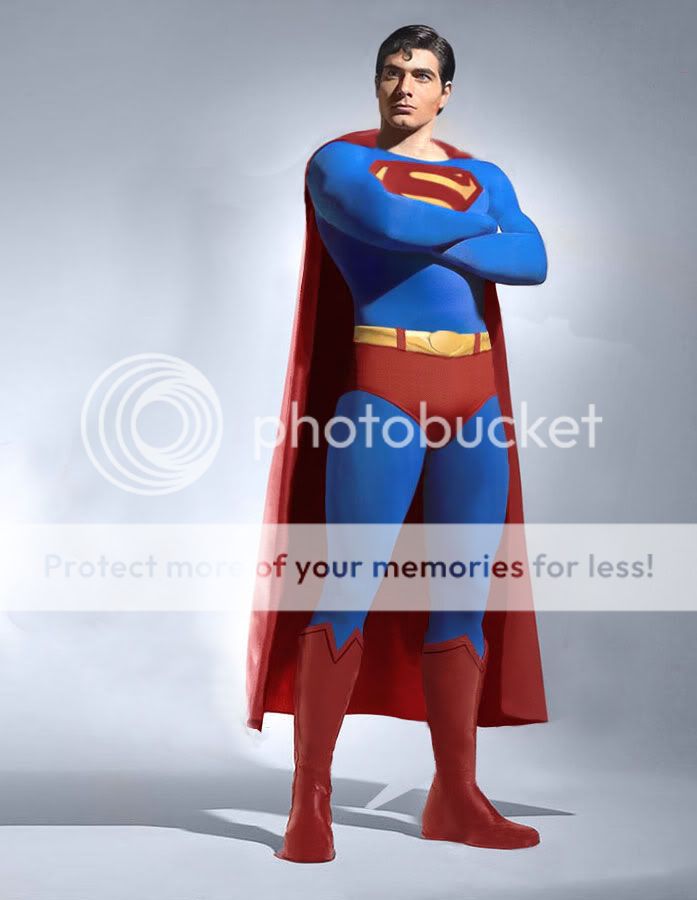
my colors would look like this:

DAY:
supeshi001colorcorrectiyn3.jpg


NIGHT:
mycolorsnighttu3.jpg
don't get me wrong TB812. I agree, you're completely entitled to your opinion... it's not that I question your opinion, I just question that color palette.
 
No offense, and if you love it thats great. I used to be a fan as well ,but I just couldn't take the $hit any more!

I didn't say I loved it. You're missing the point, don't rip Smallville here. It doesn't fly with the people upstairs. :cwink:
 
Heres the SR colors compared to a bright red suit.

391180857_13b8c17d38.jpg


Personally I love the SR Blue tone. The crimson however, can be lightened slightly... but not anywhere near to the extent of the bright red.

I prefer the tone of the way they lightened it on the CG cape shots on the DVD.
I agree Brainy!:woot: (Sorry, I'm a big LEGION fan.) You are right; just brighten up the red and the suit works. Well maybe get rid of the sappy S-buckle too!
 
Heres the SR colors compared to a bright red suit.

391180857_13b8c17d38.jpg


Personally I love the SR Blue tone. The crimson however, can be lightened slightly... but not anywhere near to the extent of the bright red.

I prefer the tone of the way they lightened it on the CG cape shots on the DVD.
Yeah, just brighten up the red and lose the S-buckle and its fine!
 
Nah I'd keep the \S/ belt. It looks good in Kurbert's artwork. They should just tweak it slightly to look like it does in the comic.
 
Nah I'd keep the \S/ belt. It looks good in Kurbert's artwork. They should just tweak it slightly to look like it does in the comic.
I disagree... the only reason it's there is to make up for it not being on the cape. It looks too feminine.


and from the sound of it, Kubert is gonna be replaced for not turning in artwork on time... hopefully by Jim Lee.
 
I disagree... the only reason it's there is to make up for it not being on the cape. It looks too feminine.


and from the sound of it, Kubert is gonna be replaced for not turning in artwork on time... hopefully by Jim Lee.
I second that Jim Lee vote! His time on Superman was to short!
 
I disagree... the only reason it's there is to make up for it not being on the cape. It looks too feminine.


and from the sound of it, Kubert is gonna be replaced for not turning in artwork on time... hopefully by Jim Lee.

I think in one interview they Louise said they took the S off the cape and then put it on the belt, something to that effect.

Singer in a seperate interview mentioned that it had been on other incarnations of Superman and decided to feature it on the belt.

Granted, I do not have links, so my 28 year old brain could be making this all up but I would like somebody to see if they recall this as well.
I don't remember anything about him talking about other incarnations with the symbol on the belt, but he did say why it was on the belt buckle in the Wizard magazine interview
 
I disagree... the only reason it's there is to make up for it not being on the cape. It looks too feminine.


and from the sound of it, Kubert is gonna be replaced for not turning in artwork on time... hopefully by Jim Lee.

I met Jim Lee in person. He liked the SR suit when I asked him.

But obviously he isnt going to change his styles.

In all the manips I've seen of the suit without the \S/ belt, it just looks empty.

Besides, it would look dumb if it just randomly disapeared in the sequel.
 
What did he say?
it said stuff like none of the departments didn't want it there, having it there would cause problems in the CGI department, how it would just look like a blob, so they decided to put it on the belt instead

I met Jim Lee in person. He liked the SR suit when I asked him. But obviously he isnt going to change his styles.
and I hope he never does...

In all the manips I've seen of the suit without the \S/ belt, it just looks empty.
that's what it's supposed to be... it was never supposed to be there in the first place. If it were, Seigel and Shuster would of put it there at the beginning.

Besides, it would look dumb if it just randomly disapeared in the sequel.
completely disagree... seeing that it serves no purpose and it just a piece of jewelry to the suit (which ALREADY has thousands of "S"s everywhere else) it would be nice to see it gone and see the traditional/classic oval instead of some overused symbol
 
You know what I suggest. Maybe they should pull a Batman Forever. A suit change in the middle of the film.


Say his SR suit gets battle ravaged in a fight with Brainiac or Doomsday to the extent Spidey's was in the first film.

In the end he gets a new costume left for him from Jor-El that is brighter and has the more traditional look.

Easy way to fix the problem.
 
I remember someone mentioning that a long time ago before the first movie came out...
 
supes_shoulda_look_like.jpg


Great picture dude!

This is exactly the way superman should look.

I like the bright colours and bigger S symbol, much better.

That suit looks like $hit! Reeve is dead and so is his utterly cheesy 70s Superman style. The suit is just fine. They should leave it as it is (and most likely they will). They aren't gonna waste time and money on an all new suit design. You might get a slightly bigger S but that's about it.
 
that suit is too bright, but I've seen better manips that blow the Singer suit away...
 
That suit looks like $hit! Reeve is dead and so is his utterly cheesy 70s Superman style. The suit is just fine. They should leave it as it is (and most likely they will). They aren't gonna waste time and money on an all new suit design. You might get a slightly bigger S but that's about it.
WTF??:huh: You're bull$hitting me! That kicks ass! A hell a alot better than the Returns suit! Don't make fun of Reeve as Superman! He's STILL the best!:cmad:
 
I don't understand why everyone is so against the suit being bright red. It didn't look bad in Superman, and no, not because it was the 70s or because the movie was "campy". No, I mean, even in the totally straight, serious scenes, the suit did not look out of place.

And it's not 70s style, that's the way the suit is supposed to look. That's how the suit has looked forever, with the biggest change being the size and style of the logo.
THANK YOU!! Finally someone who understands. :woot:
 

Members online

Latest posts

Forum statistics

Threads
202,327
Messages
22,086,609
Members
45,885
Latest member
RadioactiveMan
Back
Top
monitoring_string = "afb8e5d7348ab9e99f73cba908f10802"