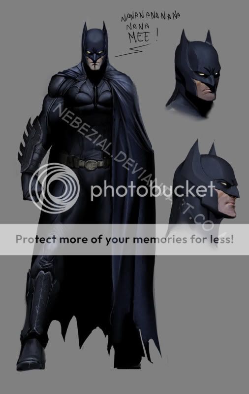
I really loved the Batman Begins armor. More than TDK or TDKR armor, even though I still liked those.
The best change had to be the separation of the cowl from the neck. Making the cowl literally like a helmet, and the neck of the costume connected to the armor itself, really made a huge difference it seemed. So, I think that's something that could be used in the next versions from here on out. Even if we get a spandex-type looking Batman.
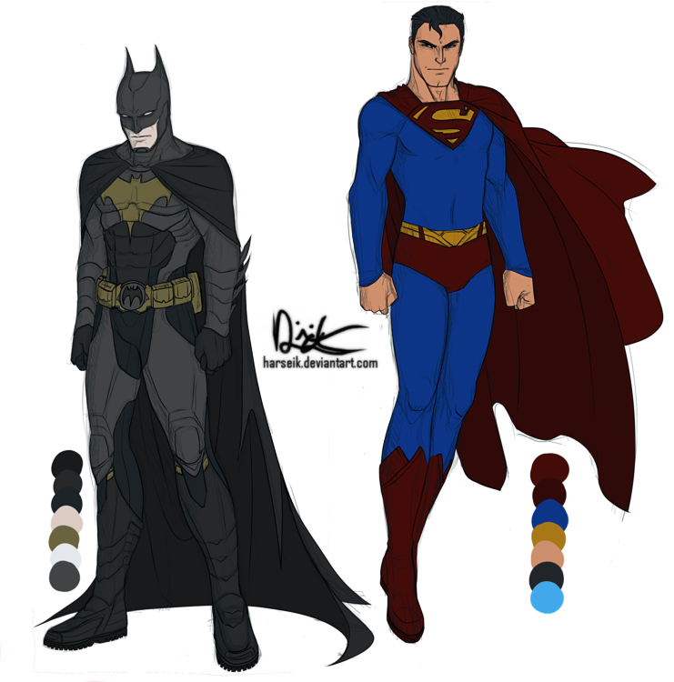
I personaly dont like that look, would like to see the full neck mask, I am pretty sure they have the technology to pull it off.
and these r movies so the visual look should be there instead of make them funtional. THESE ARE fantasy not real life.