Spider-Aziz
Dummy Dragon Holo
- Joined
- Oct 11, 2010
- Messages
- 83,442
- Reaction score
- 8,953
- Points
- 103
And it was badly receivedIt was. The pilot was filmed as a comedy.
How unfortunate for all
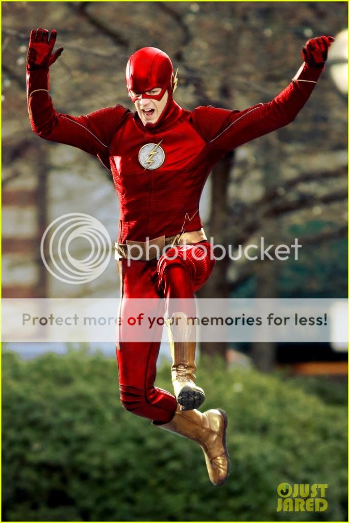
Speed Force effect in action looks good in this still
And it was badly receivedIt was. The pilot was filmed as a comedy.
Speed Force effect in action looks good in this still
Well at least the last 2 had the Flash RED! I do not understand this 5 shades of Ricardo Montalbán burgundy Corinthian leather costume they made for him.


The suit really only needs a few minor changes to look great, the logo is really the only problem I have with the suit...

Looking at the costume I see the reason they made the belt the way they did. The top is a jacket. To avoid making it noticeable they had to make the belt bigger. If the belt was all yellow it probably wouldn't look right.
Bottom line is, because its a tv show and due to production schedule and budget your never going to get a movie quality costume. They realistically don't have the resources to have thousands of costumes and most likely the team of people required to put them on.
As for the leather look. They tried to create some cohesiveness with the cowl and chest. I would have liked to have seen less on the pants. I also feel like the lighting around the belt looks like scribbles, IMO it could have done without.
All that said, I like it and the great thing about tv is that there is always room for improvement unlike a movie that requires the sequel to see changes.
Fat Martian Manhunter....Barry is a mook....good lord.
I've seen the 1994 Fantastic Four, the 1990 Captain America, Howard The Duck, but not even I could sit through this ****...

For the life of me I can't understand why the inside of the insignia isn't white. I simply can't get over it. I can live with everything else considering it's a TV show, but the red insignia just makes no sense to me at all. For them to nail the cowl and **** up the chest piece I'm simply flabbergasted.
For the life of me I can't understand why the inside of the insignia isn't white. I simply can't get over it. I can live with everything else considering it's a TV show, but the red insignia just makes no sense to me at all. For them to nail the cowl and **** up the chest piece I'm simply flabbergasted.

You can tell that the person who designed Arrow's costume was responsible for this one. She did not deviate much from the template of Arrow. That approach just doesn't work for a character like The Flash. What's good for the goose in not necessarily good for the gander. I do not despise The Flash's costume like some. It could be much better, but the essence of the character is represented.
Holy ****. Yeah wow. I see a lot.of Arrow in there. :-/
the costume kinda gives DareDevil looks
This one is much better IMO.wow, I found this other pic from the same artist, looks awesome!
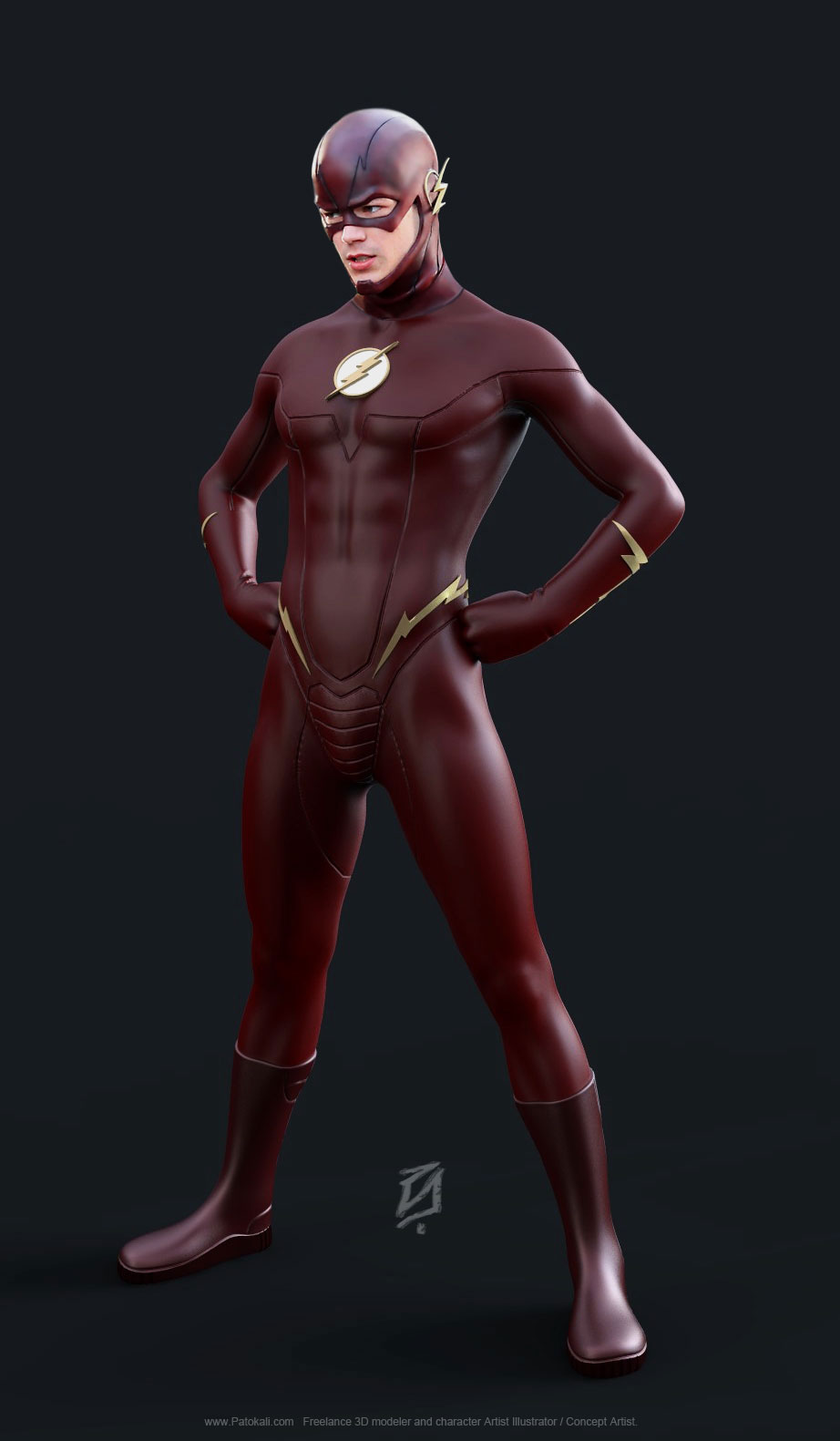
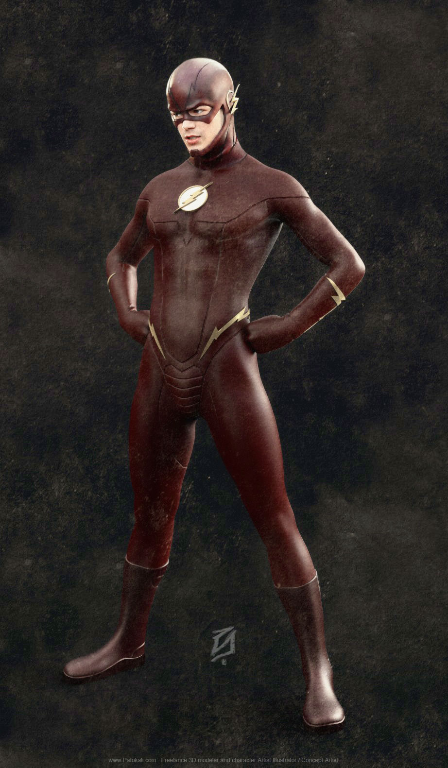
More art from this artist here: http://patokali.deviantart.com/
Hah no disagreement there.That pose is just so weird though... it makes me uncomfortable
yep yep agreed with all this. the belt is definitely the worst part of the costume. i saw a manip where someone colored the belt yellow and it looked a little bettter.Hah no disagreement there.
In the real costume my big complaint is just how massive that belt is. I run A LOT and I can tell you having something like that on would get irritating real fast.
That and they should have the costume be all one material.
yep yep agreed with all this. the belt is definitely the worst part of the costume. i saw a manip where someone colored the belt yellow and it looked a little bettter.
Can someone repost that manip? They color corrected the suit, gave him yellow belt and yellow boots
yep yep agreed with all this. the belt is definitely the worst part of the costume. i saw a manip where someone colored the belt yellow and it looked a little bettter.
Can someone repost that manip? They color corrected the suit, gave him yellow belt and yellow boots