The Official Costume Thread - - - - - - - - - - - Part 20

Status
Not open for further replies.
2uqd5zq.jpg

20fus0h.jpg

eiw68k.jpg

I know that some folks felt that the lack of red undies would help not draw attention the crotch, but how could you NOT look at that package...even if you weren't asked to? I think this really illustrates that the focus is actually worse...even though I kind of respect the approach.

It's not just you. One poster on here (I forget their name) showed the costume to their spouse who is a fashion designer, and they pointed out that all the patterns on the costume point directly to the crotch. Basically the costume is a huge neon sign pointing at his package. Plus the ornate design on the legs and side looks like a tribal tattoo or something worse that people whine about mentioning (the same people who laugh at the costume as Joe Shuster designed it to look).

It's also disgusting and obscene because it's supposed to be a kids movie. Hopefully the lighting will obscure it and from the movement it won't be noticeable.

I wanted the trunks, I'm willing to live without them, and it was a good try, but what they have done looks stupid as hell to me. But if the movie is great, then I will deal with it like I have dealt with all the bad Batman costumes. Not all movie superhero costumes can be as good as Raimi Spider-Man.
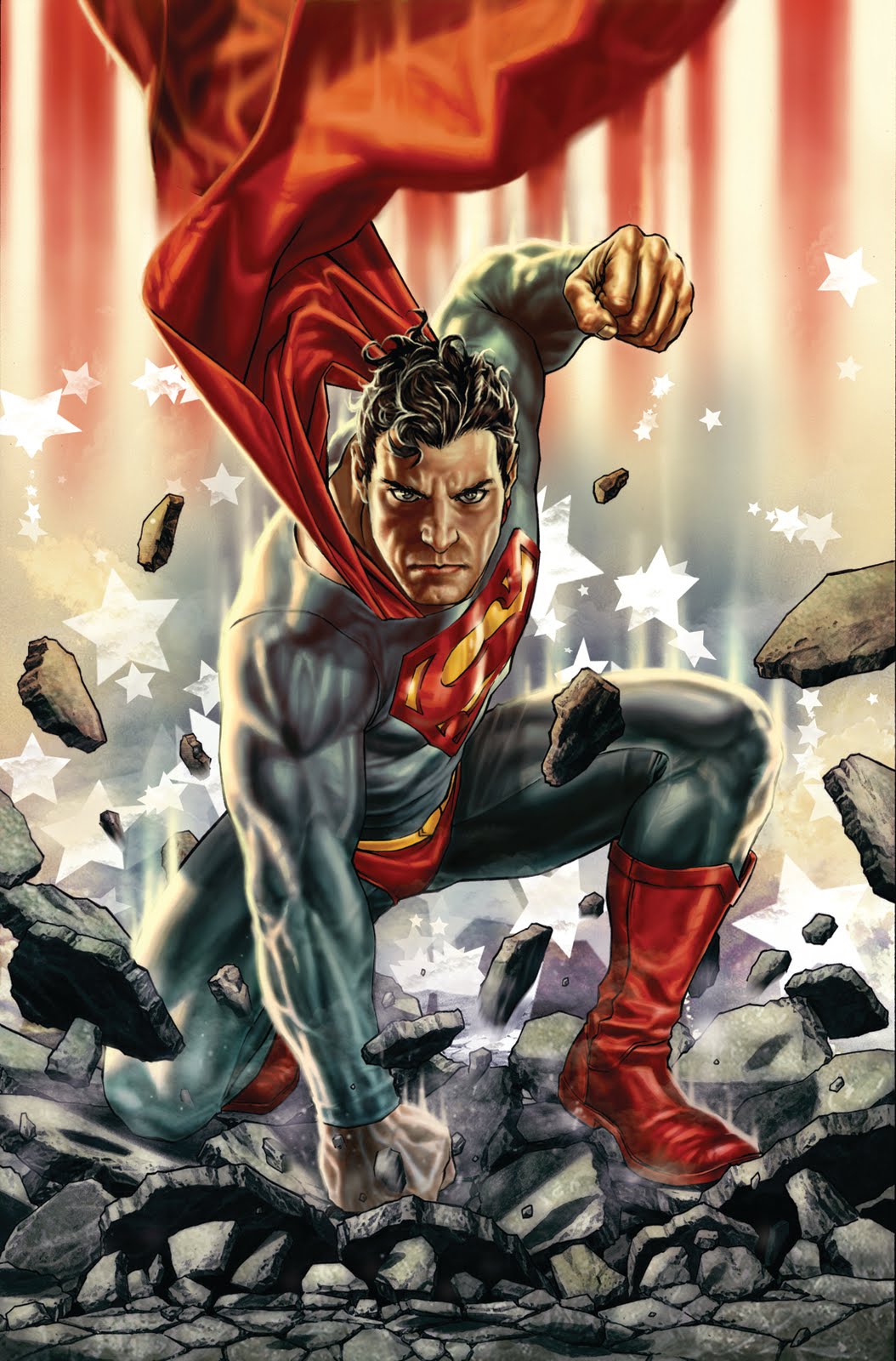
 
the fault is not in our stars... but in ourselves... We see what we want and find what we are looking for. It is very difficult to remain objective.

...and by that logic (above) , wouldn't that mean that s&s and those that came after, developed that shield that looks like an arrowhead pointing directly down toward Superman's private parts?

just food for thought.
 
The general approach with colors and visuals of MOS Superman reminds me so much of Bermejos Superman. And I love it.

Superman.Grounded.Final.low.jpg
 
Oh and Superman bulge is obviously win.

Would people complain if Lois had a great rack?
 
Again, not so much the actual package...any guy would be sportin' the same 'issue' ;)...just how graphically, I think the eyes are drawn more to that area than before with the trunks. On this design, at least.

I think it goes back to before the new suit was revealed and we were all speculating...in that a complete redesign that was very different even in format from the 'traditional' would have ultimately been a better choice. the more the similarities, the more some of the differences can become distracting, so to speak. For this, I think they should have done more...larger areas of a different shade of blue perhaps, and so on.
I can see how that argument COULD be made, I'm just saying, my eyes go to the shield, and I don't notice his crotch at all, so maybe that's either your prerogative as a fanboy looking for criticism or your prerogative at looking at the crotch, haha. I just don't see it as an issue at all, let alone an issue of the trunks (or lack thereof).

IMO, it's much more pronounced here.
superman_christopher_reeve.jpg


However, it isn't the main focus of either image for me.
 
I've been a Superman fan for several years now. And for about fifteen and a half of those years, my eyes never wandered to Superman's crotch. Moments where I even thought about his junk were incredibly rare, if not completely nonexisstent. The fact that a man's "bulge" is getting this much attention is ridiculous and has been blown way out of proportion. Red briefs would not conceal the bulge. At all. It would either be just as prominent or even more prominent. But if Cavill was wearing the briefs, then regardless, we probably wouldn't be having this discussion.
 
I just wish that they had used a more darker shade of blue for the designs that he has around his waist since it'd be next to impossible to see them clearly from afar, thus making it look like that he's just wearing a large blue body suit with the s and a yellow circle for a belt buckle.
 
Would people complain if Lois had a great rack?

her rack doesn't concern me... im more concerned about how she looks visually in regards to her comic appearance, but that discussion is for another thread...

the superman we have is not the one that has been generally or popularly known visually for the past 70 years... and I'm betting that's going to be an issue.
 
IMO, it's much more pronounced here.
superman_christopher_reeve.jpg


However, it isn't the main focus of either image for me.


It's more pronounced because it's fake. Margot Kidder stated in an interview that she used to flick Reeve's fake package with her finger for laughs on the set, as it was literally made of steel and made a funny sound.
 
the superman we have is not the one that has been generally or popularly known visually for the past 70 years... and I'm betting that's going to be an issue.


Your betting that the new look of Sups is going to be an issue with who? The general audience?
 
All I know is the ladies are going GaGa for Cavill and that means mo money.
 
I can see how that argument COULD be made, I'm just saying, my eyes go to the shield, and I don't notice his crotch at all, so maybe that's either your prerogative as a fanboy looking for criticism or your prerogative at looking at the crotch, haha. I just don't see it as an issue at all, let alone an issue of the trunks (or lack thereof).

IMO, it's much more pronounced here.
However, it isn't the main focus of either image for me.

I get you. The other thing, possibly, is that it is a skin-tight bodysuit of all one color, which could be part of drawing 'attention' to that area. If it were more like a knit military uniform, it likely wouldn't do that. But the fact that it's meant to simulate 'skin' moreso than actual clothing is probably why some people feel the same way about the tights that male ballet dancers wear.

Honestly, I really don't think it's that big of a deal either way....just that one of the reasons many cited for removing the trunks was that the red drew the eyes to that region too much, and I feel in this case it does it even more...large/prominent package or not. The new suit just gives more of a sense of 'nakedness', if you will.
 
Honestly, I really don't think it's that big of a deal either way....just that one of the reasons many cited for removing the trunks was that the red drew the eyes to that region too much, and I feel in this case it does it even more...large/prominent package or not. The new suit just gives more of a sense of 'nakedness', if you will.

One plausible notion is… the trunks on the “classic” costume are almost invisible because they’re familiar and expected. So their absence is conspicuous and draws attention to that “area.”

But that’s not an aesthetic argument for the trunks. Basically, it’s an admission that the ubiquitous superhero leotard is problematic (in terms of male “modesty”) and that the trunks represent the better of two bad options – not a ringing endorsement either way.

Ultimately, I think it comes down to what we’re used to; slap a pair of trunks on Spidey and you draw attention to his crotch. :cwink:
 
Oh and Superman bulge is obviously win.

Would people complain if Lois had a great rack?

I don't like it when they have had Lois dressed like a **** in the comics. She's a serious journalist and a person of integrity, she shouldn't be looking like a stripper.
 
Enough with the crotch talk already....move on.
 
Your betting that the new look of Sups is going to be an issue with who? The general audience?

yes i do. Superman is still known for wearing trunks... thats part of his iconic look.

taking away superman's trunks is like taking away santa's beard
 
One plausible notion is… the trunks on the “classic” costume are almost invisible because they’re familiar and expected. So their absence is conspicuous and draws attention to that “area.”

But that’s not an aesthetic argument for the trunks. Basically, it’s an admission that the ubiquitous superhero leotard is problematic (in terms of male “modesty”) and that the trunks represent the better of two bad options – not a ringing endorsement either way.

Ultimately, I think it comes down to what we’re used to; slap a pair of trunks on Spidey and you draw attention to his crotch. :cwink:
I'm sure that's part of it, in that it's so ingrained as a graphic element like the blue square on the US flag or what have you. But I also think that it's immediately recognized as a piece of attire, if you will..in this particular pattern. It gives the 'sense' of wearing something in addition to skin, whereas the bodysuit itself without extra trunks gives more of a sense of nakedness. Probably what you're also referring to when talking about the leotard.

A lot may have to do with context. In ballet/dance, we may be able to acknowledge 'nakedness' for the artistic qualities of it...like with a nude painting or sculpture. Whereas this kind of hero story isn't that kind of context for it, and we feel it's more out of place.
 
Last edited:
yes i do. Superman is still known for wearing trunks... thats part of his iconic look.

taking away superman's trunks is like taking away santa's beard
did you watch leno:cwink:

the audience applauded when cavill superman picture was shown they loved it and even leno himself said the trunks are kind of dumb and was glad they were gone
 
and does Jay Leno speak for everyone... or just himself?
 
^the whole audience applauded and loved the trunkless henry pic

1.) how do you know it was the whole audience and not simply the majority of the audience? you can't say for 100% that every single person clapped unless you were there, did a head count, and asked every single person there if they clapped or not... and i doubt you were there

2.) the audience may of clapped, but it could of been simply out of respect for Cavill, and that doesn't account for the millions of people watching at home.

one man and one show does not account for every person... that's presupposition
 
Would they not have applauded if a trunked design was shown, and Leno stated that he appreciated the tradition of keeping the design element...because it's inherently inferior no matter how you portray it?

Did he show both for comparison and see which got more applause? :D

To be honest I don't think the new design is a bad one because of the lack of trunks. The 'scaly' texture and those strange lines/molded highlights, on the other hand. they come off as more arbitrary for some reason. But not outright ghastly...like both the 'flyby' and Burton versions were.
 
Last edited:
One plausible notion is… the trunks on the “classic” costume are almost invisible because they’re familiar and expected. So their absence is conspicuous and draws attention to that “area.”

Ultimately, I think it comes down to what we’re used to; slap a pair of trunks on Spidey and you draw attention to his crotch. :cwink:

Yes, exactly, thank you for saying it better that i was capable of.
I believe that is the biggest isue with the new suit: the visual expectancy of thei existence of the trunks.
 
Status
Not open for further replies.

Users who are viewing this thread

Back
Top
monitoring_string = "afb8e5d7348ab9e99f73cba908f10802"