You are using an out of date browser. It may not display this or other websites correctly.
You should upgrade or use an alternative browser.
You should upgrade or use an alternative browser.
The Official Superman Fan Art & Manips Thread - Part 2
- Thread starter Thread Manager
- Start date
- Status
- Not open for further replies.
sf2
Superhero
- Joined
- May 2, 2005
- Messages
- 6,591
- Reaction score
- 15
- Points
- 58
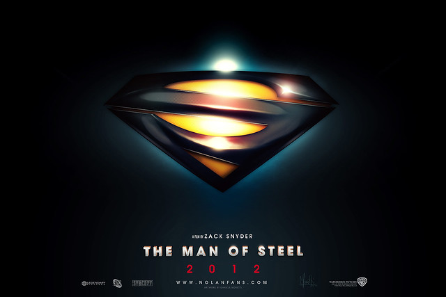
i love this design!!! very elegant, modern and contemp.
SUPERMAN SHIELD 2012 di Medusone, su Flickr
Download HD version, you can find a shape. "Share" enjoy!
send to WB now!!!
ya. i agree the raise/3d doesn't look as cool as the flat/2d.
Lead Cenobite
Exquisitely Empty
- Joined
- Feb 15, 2006
- Messages
- 4,064
- Reaction score
- 16
- Points
- 33
guess i'm the only one who doesn't care for that shield design. still...good job, SuperMed.
You aren't. It's a good design, but I wouldn't want it in a movie or to replace the traditional design. I think if the suit ends up without the trunks, it's more important that other recognizable features of the suit remain.
cwere
172879
- Joined
- Jan 26, 2011
- Messages
- 365
- Reaction score
- 0
- Points
- 36
SUPERMAN SHIELD 2012 di Medusone, su Flickr
Download HD version, you can find a shape. "Share" enjoy!
Looks even better in 2D, great job SuperMed
 t:
t:ArmsHeldOut
I wear my sunglasses at night
- Joined
- Apr 24, 2004
- Messages
- 20,263
- Reaction score
- 6,183
- Points
- 103
Send. To. WB. Now.

Indy Flash
Archeological Speedster
- Joined
- Oct 5, 2010
- Messages
- 4,968
- Reaction score
- 1
- Points
- 31
Loving the new shield.
GoblinWhirlwind
Calibrations
- Joined
- Nov 3, 2007
- Messages
- 9,619
- Reaction score
- 1
- Points
- 31
I am really starting to love this... clearly Superman's shield, but it looks alien. Truly great
Seraph Art Man
Civilian
- Joined
- May 12, 2011
- Messages
- 7
- Reaction score
- 0
- Points
- 1
That is nice S shield SuperMed I used it for a design for a Zod poster/banner that I created with Michael Shannon. Hopefully I can get the link to come up but here is a way to it. I have been on these forums for five years, or more, but I would like to know what you all think!
http://Seraphartman.deviantart.com/...ral-Zod-209114600?q=gallery:seraphartman&qo=0
http://Seraphartman.deviantart.com/art/Man-of-Steel-General-Zod-209114600?q=gallery%3Aseraphartman&qo=0
http://Seraphartman.deviantart.com/...ral-Zod-209114600?q=gallery:seraphartman&qo=0
http://Seraphartman.deviantart.com/art/Man-of-Steel-General-Zod-209114600?q=gallery%3Aseraphartman&qo=0
kal-elrebooted
True Superman Fan
- Joined
- Nov 30, 2008
- Messages
- 290
- Reaction score
- 0
- Points
- 11
Krumm
Beer Snob
- Joined
- Apr 22, 2005
- Messages
- 2,993
- Reaction score
- 0
- Points
- 31
I absolutely LOVE the color scheme BTW.
The Shield
It's really Happening!
- Joined
- Jan 31, 2011
- Messages
- 3,844
- Reaction score
- 53
- Points
- 73
That is nice S shield SuperMed I used it for a design for a Zod poster/banner that I created with Michael Shannon. Hopefully I can get the link to come up but here is a way to it. I have been on these forums for five years, or more, but I would like to know what you all think!
http://Seraphartman.deviantart.com/...ral-Zod-209114600?q=gallery:seraphartman&qo=0
http://Seraphartman.deviantart.com/art/Man-of-Steel-General-Zod-209114600?q=gallery%3Aseraphartman&qo=0
I Think... Its Damn Good!
Random490
Sidekick
- Joined
- Aug 9, 2005
- Messages
- 1,629
- Reaction score
- 151
- Points
- 73
I love this shield, it's completely brilliant, movie quality material in all the best ways. I love how you incorporated the S into the pentagon. Very stylish and alien yet very recognizable. Redesigning at it's best. I only had one problem, that the border breaks open and I just see that being difficult to fit onto a costume and looks a bit odd to me. So I was bored and decided to quickly close it up and see how it looks:

I never thought I could settle for this much change to the classic shield, but I've got to admit, it's quite refreshing to not have that small top-right yellow triangle as part of the design. Also feels nice to have the small slivers opening up the sides and breaking the classic, confined shield. It would bring the blue tights into the shield design. Pretty clever.
My only question is how would you deal with the yellow/blue boundaries for the actual suit? Would it be a gradient? Or simply just have the yellow end and blue start (much like your mock above)?
Really nice work.
I like it, but the first thing that has stood out to me straight away is that the top of the shield, or the top of the S, whatever way you want to look at is, it too thin, the rest of the red part of the shield is far thicker and chunkier, which makes the top of the S just look wrong. It almost looks like the top of the shield has been cut off.
DorkyFresh
Sum Dum Goy
- Joined
- Apr 15, 2004
- Messages
- 19,812
- Reaction score
- 699
- Points
- 73
I like it, but the first thing that has stood out to me straight away is that the top of the shield, or the top of the S, whatever way you want to look at is, it too thin, the rest of the red part of the shield is far thicker and chunkier, which makes the top of the S just look wrong. It almost looks like the top of the shield has been cut off.
this is my main problem with it. it's not "centered" so to speak...but if you move the "S" downward more to the center then it throws off the straight lines that line up with the corners of the diamond. i'm also not a fan of the triangle at the bottom. it might look better if the bottom of the "S" were curved or at least parallel with the straight lines in the middle of the "S".
DaJanksta
Henry Cavill's chest hair
- Joined
- Mar 14, 2007
- Messages
- 2,854
- Reaction score
- 0
- Points
- 31
Indy Flash
Archeological Speedster
- Joined
- Oct 5, 2010
- Messages
- 4,968
- Reaction score
- 1
- Points
- 31
Another great one night owl.
ilovelamp18
A man will fly 6-14-13
- Joined
- May 19, 2007
- Messages
- 268
- Reaction score
- 0
- Points
- 11
Krumm
Beer Snob
- Joined
- Apr 22, 2005
- Messages
- 2,993
- Reaction score
- 0
- Points
- 31
this is my main problem with it. it's not "centered" so to speak...but if you move the "S" downward more to the center then it throws off the straight lines that line up with the corners of the diamond. i'm also not a fan of the triangle at the bottom. it might look better if the bottom of the "S" were curved or at least parallel with the straight lines in the middle of the "S".
That's what I was thinking. The shield looks like it is tilted backwards. In the original manip, I thought it was supposed to be that way -- as if it was a flying through space.
But now that it is out of that context -- it's a little odd. Moving the center of it down would help with that perspective issue but like you said, it would throw off the design.
Interesting design i like it
Night Owl
Civilian
- Joined
- Apr 28, 2010
- Messages
- 363
- Reaction score
- 0
- Points
- 36
Another great one night owl.
thanks indy
Thread Manager
Moderator
- Joined
- Jan 24, 2011
- Messages
- 0
- Reaction score
- 9
- Points
- 1
This thread is now closed it has a continuation thread [split]354199[/split]
- Status
- Not open for further replies.
Similar threads
- Replies
- 3K
- Views
- 674K
- Replies
- 1K
- Views
- 228K
- Replies
- 812
- Views
- 86K
- Replies
- 995
- Views
- 68K
- Replies
- 1K
- Views
- 68K
Users who are viewing this thread
Total: 1 (members: 0, guests: 1)
Staff online
-
Lily Adler🎃 Pumpkin Spice ☕
Members online
Total: 9,584 (members: 12, guests: 9,572)
Latest posts
-
-
🌎 Discussion: The Economy, Fiscal Cliff, National Debt, And Other Financial Issues IV (9 Viewers)
- Latest: blueharvest
-
-
-


