sf2
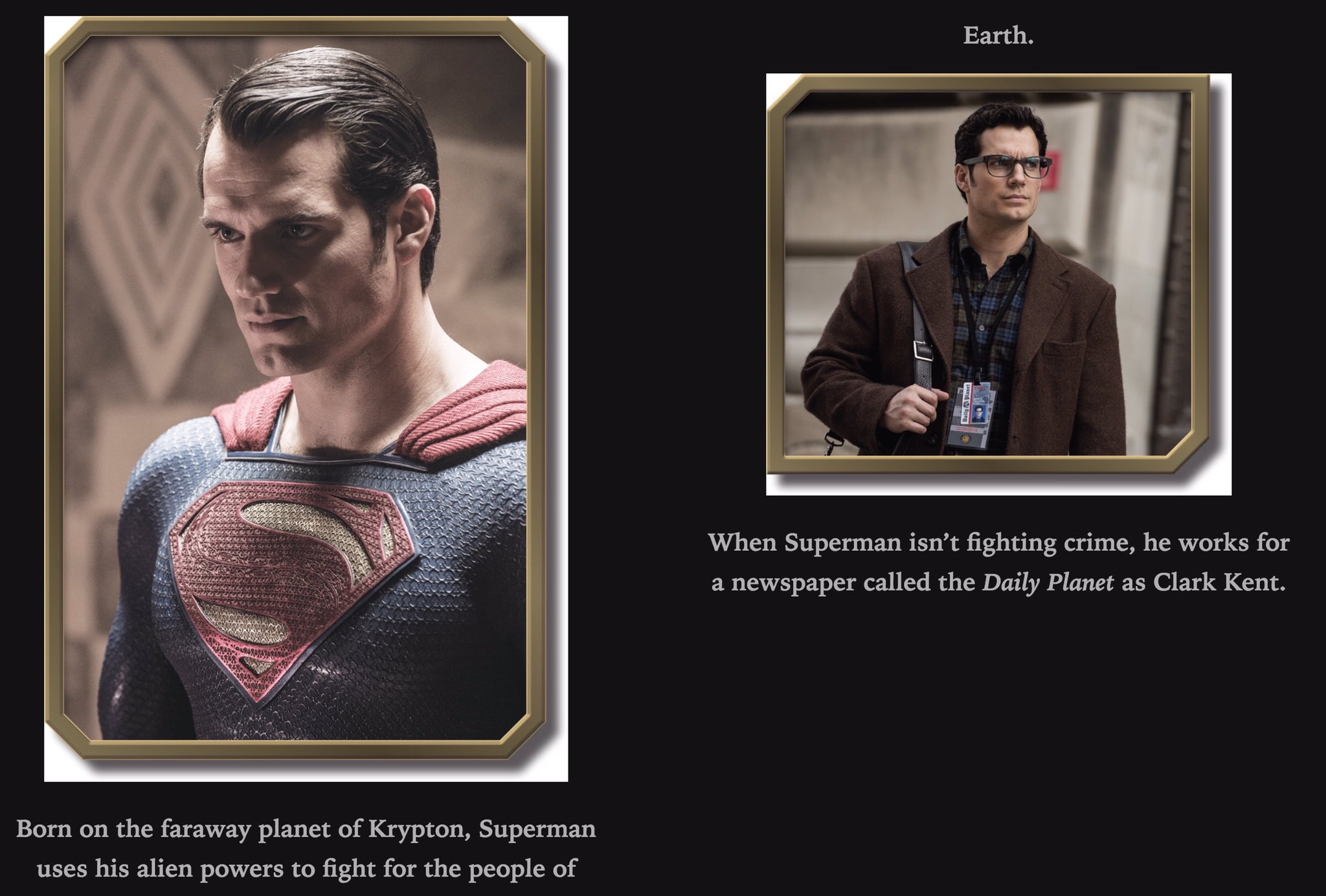
Superhero
- Joined
- May 2, 2005
- Messages
- 6,591
- Reaction score
- 15
- Points
- 58
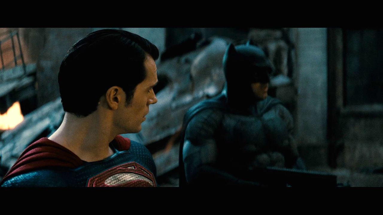
sharp eyes! the\S/ placement definitely looks different between the 2.We've spoken a lot about the S shield having been lowered/smaller in BvS and I have just watching the trailer again and noticed something, the S seems to be in different places??
This shot you can see the pattern on his suit has like 3 rows above the S
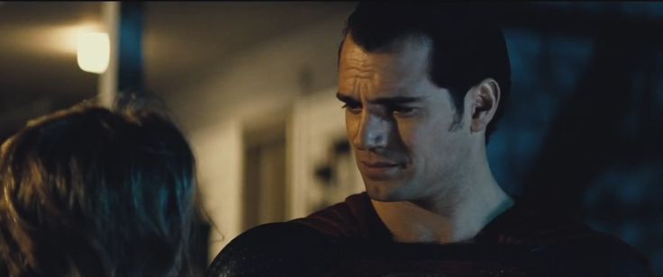
But then in this shot there is really only one

 t:
t: