
Llama_Shepherd
Superhero
- Joined
- Dec 26, 2010
- Messages
- 9,713
- Reaction score
- 0
- Points
- 31
Batman started wearing bullet resistant fabrics in 1940.
I think Mike22's manip (along with many others) perfectly demonstrates that the classic suit can, if done correctly, look awesome and cool in live action.
Check out some of the BTS features on the Superman Returns DVD/Blu-Ray, when they were designing the costume. There are some mock suits designed that absolutely nailed it. Sadly, they ended up going with something more subdued.
Ok I've ripped the scene from the dvd and uploaded to youtube.
I still don't understand why the went with the smaller S as the last suit with the larger S was just about perfect.
Not sure if it will stay up for long as it's a copyrighted dvd but I put a disclaimer in so hopefully it will be ok.

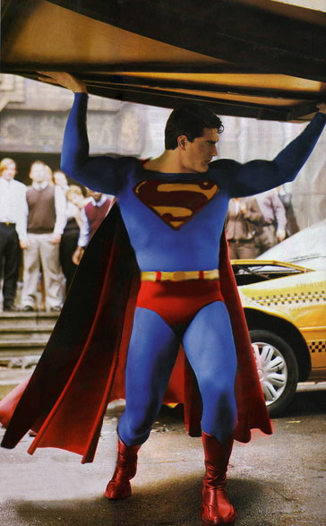
Louise Mingenbach could have done a better job, her design did not favor Routh's body type, he had a long torso which was accentuated by the costume design.
Lowering the neck line and increasing the shield size was needed, a different cape attachment would have resulted in a better color distribution, the briefs should have been a tad higher on the waist.
And the suit colors were wrong too, instead of brown Red, a darker shade of red would have looked good, the suit had "royal blue color" which was not right either, it suppressed the diamond shaped "texture" which would have added some shades to highlight muscle tone.
The Cape made up of heavier material prevented the cape from waving in the wind, and the muscle suit was not good either. *sigh*
Just goes to show that it's the proportion of elements that make a good Superman suit, not just the elements themselves.
Yup.
And, the muscle suit, suit materials, colors, and the design are important elements too.
No. that scene was among the last scenes to be shot if not mistaken. Then, they added another millions-dollar scene later because it wasnt action-packed.For SR, the costume designers made a mistake by taking body molds of Routh when he was not finished putting on muscle, he was still training.
The problem was that Singer should have waited for some time before taking the body mold and making his muscle suit, later on when Routh did train he got bigger and the SR suit kept tearing up. And he was told to stop that for a while.
The scene with Lex Luthor on the new krypton Island was the first scene that was shot i the movie (correct me if I am wrong) and you can see that he looks a bit bigger there than in other scenes in the movie.
The muscle suit was not right, and the rubber like glued on "S" shield was made smaller as a bigger shield hindered Routh's movements especially when he was required to lift his hands up.
The obvious solution was to have a "S" shield printed on the Suit so that it could have been larger.
A suit made of materials like Captain America would be something like -
Here's a rough manip I did -
We all see the problems and know exactly how to fix them. Funny, they just dont / didnt. and thats matter all. Anyway, the SR suit doesnt really look bad on screen.Louise Mingenbach could have done a better job, her design did not favor Routh's body type, he had a long torso which was accentuated by the costume design.
Lowering the neck line and increasing the shield size was needed, a different cape attachment would have resulted in a better color distribution, the briefs should have been a tad higher on the waist.
And the suit colors were wrong too, instead of brown Red, a darker shade of red would have looked good, the suit had "royal blue color" which was not right either, it suppressed the diamond shaped "texture" which would have added some shades to highlight muscle tone.
The Cape made up of heavier material prevented the cape from waving in the wind, and the muscle suit was not good either. *sigh*
We all see the problems and know exactly how to fix them. Funny, they just dont / didnt. and thats matter all. Anyway, the SR suit doesnt really look bad on screen.

Did you boost the saturation overall or just on the suit?
it was more selective color, a color filter, and desaturating the colors a little to look a little more realistic with the lighting dynamic around it

