
You are using an out of date browser. It may not display this or other websites correctly.
You should upgrade or use an alternative browser.
You should upgrade or use an alternative browser.
It's a Bird, It's a Plane, It's the Superman Costume Thread! - Part 2
- Thread starter Thread Manager
- Start date
- Status
- Not open for further replies.
Brian Braddock
R.I.P. '96 Y.N.W.A.
- Joined
- Jun 5, 2005
- Messages
- 15,646
- Reaction score
- 259
- Points
- 73
Nolan syndrom. not everything has to be explained. i was born in a time when things were there because they looked cool.
Nah, it's not Nolan syndrome at all. That's a bit of a sweeping generlisation there.
titansupes
Avenger
- Joined
- Dec 11, 2010
- Messages
- 11,628
- Reaction score
- 1,871
- Points
- 103
If any suit changes take place, I expect them to be a la SM1->SM2->SM3. No explanation, because they'll be subtle enough to not even count as changes in-universe.
As I said...

Exactly. Superman does not upgrade his suit.
I expect if the filmmakers decide to for the potential sequel, they'll be differences as negligible as those between Raimi's Spidey 1 and 2.
Brian Braddock
R.I.P. '96 Y.N.W.A.
- Joined
- Jun 5, 2005
- Messages
- 15,646
- Reaction score
- 259
- Points
- 73
If any suit changes take place, I expect them to be a la SM1->SM2->SM3. No explanation, because they'll be subtle enough to not even count as changes in-universe.
I agree but then that's the key thing here, isnt it - subtle changes. The inclusion of trunks wouldnt be subtle as its a major stylistic and aesthetic change, kind of akin to Superman deciding not to have a cape or that the costume should be short-sleeved.
Gianakin_
SW Prequels Defender
- Joined
- Oct 12, 2006
- Messages
- 21,479
- Reaction score
- 0
- Points
- 31

Gianakin_
SW Prequels Defender
- Joined
- Oct 12, 2006
- Messages
- 21,479
- Reaction score
- 0
- Points
- 31
I agree but then that's the key thing here, isnt it - subtle changes. The inclusion of trunks wouldnt be subtle as its a major stylistic and aesthetic change, kind of akin to Superman deciding not to have a cape or that the costume should be short-sleeved.
Yes, trunks change everything and I don't expect them to appear. If they do... I'll eat crow and utter "wow". Nekkid.
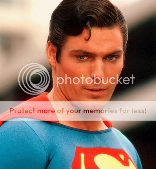
It has probably been discussed before, but why in many pics the "S" shield/symbol has the yellow color behind it and in many others the color is just black(ish)? Does it change during the movie depending of how many sun energy Superman is absorbing or what? 
PS: An why is his hair brushed towards the wrong direction in both SR and MOS?
PS: An why is his hair brushed towards the wrong direction in both SR and MOS?
G.Godfrey
Sidekick
- Joined
- May 21, 2012
- Messages
- 3,539
- Reaction score
- 0
- Points
- 31
PS: An why is his hair brushed towards the wrong direction in both SR and MOS?
It's not the wrong direction.
conan69
Cimmerian
- Joined
- Sep 20, 2005
- Messages
- 2,243
- Reaction score
- 12
- Points
- 58

I officially hate the suit, and prefer the Superman Returns suit, by far.
I dont even mind the suit design "in theory"... but the application sucks. Tone down the texture of the suit. Theres so much of it, its distracting.
The suit is just too drab for Superman, a man whos supposed to personify "Hope". It looks burnt, like he just walked out of a fire.
I prob would mind the suit less is the blues were textured and the reds, like the S and boots were a bit cleaner, matching the cape.
Last edited:
Sam
Im Always Around
- Joined
- Jan 13, 2005
- Messages
- 1,048
- Reaction score
- 0
- Points
- 31
I officially hate the suit, and prefer the Superman Returns suit, by far.
I dont even mind the suit design "in theory"... but the application sucks. Tone down the texture of the suit. Theres so much of it, its distracting.
The suit is just too drab for Superman, a man whos supposed to personify "Hope". It looks burnt, like he just walked out of a fire.
I prob would mind the suit less is the blues were textured and the reds, like the S and boots were a bit cleaner, matching the cape.
And I offically love the suit. It is a great reinterpretation of the costume, but still reminiscent of the classic elements.
Bruce Malone
Superhero
- Joined
- May 23, 2009
- Messages
- 8,216
- Reaction score
- 11
- Points
- 33
Excuse me for sounding like an *******, but Cavill seems to suffer from the same thing Matthew McConaughey. Big head and short chubby arms. Or at least that what it looks like in that pic.
Yeah his arms are pretty stubby compared to his height. He's not short but he certainly doesn't exude that "statuesque" type figure that reeve and even routh had.
I actually think physically he'd make a better wolverine than jackman does. This pics of him shirtless and with the beard totally scream wolverine.
I officially hate the suit, and prefer the Superman Returns suit, by far.
I dont even mind the suit design "in theory"... but the application sucks. Tone down the texture of the suit. Theres so much of it, its distracting.
The suit is just too drab for Superman, a man whos supposed to personify "Hope". It looks burnt, like he just walked out of a fire.
I prob would mind the suit less is the blues were textured and the reds, like the S and boots were a bit cleaner, matching the cape.

I was someone who hated the design when it first got out. Now that i know there is a reason WHY the suit looks like it does, and its not just because someone pulled a Michael bay and wanted to because THEY wanted to, I am okay with it. Its(forgive me everyone) "grounded" and sound.
Tra-El
Avenger
- Joined
- Aug 4, 2010
- Messages
- 11,322
- Reaction score
- 4,261
- Points
- 103
I officially hate the suit, and prefer the Superman Returns suit, by far.

I LOVE the darker blue pallet and the architecture the creative team put together when re-envisioning a new look to Superman's Kryptonian heritage while still holding true to an iconic look in nature of the classic suite. It WORKS.
Returns was a suite that jumped right through the television set of Nickelodeon.
Dr.
From parts unknown
- Joined
- Aug 19, 2010
- Messages
- 6,687
- Reaction score
- 3,685
- Points
- 103
I officially hate the suit, and prefer the Superman Returns suit, by far.
I dont even mind the suit design "in theory"... but the application sucks. Tone down the texture of the suit. Theres so much of it, its distracting.
The suit is just too drab for Superman, a man whos supposed to personify "Hope". It looks burnt, like he just walked out of a fire.
I prob would mind the suit less is the blues were textured and the reds, like the S and boots were a bit cleaner, matching the cape.
I believe you are in a small minority. A SHH poster* (forget who) put it well: this is the first time in live-action that someone actually looks like Superman - rather than an actor wearing a costume, playing Superman.
* Edit: it was actually someone over at eyesskyward.com
Last edited:
I believe you are in a small minority. A SHH poster (forget who) put it well: this is the first time in live-action that someone actually looks like Superman - rather than an actor wearing a costume, playing Superman.
wow...thats pretty accurate!
afan
Sidekick
- Joined
- Jan 4, 2005
- Messages
- 3,642
- Reaction score
- 2
- Points
- 58
Can't really say I hate the suit, in fact it's very well done, but I would certainly say it's attempting to fix that which was not broken.....I wish that the talented makers of this suit and the filmakers adhered to the classic look.
conan69
Cimmerian
- Joined
- Sep 20, 2005
- Messages
- 2,243
- Reaction score
- 12
- Points
- 58
For me, if the symbol and gold parts were smooth it'd be perfect.
I agree that would be a big improvement.
G.Godfrey
Sidekick
- Joined
- May 21, 2012
- Messages
- 3,539
- Reaction score
- 0
- Points
- 31
Well the suit has the correct colors but they sure do love to desaturate it. Below is a comparison, only change made is the color saturation. First pic is lowest saturation, second default and third full (or in this case normal) saturation.

I'm conflicted though. At first I didn't like the drab, colorless look all that much. But as much as I love the fully saturated image, there is a quality about the default pic I really dig. Kind of gives me this old school, vintage vibe and reminds me of a painting almost, so to speak.
But as it is, it's almost impossible to tell how the costume will appear overall. Even in the trailer there are hints of almost bright blue, deep blue and navy blue which looks almost black and in the photos it's not always the same.
But I would be EXTREMELY happy with these colors:

That to me looks like PERFECTION. Fingers crossed it looks like that or that I will be able to make it like that once it's out on dvd/blu-ray. t:
t:
I'm conflicted though. At first I didn't like the drab, colorless look all that much. But as much as I love the fully saturated image, there is a quality about the default pic I really dig. Kind of gives me this old school, vintage vibe and reminds me of a painting almost, so to speak.
But as it is, it's almost impossible to tell how the costume will appear overall. Even in the trailer there are hints of almost bright blue, deep blue and navy blue which looks almost black and in the photos it's not always the same.
But I would be EXTREMELY happy with these colors:
That to me looks like PERFECTION. Fingers crossed it looks like that or that I will be able to make it like that once it's out on dvd/blu-ray.
t:
Last edited:
StarvingArtist
Sidekick
- Joined
- Sep 7, 2004
- Messages
- 2,613
- Reaction score
- 0
- Points
- 31
Can someone answer me why it's a good idea for Superman to be edgy? Isn't that what all the articles are saying? That this Superman is an edgy, lonely, Bill Bixby wanderer type? I'm really curious what opinions are out there. Maybe there's some essay out there on what it says about American society nowadays requiring their icons to have a dash of dark brooding angst. I guess it's just cool to be an angry self centered *****e these days.
Last edited:
conan69
Cimmerian
- Joined
- Sep 20, 2005
- Messages
- 2,243
- Reaction score
- 12
- Points
- 58
I LOVE the darker blue pallet and the architecture the creative team put together when re-envisioning a new look to Superman's Kryptonian heritage while still holding true to an iconic look in nature of the classic suite. It WORKS.
Returns was a suite that jumped right through the television set of Nickelodeon.
I wasnt clear. What I mean was the simplicity of the SR suit, with its sublter textures. The suit and the S on the SR are textured, but not to the extent of this....
http://www.impawards.com/2013/posters/man_of_steel_xlg.jpg
Which to me is overkill. Its SO distracting. It resembles chainmail/ armor which Superman should never wear. Someone said that the nontextured red cape actually looks odd with the texture of the rest of the suit and I agree. I would have preferred is the reds were cleaner, if they were determined to make the blue so highly textured.
I do have to say I dislike the upped saturation pic above less than the desaturated one.
I dont know.... the extreme of the texture is a real bother to me.
Last edited:
I'm not completely sure about which is the correct direction, but I've always seen it towards the opposite direction (in spoilers because of the size of the images):It's not the wrong direction.


I've seen some of Shuster's drawings with the hair brushed towards the other direction, but almost every Superman has always had his hair towards one direction while the characterizations in SR and MOS (and I also remember one of the actors in the Superboy's tv show) have their hair brushed towards the opposite direction, don't know why.
Is there any canon for Superman's hair? I'm curious.
HankTheTurtle
Civilian
- Joined
- May 4, 2005
- Messages
- 364
- Reaction score
- 0
- Points
- 11
Some actors' hair just parts better on one side than on the other.
- Status
- Not open for further replies.
Similar threads
- Replies
- 321
- Views
- 20K
- Locked
- Replies
- 1K
- Views
- 66K
- Replies
- 1K
- Views
- 168K
- Replies
- 1K
- Views
- 75K
Users who are viewing this thread
Total: 2 (members: 0, guests: 2)