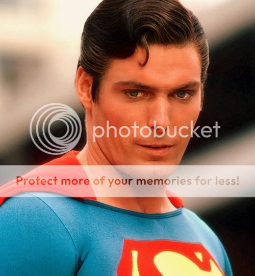
It's a Bird, It's a Plane, It's the Superman Costume Thread! - Part 2

Status
Not open for further replies.
Can't really say I hate the suit, in fact it's very well done, but I would certainly say it's attempting to fix that which was not broken.....I wish that the talented makers of this suit and the filmakers adhered to the classic look.
Totally agree with this. We're on the exact same page.
 
I'm not completely sure about which is the correct direction, but I've always seen it towards the opposite direction (in spoilers because of the size of the images):
supazond.jpg


Christopher-Reeve-Superman-hairstyle.jpg
superman02.jpg
Superman1.jpg
superman-artwork-43.jpg
manofsteel1of6p33.jpg
alg-superman-jpg.jpg
Superman.jpg
jerry-siegel-and-joseph-shuster-superman.jpg
Superman.jpg

I've seen some of Shuster's drawings with the hair brushed towards the other direction, but almost every Superman has always had his hair towards one direction while the characterizations in SR and MOS (and I also remember one of the actors in the Superboy's tv show) have their hair brushed towards the opposite direction, don't know why.

Is there any canon for Superman's hair? I'm curious.

Although I believe you are right and Superman's hair is more often that not parted on the left, Curt Swan who is one of the legendary Superman artists drew Superman with his hair parted on the right. The truth is that MOS Superman probably parts his hair on the right because that is how Cavill's hair naturally parts. Most men can't change the side of their hair part without it looking really stupid. I know I can't
 
I believe you are in a small minority. A SHH poster* (forget who) put it well: this is the first time in live-action that someone actually looks like Superman - rather than an actor wearing a costume, playing Superman.

Where is the Lex Luthor "Wrong" pic when you need it?
 
Well the suit has the correct colors but they sure do love to desaturate it. Below is a comparison, only change made is the color saturation. First pic is lowest saturation, second default and third full (or in this case normal) saturation.

mossat.jpg


I'm conflicted though. At first I didn't like the drab, colorless look all that much. But as much as I love the fully saturated image, there is a quality about the default pic I really dig. Kind of gives me this old school, vintage vibe and reminds me of a painting almost, so to speak.

But as it is, it's almost impossible to tell how the costume will appear overall. Even in the trailer there are hints of almost bright blue, deep blue and navy blue which looks almost black and in the photos it's not always the same.

But I would be EXTREMELY happy with these colors:

mos8.jpg


That to me looks like PERFECTION. Fingers crossed it looks like that or that I will be able to make it like that once it's out on dvd/blu-ray. :woot:

Completely agree :)
 
Can't really say I hate the suit, in fact it's very well done, but I would certainly say it's attempting to fix that which was not broken.....I wish that the talented makers of this suit and the filmakers adhered to the classic look.

Totally agree with this. We're on the exact same page.

I feel the same way as you and afan buddy.

Agreed. I like the MOS suit and I understand that, due to them making the suit of alien origin and a bodysuit that all Kryptonians wear, that it would be weird for him to have the underwear.

Even still though, there is nothing stopping them from using the classic suit in a sequel or even at the very end of this film now that he's taken his place on earth as Superman.

Obviously within this continuity, the suit would be inspired by his Kryptonian heritage but they can say he modified it to give himself a less alien/more earthly look.
 
Last edited:
...there is nothing stopping them from using the classic suit in a sequel or even at the very end of this film now that he's taken his place on earth as Superman.

Obviously within this continuity, the suit would be inspired by his Kryptonian heritage but they can say he modified it to give himself a less alien/more earthly look.

But the (narrative) challenge there would be explaining how/why the addition of trunks (particularly) makes Supes substantially more Earthly/friendly/approachable/etc. Sounds like a can of worms to me.
 
I am troubled by the fact that the yellow shade in the "S" shield is different than the golden shaded yellow on the belt and buckle.

Why the yellow shade of the "S" shield is not same as that of the belt ?
 
Agreed. I like the MOS suit and I understand that, due to them making the suit of alien origin and a bodysuit that all Kryptonians wear, that it would be weird for him to have the underwear.

Even still though, there is nothing stopping them from using the classic suit in a sequel or even at the very end of this film now that he's taken his place on earth as Superman.

Obviously within this continuity, the suit would be inspired by his Kryptonian heritage but they can say he modified it to give himself a less alien/more earthly look.
And yet, in pre-New 52 canon, the trunks (or over pants, as I think they were called) were actually very much a part of Kryptionian fashion. There's that moment in Secret Origins where you see Kryptionians, and they're all wearing different outfits (Golden Age, Silver Age, Byrne). It would have been very easy to say that the classic suit was just the style of Krypton.
 
I7nSYcU.jpg


Its kind of growing on me, I guess... but I have to say, I dislike the pics with the upped saturation much less.
 
^^^
It`s very well done, but I just don't like how that looks.
 
I still haven't seen a manip that I like better than the actual suit. It's all nice work though.
 
Status
Not open for further replies.

Users who are viewing this thread

Staff online

Latest posts

Forum statistics

Threads
202,288
Messages
22,080,475
Members
45,880
Latest member
Heartbeat
Back
Top
monitoring_string = "afb8e5d7348ab9e99f73cba908f10802"