• Xenforo Cloud has upgraded us to version 2.3.6. Please report any issues you experience.

Homecoming Marvel's Spider-Man Costume!? - Part 8

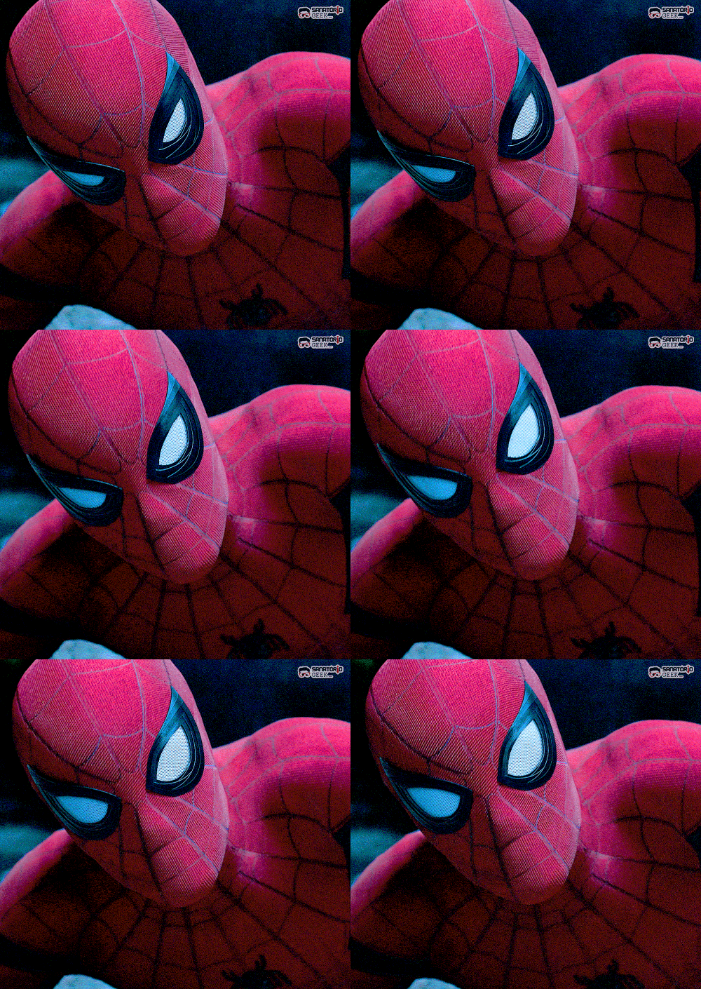
I'm trying to get over the fact that the belt is so high, but I can't quite do it because the suit looks ridiculous this way. It's like they tried to project anime human proportions on a regular human, it doesn't work.

It's a shame too, because this movie looks like it could be my favorite Spiderman film, and if the suit will constantly look off-putting, I might have some real difficulty enjoying watching the film

Now that you mention it, I think that's my problem with the overall physique/look of him. If the belt was lower and the mid red section was a little tighter I think he'd look better, for me anyways.
 
I think the MCU suit, when revealed, was definitely out of left field, design-wise. But the black bands and overall design have grown on me. It looks great in motion, and makes sense fitting into the already established universe. It was made by Stark, most likely based on Peter'a DIY suit. And with technology these days, its enhanced with a sheen quality via post. And c'mon, the lenses and the tick spider? The bright red and blue? Thanks Marvel.
 
I'm not loving Tom's overall physique/frame. Garfield really had the best frame for Spidey.
spiderman_full1_by_emreunayli-d6llcyl.jpg

I know I'm in the fringe on this one but...I thought the ASM 1 suit looked incredible. Sure the set photos didn't do a kind service to it but, on screen, man that thing popped. It looked so beautiful in some shots. While more faithful, I honestly didn't like the ASM2 suit. It looked very Raimi esque and it just felt "off" to me.

My perfect suit would have been the texturing from ASM1 combined with the elements of the suit from ASM2. That would have been a beautiful thing. I wish I could find the cosplayed who merged the two just like that. His suit looks incredibly bad ass. I get the "basketball" texturing complaint but honestly, if Spider-Man were real, I feel that's what his suit would look like.
 
Yeah, while not my favorite, the ASM1 suit looked specially good in night-time shots. They did a really good job with the lightning.
Still, I never really thought of Spider-Man as a "night" superhero, and that film had almost all scenes shot at night, which is weird.
 
I think what bothers me about the animated eyes is that the whole lens contracts, like a camera shutter motion. it looks too artificial for my tastes. Imagine if our eyes literally shrank in size when we squinted. That's the issue. The two corners of the lenses should remain fixed, while the top and bottom of the lenses expand and contract. That way they behave more like natural eyes, with the black rims acting like eyelids.
 
Last edited:
I think the way they pulled it off is the one way they could without it being like two big blinking eyes.
 
My perfect suit would have been the texturing from ASM1 combined with the elements of the suit from ASM2. That would have been a beautiful thing. I wish I could find the cosplayed who merged the two just like that. His suit looks incredibly bad ass. I get the "basketball" texturing complaint but honestly, if Spider-Man were real, I feel that's what his suit would look like.

They considered what you wanted:

7OXNKLA.jpg

vAKTwnQ.jpg
 
Ditch the lines on his legs and rear, and that's not bad.
 
People are always going to nitpick the suit. "Well, if the lines were closer to here, and that was lower, and these were bigger, and the color was 25% darker..."
 
They still would've had the eyes you hated.
Yeah, the lenses would have looked terrible either way. But at least it wouldn't have been a blatant ripoff of Raimi's suit. (which it was, MCU suit is proof). I don't understand why Webb couldn't just evolve the first costume, there was so much potential. I wanted the Romita lenses for TASM2 suit but I'm glad they didn't do 'em since MCU Spidey adopted them.
 
I think what bothers me about the animated eyes is that the whole lens contracts, like a camera shutter motion. it looks too artificial for my tastes. Imagine if our eyes literally shrank in size when we squinted. That's the issue. The two corners of the lenses should remain fixed, while the top and bottom of the lenses expand and contract. That way they behave more like natural eyes, with the black rims acting like eyelids.

They don't look like natural eyes so why should they behave like they are?
 
It's funny how different Spider-Man looks in this movie compared to Civil War.

spider-man-in-civil-war-174255.jpg


source.gif


The Homecoming costume has a texture to it.
 
Last edited:
It's the difference between having an actual suit as opposed to digitally creating one on top of an existing suit.
 
Yeah, the lenses would have looked terrible either way.

:shrug: I love 'em.

But at least it wouldn't have been a blatant ripoff of Raimi's suit. (which it was, MCU suit is proof)

Wasn't a blatant ripoff at all. It had some similarities, sure, but that's it. (Talking to a brick wall here because of your extreme, hilarious hate for it)

The MCU suit is a great design bogged down by unnecessary additions because they abandoned the raised webbing. Then again, the MCU has done that for a lot of their suits so meh.
 
It's the difference between having an actual suit as opposed to digitally creating one on top of an existing suit.
I do think that the suit looks good when watching Civil War in 2D. But it's nice having a real live suit as opposed to one that is 100% animated.
 
The Civil War suit has texture too:
captain-america-civil-war-spider-man-ant-giant.jpg

civil-war-spiderman-04-materials.jpg


It's actually the same texture as the Homecoming suit. HC just looks 5x better due to it being practical.
 
The Civil War suit comes off as a bit more "plastic" I guess?
 
When the first decent set photos of the SMH suit went online, I can tell right away that they tried their best to emulate the CW suit's textures with practical materials. Again, they have the help of CG to enhance it.
 
When the first decent set photos of the SMH suit went online, I can tell right away that they tried their best to emulate the CW suit's textures with practical materials. Again, they have the help of CG to enhance it.
The mask/costume looks infinitely better in the trailer than it does in set photos. I remember some freak outs from my friends over that, but I figured they would give it a CGI/digital touch-up.
 
The mask/costume looks infinitely better in the trailer than it does in set photos. I remember some freak outs from my friends over that, but I figured they would give it a CGI/digital touch-up.
It was a given. I think it looks great from the trailer. No wonder they finished shooting a bit far from release date. Post is gonna have a lot of work to do.
 
In late, but that TASM2 concept art is fantastic. I loved the TASM1 suit.

TASM2 was good too, but it felt like a giant leap from the previous film.
 

Staff online

Latest posts

Forum statistics

Threads
201,568
Messages
21,992,192
Members
45,788
Latest member
drperret
Back
Top
monitoring_string = "afb8e5d7348ab9e99f73cba908f10802"