
don't get me wrong, i really, really like it. my only piece of [hopefully constructive] criticism would be that the faun is a bit small and i feel he should dominate the picture... if you kind of brought the viewer's eye level lower so that the various elements were more in front of each other... maybe that could strengthen the composition. i dunno why but i feel the faun should be more prominent. HOWEVER! [1] it's really strong as it is and i really like it! and [2] i think it's a great success in terms of your self-proclaimed mission to inject more depth into your pictures! keep up the good work!!
You are using an out of date browser. It may not display this or other websites correctly.
You should upgrade or use an alternative browser.
You should upgrade or use an alternative browser.
Mattchew's fanart thread 3.0... *****ing out, hardcore style.
- Thread starter Mattchew
- Start date
Mattchew
Sidekick
- Joined
- Nov 3, 2005
- Messages
- 4,990
- Reaction score
- 0
- Points
- 31
I like it. I don't know if it's just my screen but it looks a little dark. You might want to punch up the highlights a bit more on the pan, and on the fairies. Good to see more than just a standing pose, some movement and more depth in your work. Looking forward to seeing more of this kind of work.
Again could just be my old monitor at work.
Its just too dark... not your monitor. Once I laid it in and altered the color to fit it in, he really fades into the setting. Not gonna do any tweaking though... it is what it is... onward and upward. Thanks for all the insightful commets though. Very helpful for future efforts!
")
don't get me wrong, i really, really like it. my only piece of [hopefully constructive] criticism would be that the faun is a bit small and i feel he should dominate the picture... if you kind of brought the viewer's eye level lower so that the various elements were more in front of each other... maybe that could strengthen the composition. i dunno why but i feel the faun should be more prominent. HOWEVER! [1] it's really strong as it is and i really like it! and [2] i think it's a great success in terms of your self-proclaimed mission to inject more depth into your pictures! keep up the good work!!
Yeah... I know its weak composition-wise. I had it laid out differently, but then the tree was totally blocked so I had to down-size the faun and at that point I knew it was off, but I went ahead anyway. Thanks for the input... the critique was both constructive AND spot on.
I kind of agree with PHIG
The tree being centered draws my attention rather than the faun.
With that said WOW
ditto. hopefully, better next time.
-------------------------------------------------------------------------------
to cleanse the pallet from that less-than-successful "Pan's Labyrinth" pic, here's a random TDK-style Harley sketch I did while I should have been taking notes in class today...

No intention to push forward with it. Just a time killer. Now on to this month's fanart contest...
KAD
Sidekick
- Joined
- Oct 20, 2004
- Messages
- 4,390
- Reaction score
- 0
- Points
- 31
No intention to push forward with it. Just a time killer. Now on to this month's fanart contest...
IT MUST BE GREEN, SUPER GREEN.
And it is....
Mattchew
Sidekick
- Joined
- Nov 3, 2005
- Messages
- 4,990
- Reaction score
- 0
- Points
- 31
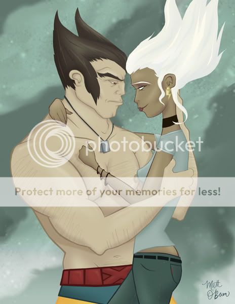
Here's my Valentine-themed fanart contest submission...
The theme had SO many possibilities and I just kinda got stuck with this couple in mind and couldn't really shake the idea. Wish it could have been a funnier pairing, but what are you gonna do, right?
Anyway...
The theme had SO many possibilities and I just kinda got stuck with this couple in mind and couldn't really shake the idea. Wish it could have been a funnier pairing, but what are you gonna do, right?
Anyway...
Hope you like it! Let me know what you think, AND vote for me in the contest @ the end of the month, assuming you like it, of course.
0neDisturbedSOB
Guest
- Joined
- Jul 19, 2003
- Messages
- 7,743
- Reaction score
- 0
- Points
- 31
No intention to push forward with it. Just a time killer. Now on to this month's fanart contest...
Very Burton-esque I'd say. Nice work.
Mattchew
Sidekick
- Joined
- Nov 3, 2005
- Messages
- 4,990
- Reaction score
- 0
- Points
- 31
Thanks for the comment on the Harley sketch guys!...
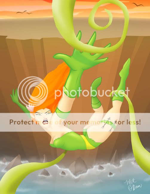
Here's a final on my falling Ivy picture...
I was trying to get more depth, once again, and this time trying for a more dynamic pose...
EDIT...EDIT...EDIT...EDIT...EDIT...EDIT...EDIT
EDIT...EDIT...EDIT...EDIT...EDIT...EDIT...EDIT
EDIT...EDIT...EDIT...EDIT...EDIT...EDIT...EDIT
Picture removed, for updates.
Let me know what you think!
[/CENTER]
Odin's Fury
Civilian
- Joined
- Feb 6, 2006
- Messages
- 751
- Reaction score
- 0
- Points
- 11
Diggin it man. One thing I would think is that you need some more depth in the background. Greying out the bottom of the gorge would definitely make it seem deep. Know what I'm saying yo?
But I really like your style. Your faun is sweet!
But I really like your style. Your faun is sweet!
Le Diable Blanc
Superhero
- Joined
- Aug 21, 2006
- Messages
- 6,402
- Reaction score
- 0
- Points
- 31
Ooh love it! And love the Logan/Storm one too.
One little detail that bothers me about the Ivy one (and maybe that's just me) is the ice at the bottom (the blue part). I think I would either move it down a bit or get rid of it all together. To me it looks like she's falling very close to the edge or like there's blue sky at the bottom of the gorge. But again, maybe that's just me and my messed up perception.
One little detail that bothers me about the Ivy one (and maybe that's just me) is the ice at the bottom (the blue part). I think I would either move it down a bit or get rid of it all together. To me it looks like she's falling very close to the edge or like there's blue sky at the bottom of the gorge. But again, maybe that's just me and my messed up perception.
hey matt
ivy rocks... as i discovered myself recently, she's a lotta fun to draw! great posing, great fore-shortening. beautiful colour palette. i know what diableblanc means about it looking like blue sky at the bottom of the gorge... i guess it's supposed to be sea, right? i think you need some kind of texture on it, a pattern of foam on the surface or something, other than that, beautiful work. oh, for some reason, her right foot stands out... is it outlined differently?
ivy rocks... as i discovered myself recently, she's a lotta fun to draw! great posing, great fore-shortening. beautiful colour palette. i know what diableblanc means about it looking like blue sky at the bottom of the gorge... i guess it's supposed to be sea, right? i think you need some kind of texture on it, a pattern of foam on the surface or something, other than that, beautiful work. oh, for some reason, her right foot stands out... is it outlined differently?
Mattchew
Sidekick
- Joined
- Nov 3, 2005
- Messages
- 4,990
- Reaction score
- 0
- Points
- 31
To me it looks like she's falling very close to the edge or like there's blue sky at the bottom of the gorge. But again, maybe that's just me and my messed up perception.
i know what diableblanc means about it looking like blue sky at the bottom of the gorge...
AHHHHH! Never thought about it that way, but now that you said that its all I can see. Making changes.
Mattchew
Sidekick
- Joined
- Nov 3, 2005
- Messages
- 4,990
- Reaction score
- 0
- Points
- 31
UPDATE!
Final!
This is the currently-referred-to-as final version of my Ivy Falling picture I've been working on.
I was trying to get more depth, once again, and this time trying for a more dynamic pose...
There was some issue of the water @ the bottom looking like the sky. I added some rocks in the water, spray, haze, and light reflections of the rocks to make it look as much like water as I can pull off.
Also threw some birds in the sunrise sky at the top to make it sell more as the sky.
Hope it helps.
Let me know what you think of the updates, and about the picture in general!
PS: her a$$ is a subtle/not-so-subtle shout-out to blksuperman2's stuff because it always amazes me how he can make a billion different brilliant compositions where women's a$$es face the viewer. Hope I did you proud, blksuperman2!
PS: her a$$ is a subtle/not-so-subtle shout-out to blksuperman2's stuff because it always amazes me how he can make a billion different brilliant compositions where women's a$$es face the viewer. Hope I did you proud, blksuperman2!
Mattchew
Sidekick
- Joined
- Nov 3, 2005
- Messages
- 4,990
- Reaction score
- 0
- Points
- 31
Diggin it man. One thing I would think is that you need some more depth in the background. Greying out the bottom of the gorge would definitely make it seem deep. Know what I'm saying yo?
But I really like your style. Your faun is sweet!
Thanks... The faun pic was a blast to do... Made LOTS of changes to the bottom of the gorge, so thanks for the helpful comments!
Ooh love it! And love the Logan/Storm one too.
One little detail that bothers me about the Ivy one (and maybe that's just me) is the ice at the bottom (the blue part). I think I would either move it down a bit or get rid of it all together. To me it looks like she's falling very close to the edge or like there's blue sky at the bottom of the gorge. But again, maybe that's just me and my messed up perception.
Thanks for the complement on the Logan/Storm pic! As for the Ivy comments, made LOTS of changes... I'd like to hear you comments on the update!
Great stuff! I like the aquaman and your life drawing's the best.
Thanks... That Aquaman is REALLLLY cartoony. Glad you liked it! As for the life drawings, thanks so much for the kind words... I've kinda been teaching myself and trying different things so I really appreciate the support!
hey matt
ivy rocks... as i discovered myself recently, she's a lotta fun to draw! great posing, great fore-shortening. beautiful colour palette. i know what diableblanc means about it looking like blue sky at the bottom of the gorge... i guess it's supposed to be sea, right? i think you need some kind of texture on it, a pattern of foam on the surface or something, other than that, beautiful work. oh, for some reason, her right foot stands out... is it outlined differently?
Made LOADS of updates to the bottom of the picture... I'd love to hear your thoughts on the updates.
unreal
Excellent work
Particularly like the sense of drama
Animate already
Thanks KAD... Your pics were actually the inspiration for this, cause you use perspective all the time.
blksuperman2
Deadly Akuma
- Joined
- Jan 31, 2006
- Messages
- 6,431
- Reaction score
- 12
- Points
- 58
UPDATE!
Final!
This is the currently-referred-to-as final version of my Ivy Falling picture I've been working on.
I was trying to get more depth, once again, and this time trying for a more dynamic pose...
There was some issue of the water @ the bottom looking like the sky. I added some rocks in the water, spray, haze, and light reflections of the rocks to make it look as much like water as I can pull off.
Also threw some birds in the sunrise sky at the top to make it sell more as the sky.
Hope it helps.
Let me know what you think of the updates, and about the picture in general!
PS: her a$$ is a subtle/not-so-subtle shout-out to blksuperman2's stuff because it always amazes me how he can make a billion different brilliant compositions where women's a$$es face the viewer. Hope I did you proud, blksuperman2!
Hahahahaha. Yes sir you have done me proud.
 Two thumbs up for you sir.
matt matt matt matt matt
fantastic update... i'd say it looks a million times better
only thing i'm not 100% sold on is the reflections of the rocks: on the surface of waves breaking against rocks you don't see them. you only really get reflections on still areas of water. BUT!! i don't think you need to change it: it's a brilliant piece, the rocks in particular are a brilliant addition. and you work so damn fast!! i'm very envious...
Syncos
ROFLICIOUS
- Joined
- Apr 5, 2006
- Messages
- 3,855
- Reaction score
- 1
- Points
- 58
UPDATE!
Final!
This is the currently-referred-to-as final version of my Ivy Falling picture I've been working on.
I was trying to get more depth, once again, and this time trying for a more dynamic pose...
There was some issue of the water @ the bottom looking like the sky. I added some rocks in the water, spray, haze, and light reflections of the rocks to make it look as much like water as I can pull off.
Also threw some birds in the sunrise sky at the top to make it sell more as the sky.
Hope it helps.
Let me know what you think of the updates, and about the picture in general!
PS: her a$$ is a subtle/not-so-subtle shout-out to blksuperman2's stuff because it always amazes me how he can make a billion different brilliant compositions where women's a$$es face the viewer. Hope I did you proud, blksuperman2!
That looks fantastic Mchewy. I'm really digging the foreshortening, and your use of thick and thins. you've really been amping up your game. i'm impressed.

oliver_jones_37
power...less
- Joined
- Aug 3, 2003
- Messages
- 219
- Reaction score
- 0
- Points
- 11
That Ivy is simply brilliant, great work!
Le Diable Blanc
Superhero
- Joined
- Aug 21, 2006
- Messages
- 6,402
- Reaction score
- 0
- Points
- 31
Thanks for the complement on the Logan/Storm pic! As for the Ivy comments, made LOTS of changes... I'd like to hear you comments on the update!
OMG duh! I'm such a *****e! To me it looked like the other side of the gorge but now I finally get it. It's great you know how to listen to your dumb-ass fans though
Awesome job!keith_v
Sidekick
- Joined
- May 13, 2006
- Messages
- 1,441
- Reaction score
- 35
- Points
- 58
UPDATE!
Final!
This is the currently-referred-to-as final version of my Ivy Falling picture I've been working on.
I was trying to get more depth, once again, and this time trying for a more dynamic pose...
There was some issue of the water @ the bottom looking like the sky. I added some rocks in the water, spray, haze, and light reflections of the rocks to make it look as much like water as I can pull off.
Also threw some birds in the sunrise sky at the top to make it sell more as the sky.
Hope it helps.
Let me know what you think of the updates, and about the picture in general!
PS: her a$$ is a subtle/not-so-subtle shout-out to blksuperman2's stuff because it always amazes me how he can make a billion different brilliant compositions where women's a$$es face the viewer. Hope I did you proud, blksuperman2!
Looks great! The spray at the base of the cliff really makes it. The only other thing I could think that may improve the image would be a subtle motion blur, either to Ivy or the background. That could really give the illusion of falling and speed.
Looks great! The spray at the base of the cliff really makes it. The only other thing I could think that may improve the image would be a subtle motion blur, either to Ivy or the background. That could really give the illusion of falling and speed.
keith, you're an amazing artist and i have nothing but respect for your creative talents, BUT... motion blur? NO!!!! it always looks crap!! in my very humble [koff] opinion...
Mattchew
Sidekick
- Joined
- Nov 3, 2005
- Messages
- 4,990
- Reaction score
- 0
- Points
- 31
Hahahahaha. Yes sir you have done me proud.
Nice!
matt matt matt matt matt
fantastic update... i'd say it looks a million times better
only thing i'm not 100% sold on is the reflections of the rocks: on the surface of waves breaking against rocks you don't see them. you only really get reflections on still areas of water. BUT!! i don't think you need to change it: it's a brilliant piece, the rocks in particular are a brilliant addition. and you work so damn fast!! i'm very envious...
Thanks!
That looks fantastic Mchewy. I'm really digging the foreshortening, and your use of thick and thins. you've really been amping up your game. i'm impressed.
Thanks, as always!!
That Ivy is simply brilliant, great work!
Thanks.
Love the Logan Storm one, amazing colours very subtlet:
Thank you!
OMG duh! I'm such a *****e! To me it looked like the other side of the gorge but now I finally get it. It's great you know how to listen to your dumb-ass fans though
Not at all... I dig critiques. Thanks!
Looks great! The spray at the base of the cliff really makes it. The only other thing I could think that may improve the image would be a subtle motion blur, either to Ivy or the background. That could really give the illusion of falling and speed.
keith, you're an amazing artist and i have nothing but respect for your creative talents, BUT... motion blur? NO!!!! it always looks crap!! in my very humble [koff] opinion...
Well, my inability to archive a motion blur makes it a moot point.
Mattchew
Sidekick
- Joined
- Nov 3, 2005
- Messages
- 4,990
- Reaction score
- 0
- Points
- 31
FINALLY a final on my Sentinel/Rogue/Magneto picture.
The idea I hope is clear, but in explanation Rogue is using Magneto's power to force the Sentinel to trap him in its hand, AND at the same time tear its head off...

The idea I hope is clear, but in explanation Rogue is using Magneto's power to force the Sentinel to trap him in its hand, AND at the same time tear its head off...
Hope you all like it. I'd love to hear comments and critiques.
Similar threads
- Replies
- 231
- Views
- 20K
- Replies
- 676
- Views
- 87K
Users who are viewing this thread
Total: 1 (members: 0, guests: 1)
Staff online
-
 OnTheAirWakandan Ambassador
 -
 SwordOfMorningSuper Moderator
 -
 DKDetectiveElementary, Dear Robin (he/him)
Latest posts
-

-

-
-
 In the Kitchen with DKDetective and InCali: All Things Food, Wine, and Spirits, Etc. (5 Viewers)
- Latest: InCali
-
