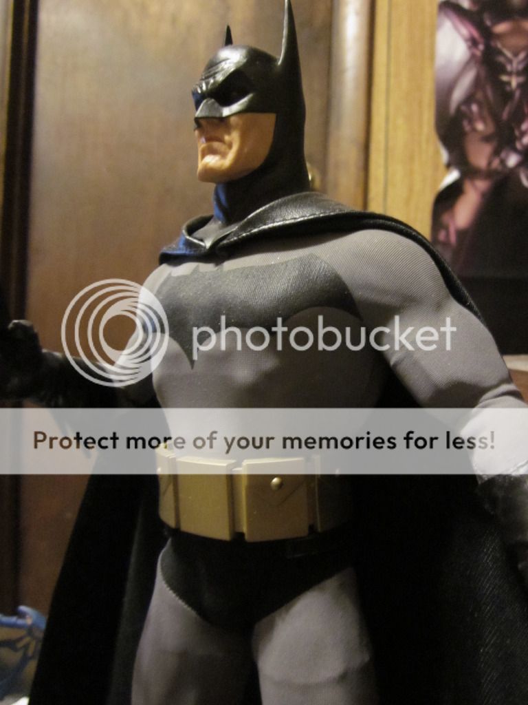
The Batsuit Thread

Status
Not open for further replies.
...that was one of my big hangups with with the TDK and TDKR suits. The symbol on those suits seemed like more of an afterthought and like it was forced. I thought the Begins suit was pretty good aside from the huge neck.

I love Begins Batsuit. :up:

Bale_as_Batman_zpsa6970324.jpg
 
The Begins suit is probably my favorite suit after the Keaton suits. :up:

On the whole, it is great. I loved the black velvet cape! There were just a couple of times when Bale looked very awkward in the suit though.
 
After looking at more shots of the Arkham Origins costume, I'm in favor for it now.

It could definitely work on screen. He's armored, but enough so he can also move around quick. That was my gripe about TDK/TDKR's costume. He moved too slow.

In the Arkham games and comics, he moves with incredible speed.
 
I love the yellow oval. It's as iconic as Superman's S symbol. I never liked the symbol on the The Dark Knight and the TDKR suits because you can hardly see it.

Even to this day, it's hard not to think of the yellow oval symbol as THE Batman symbol. It was around for a long time, after all. 36 years before the black bat returned to prominence as the standard logo. Now, any time it returns, some other artist comes along and does away with it like it's some affront to the mythos.

The Begins suit is alright but it's very awkward looking to me in promotional photos and stills. I HATE cape clasps and I hate the shape of the cowl. Like in the above picture, the cape doesn't look like it belongs. It doesn't flow with or match the rest of the suit.
 
Last edited:
I don't get it. The AA suit is just an uglier version of the vanilla grey and black ensemble.
 
I love AA suit and I wished Nolan took some inspiration from Rocksteady.

batmanarkhamasylume3200_zpsbcc54a28.jpg

Make grey areas black, you have a movie Batsuit.
 
Yup,I love it too But it's my third favorite Bat suit on film after Returns&'89
 
If an armored Batsuit is used again, how about DC/WB useing the "Injustice" Batsuit design?
 
i like lightly armored suits, but that suit is no good
 
My only issue with TDK & TDKR suit was how segmented and detailed the suit looked...in a sense, it was very "busy" to look at.
 
If an armored Batsuit is used again, how about DC/WB useing the "Injustice" Batsuit design?

No thanx,The chest plate piece is too large and the metal on the cowl is ugly&stupid..IMO


The alternate suit is better


I still prefer the new Arkham Origins suit
 
Even to this day, it's hard not to think of the yellow oval symbol as THE Batman symbol. It was around for a long time, after all. 36 years before the black bat returned to prominence as the standard logo. Now, any time it returns, some other artist comes along and does away with it like it's some affront to the mythos.

The Begins suit is alright but it's very awkward looking to me in promotional photos and stills. I HATE cape clasps and I hate the shape of the cowl. Like in the above picture, the cape doesn't look like it belongs. It doesn't flow with or match the rest of the suit.
I'm glad I'm not the only one.
 
Both Injustice costumes are pretty obnoxiously bad. The look of that universe, but generally speaking I wouldn't want any of the Injustice outfits (Batman or otherwise) to appear in any other mediums--they're just not very good superhero costumes. If you unlock the Batman concept art in the game, though, there are a handful of pretty cool costume designs. Most are just more of the same overly busy, overly armoured stuff--but there's a handful that are pretty interesting.

The Arkham Origins suit has some pretty neat ideas, though there's too much bulk on it (I wish they'd drop the extra-extra-extra plated forums in these game). Trim it down and you'd see something conceptually similar to Bunk's design, which I have always been a huge proponent of.
 
and by the way the Arkham Origins suit is damn awesome.
 
I hate seeing Batman all covered up with pads and huge forearms like in those video games.
 
I require someone to explain the appeal of the AA suit to me. As I see it, it is the vanilla black and grey Batsuit, but pumped up so that no human being could move within it, covered in ugly studs, and with comedy Frankenstein boots and gauntlets that look like something he jogs in to build up his forearms.

I often hear people say something like 'the AA suit, toned down, would be perfect'. Well, that's just the comicbook suit.
 
I mentioned back before TDKR that a mo-capped CGI cowl may be the answer for both keeping the bulk down and freedom of movement. It was met with a fair share of ridicule, which is understandable in some ways, but I really think it's an option that's looking better the more the capabilities/technology continue to develop. It might be the best way to do a cowl that isn't bulky to make room for the actors ears and stay rigid, and not too thin to have the stability to highlight the brows and keep the ears nice and strong.
 
I require someone to explain the appeal of the AA suit to me. As I see it, it is the vanilla black and grey Batsuit, but pumped up so that no human being could move within it, covered in ugly studs, and with comedy Frankenstein boots and gauntlets that look like something he jogs in to build up his forearms.

I often hear people say something like 'the AA suit, toned down, would be perfect'. Well, that's just the comicbook suit.

Indeed, and at the risk of being in the minority (at least on this forum) that's pretty much what I would like to see in a movie. (realizing that it will probably never happen)
For me something like this would be perfect:
 
Status
Not open for further replies.

Users who are viewing this thread

Back
Top
monitoring_string = "afb8e5d7348ab9e99f73cba908f10802"