The Official Superman Fan Art & Manips Thread - Part 2

Status
Not open for further replies.
well i guess by "classic" symbol, you all are referring to the most mainstream one. and all i am saying is that since the character was created in the late 30's, and that "classic" symbol was revamped in the 60's or so, the character will inevitably have to be modernized and the suit (including the shield) will have to be altered slightly to appear cooler or sleeker, in which case they will alter the \S/. I know movies, and furthermore I think i know Snyder. They did it with every super hero movie so far, and if Watchmen is any indication, Snyder is a very big fan of the redesign. So it's gonna happen.
 
well i guess by "classic" symbol, you all are referring to the most mainstream one. and all i am saying is that since the character was created in the late 30's, and that "classic" symbol was revamped in the 60's or so, the character will inevitably have to be modernized and the suit (including the shield) will have to be altered slightly to appear cooler or sleeker, in which case they will alter the \S/. I know movies, and furthermore I think i know Snyder. They did it with every super hero movie so far, and if Watchmen is any indication, Snyder is a very big fan of the redesign. So it's gonna happen.

It wasn't revamped in the 60s though. The logo has been mostly the same since atleast the late 40s. You have to realize the Superman logo isn't something that's been constantly updated over the years. It changed a lot in the 40s before finally settling on a specific design. And I don't think everything has to be all jagged and angular to be modern.
 
I hope I dont get anyone upset but...
newpicsuperman.jpg
 

I wish this was the official shield; and it saddens me that we'll probably get something inferior -- unless the production team goes with a classic look.

Honestly, this design is so pleasing to the eye! It has such a fresh feel to it, something that is sorely needed to attract audiences outside of the Superman fan-base.


I really like this, good work guys. I wish i knew how to produce such high quality looking pieces.

It does however remind me a lot of a badge on a car. What sort of material do you imagine the shield would be made of or at least resemble.

My problem with 3d shields that look as solid as this one is they will need to be downsized to fit comfortably on a chest that is flexing and moving. and I think small shields are not that appealing (SR)
 
the shield looking good. but somehow it looks a bit 'evil'. lol

i like the SR shield design.
 
guess i'm the only one who doesn't care for that shield design. still...good job, SuperMed.
 
guess i'm the only one who doesn't care for that shield design. still...good job, SuperMed.

You're not the only one. I don't like it either; it reminds me too much of the Burton era.

I think that current shield is too much of a deviation from the original well known shield design. Heck, I haven't seen that many superhero franchises that had their heroes wearing emblems, where it deviated tremendously from the source material.
 
it's not a lens flare. in my design, the yellow part is backlit. the \S/ is raised but it's underneath the actual suit. like a diamond shaped hole is cut out of the chest, and the rest of the shield is underneath. a seam (of the hole cut out of the chest) serves as the border for the shield.


surely you're not naiive enough to think they won't change it. it's already changed dozens of times throughout the years (and when you say "classic shield" are you referring to this one?
STAR09375.jpg
) anyway, it WILL be changed, i'd bet my life savings on it.
That was never an official shield design. That was created in the 1990's based on the Fliescher cartoon shield
3081377982_36b0909bfd.jpg

Even then, the Shield stuck to the model that the current shield has evolved into.
superlogo1.jpg

SupermanSHistoryRefl.jpg

However they all follow the same base design.

This is the Superman Shield:
superman-shield.jpg-300x206.jpg

This is the shield that is given to every single licenser in the world by Warner consumer products. This is a trademarked brand of over 40 years. It's the second most recognized popculture mark behind the Micky Mouse ears. They aren't going alter it too much. Even the SR Shield is not terribly different.
SupermanReturnsShield1.jpg

So no, there will not be a radical redesign. In fact, seeing the tradionalist in Zack that I do I imagine we will see the classic shield being used.
 
I still want the classic looking S but if they change it I like that new design.
 
guess i'm the only one who doesn't care for that shield design. still...good job, SuperMed.

You're not alone, I dont like it much either. Call me old fashioned but I prefer the original shield to anything they do. They shouldnt mess with what works.

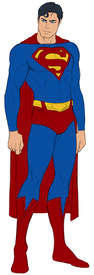
For me this would work best, found it on deviantart

 
You're not alone, I dont like it much either. Call me old fashioned but I prefer the original shield to anything they do. They shouldnt mess with what works.

For me this would work best, found it on deviantart


.........somebody tell Charlie Sheen that was his Que

*Charlie walks in and see's the pic*

"WINNING"

:funny:

there ladies and gentlemen is your "Man Of Steel" suit :woot::woot:
 
You're not alone, I dont like it much either. Call me old fashioned but I prefer the original shield to anything they do. They shouldnt mess with what works.

For me this would work best, found it on deviantart


Nearly perfect.
 
uh guys....that's basically the Superman Returns suit with a bigger, more traditional shield and brighter reds. he even has the tight collar. no thank you, i say.
 
uh guys....that's basically the Superman Returns suit with a bigger, more traditional shield and brighter reds. he even has the tight collar. no thank you, i say.

But DFresh, isn't that what was wrong with the SR suit? The red, the shield, the boots, the \S/ on the belt... The collar on the Singer's suit was crew neck this one is straight. This is just a classic Supes suit. . .
 

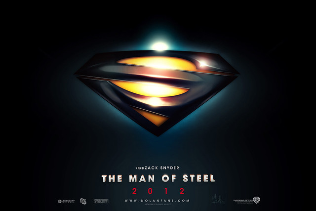
SUPERMAN SHIELD 2012 di Medusone, su Flickr

Download HD version, you can find a shape. "Share" enjoy!

Hmm. When I saw your first manip, I thought the shape of the shield was based on a perspective -- as if it were tilted backward. Unfortunately, I can't get that out of my head now. :csad:
 
Last edited:
Status
Not open for further replies.

Users who are viewing this thread

Back
Top
monitoring_string = "afb8e5d7348ab9e99f73cba908f10802"