BvS The Superman Suit Thread - Part 3

Status
Not open for further replies.
The only improvement is adding yellow to the belt but the New 52 suit is and always will be garbage IMO. It has completely stripped Supes of the charm and regality the classic suit provided.

Clearly, the ONLY suit change that has ever worked is the MOS/BVS suit.
 
The hand warmers are so random.

Yeah, they should use something closer to the Cavill suit like how they made WW's costume more like Gadot's.
 
recently, it's been revealed that Supes is getting yet another suit change in the DC52 universe:
http://www.supermanhomepage.com/images/characters/superman-images/2015-costume.jpg

So they... made it worse?

facepalm.jpg
 
it only goes to show that the superman used in marketing is the classic 80's style suit - i have seen some new 52 style images, but that's expected - they want to push this, but seriously, superman in the comics for me is not what i want from my own personal view point
 
how the hell did they get that from this!!!
1039288-jim_lee_superman.jpg


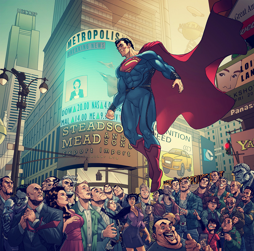
They should just use this-
welcome_to_metropolis__man_of_steel__revised__by_bongzberry-d5nsxiq.jpg
 
Just have Wilkinson design every suit ever. The costumes will transfer great into live action while looking fantastic on page. Everybody wins.
 
Hopefully another artist can draw it so we have a clearer perspective on how it looks. So far it seems to be an improvement over the original new 52 atrocity.
 
recently, it's been revealed that Supes is getting yet another suit change in the DC52 universe:
http://www.supermanhomepage.com/images/characters/superman-images/2015-costume.jpg

Damn I hate this! And THAT face is NOT Superman. What's with the claws? I'm sick of dc F***ing with Superman like this!! Yet another piss poor design effort and execution. These people have no passion for the character anymore. It's excruciating and infuriating.
how the hell did they get that from this!!!
1039288-jim_lee_superman.jpg


They should just use this-
welcome_to_metropolis__man_of_steel__revised__by_bongzberry-d5nsxiq.jpg

This would have been beautiful and much more appreciated and excepted... break my heart. Makes me want to thank Zack that much more.

Why can't they give Superman's appearance to a fan vote?? Give him to the ones that love him the most. Just a regular head to boot front, side, and back view by their highest fan rated artist with the top ten fan designs voted by the fans. And let us choose the winner. It would be all over the news... all kinds of free publicity.
 
:funny: That New-New 52 design is atrocious- even worse than the last. Those sleeves appear to have been inspired by the costume of a fifteenth century lady.
 
:funny: That New-New 52 design is atrocious- even worse than the last. Those sleeves appear to have been inspired by the costume of a fifteenth century lady.

I couldn't put my finger on it before. Thanks! :csad:
 
:funny: That New-New 52 design is atrocious- even worse than the last. Those sleeves appear to have been inspired by the costume of a fifteenth century lady.

It's hard for me to tell if that's actually part of the design or Romita just exaggerating it.
 
2015-costume.jpg


That is just terrible art.

I also apologize for showing it in all its atrociousness...
 
Those extra-long sleeves combined with the bedhead make him look like he's wearing pajamas and just got woken up from a nap. No wonder he seems so cranky.
 
Those extra-long sleeves combined with the bedhead make him look like he's wearing pajamas and just got woken up from a nap. No wonder he seems so cranky.

Batman hid an atomic grenade under his pillow again…..that silly!

But then the smoke clears and we see that Supes is still snoring away…..
 
This actually looks worse than New 52 one. I didn't know it was possible.

New 52 had the overlord collar, paper mache red belt and unnecessary red lines, but it still didn't bastardize the suit to this extent.

Here, the collar is still there, red lines are still there, belt looks like a piece of plastic one would find on some robot toy and sleeves are ten time worse now, with those fingerless gloves.

It might look a bit better when handled by another artist, though. Right now it looks like Jet Li in pajamas having an epileptic seizure.
 
2015-costume.jpg


That is just terrible art.

I also apologize for showing it in all its atrociousness...

And who is this artist anyway?! Is this really how they draw or is this just a piss poor representation of their work? I can't believe DC accepted this!!
 
What really kills me is that they're introducing a new suit with an artist that felt like using this opportunity to illustrate the character like a beast faced, wig haired monster. Thanks DC for allowing him to add to your effort in trashing Superman. Gawd! This pisses me off! I REALLY wish I could sit in on these meetings...
 
And who is this artist anyway?! Is this really how they draw or is this just a piss poor representation of their work? I can't believe DC accepted this!!
It's by John Romita JR. and yes he always has that crude art style.
 
It's like John Romita Jr. draws everything with a ruler. So much straight lines.
 
Status
Not open for further replies.

Users who are viewing this thread

Back
Top
monitoring_string = "afb8e5d7348ab9e99f73cba908f10802"