• Xenforo is upgrading us to version 2.3.7 on Thursday Aug 14, 2025 at 01:00 AM BST. This upgrade includes several security fixes among other improvements. Expect a temporary downtime during this process. More info here

BvS The Superman suit Thread

Status
Not open for further replies.
Brighten up the colors to give off a more positive and earthy look, especially after the events of MOS. Other than that, keep the actual suit.
This just tells me what you want done to the suit, not why it makes sense within the story to change it. Know what I mean? :oldrazz:

Personally, this is what I'd do too, as well as removing the Kryptonian detailing.

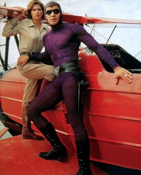
Or at least, redesigning them so they show through more like the the detailing on the Phantom suit, though slightly more faint.:

7798778_orig.jpg

Sorry, its the best example I could think of.

Same here. There are a lot of people that want changes made, but I'm not sure why they would in the story. I'd be a little upset if there were changes made to an ancient alien suit and no one addresses it within the story.
 
but you can't judge an entire race just because Zod's army... what about Jor-el kindness? :csad:
Anything the people of Earth know about Jor-El would be second-hand from Lois and would sound, well, completely insane ("Superman's ghost dad hologram helped me!"). They also wouldn't be too worried about color of the attire. Just look at what happened to Muslims after 9/11. People are stupid and quick to stereotype. Superman being a Kryptonian AND embracing his Kryptonian heritage would be seen as a slap in the face to humans who see the Kryptonians as little more than the invaders who decimated Metropolis. Even just knowing he is of the same race would make for an uphill battle for Kal-El regardless of what he calls himself or how he dresses.

Maybe the way to "change" it would be to have Clark go to his mom and say, "This design is a little too Kryptonian and people are mad about it, can you help me make it look more like it's from Earth?" This would be a way to have your cake and eat it too, the suit would be alien in origin like the New 52, but still fit in the idea of Ma Kent making the suit for him. And maybe he could keep the "armored" Kryptonian suit around for when big threats come around.

I want Superman with the mullet.
I could be COMPLETELY on board with this if Caville can pull off the Dave Grohl sort of look. I don't want a legitimate mullet, I want it long all around. Yes, it was sometimes drawn in the 90s as a full-on mullet, but at the best of times, I don't think that was the intent of the artist.
 
I don't believe they'll make any changes to the costume but if they do, here are 2 minor alterations I'd like to see:

- The midsection design should be even more obviously used to break-up the sea of light-blue that is the bodysuit.
- The dark-blue color of the midsection design (and wristbands) should match that of the boots.

The midsection design is too subtle, it needs to look more deliberate as if to say "Yeah I got rid of the red undies, got a problem with that?" As for the boots, the same blue color that's used for the midsection (and wristbands) should be used. If not for anything else then for the fact that when stationary, looking at the costume head-on with the long red cape, it appears almost as if the legs are chopped-off below the knees. The knee-high boots should not blend-in with the red cape and changing the boots' color to blue would solve that issue.

2075blv.jpg

fantastic art work, don't suppose you have it in black and white?
 
I was just looking at some of the concept art from Man of Steel, and I was curious:


How would you guys feel if they went with one of their designs that featured the red "tights" (it looks like it would be a part of the suit rather than something over it)? Particularly, ones like this which retained the Kryptonian detailing from the MOS?

7BzCTge.png


2hpRd5n.png


94ib4vm.png
 
Last edited:
Makes no since to change the suit. If anything like others here have said, maybe some subtle changes to the colors as in brightening or changing shade of color slightly but no obvious straight up changes such as making the S shield black or etc. etc. The Suit looked perfect in my opinion and there is really no reason to change it either, this isn't the suit made by Momma Kent. its Kryptonion in this story, any changes wouldn't make much since.

I'm with ya 100% on this! I'd say lighten the colors a bit, but keep the suit itself as it is design-wise for the exact reason you mention; in this rendition, it's of Kryptonian origins, not handmade here on Earth. I mean, who would have the expertise to make alterations to such a suit in that world? He would have to have a completely different suit made and maybe that's what they indeed on doing...I honestly hope not, because as many of you have stated and agree, the MoS suit was pretty badass! More over, I thought the new take on the suit's origin gave it more credibility compared to his mom making it for him.
 
I was just looking at some of the concept art from Man of Steel, and I was curious:


How would you guys feel if they went with one of their designs that featured the red "tights" (it looks like it would be a part of the suit rather than something over it)? Particularly, ones like this which retained the Kryptonian detailing from the MOS?

7BzCTge.png


2hpRd5n.png


94ib4vm.png

I just couldn't see the point in adding the red trunk area onto the bodysuit. What purpose would it service other giving the illusion of a look from the old days? I could see leaving the trunks on the suit if it were part of the original design, but adding them on now just wouldn't make any sense to me. Especially when it would just be adding coloring onto the existing suit in that area, not adding actual red trunks. I think the suit is good as it is, just lighten the colors a bit and you'll have a more visually optimistic Superman - get away from the darker image.
 
Last edited:
Is that an \S/ on the back of that cape? I never noticed that before>
 
You know, I took Snyder at his word regarding the trunks; he wanted them, and they tried to make it fit within the framework they were working with, re; the Kryptonian undersuit; but that doesn't make sense.
If it's already an "undersuit," over which they add other clothing elements, why NOT have a trunk like part?

First off, there are no "rules" for such a type of clothing, especially if YOU'RE the one constructing the story around the how and why of said clothes.
Second, if it's largely treated as an UNDERsuit, why not have an underwear type area?

Of course it's not JUST for going under the other clothing and armour elements, and is meant to function as "regular" clothing as well, but whatever.

Main point is, it's something they were designing from the ground up, not just the design, but the entire concept.

Bah, any who, long story short, I'm still quite happy with the final design, even though I didn't care for the \S/ design they went with; though it also made sense within the overall design aesthetic they were going for on Krypton, and looked perfectly good on screen.

That said, I don't see why they would NOT include the emblem on the cape. Clearly the house symbols are important in that culture, and so are the capes, why wouldn't they want to identify themselves coming and going?
Hell, considering the velvet like nature of the capes, I would have accepted a basic texture formed glyph on the cape. Kind of like what thy do with horse hair/fur, simply brushing over a stencil in the opposite direction of the flow of the rest of the hair.
http://stencilbum.co.uk/shop/cms.php?id_cms=21

Would have been a less ornate approach, and feel less like he's trying to push his brand or something.
 
You know, I took Snyder at his word regarding the trunks; he wanted them, and they tried to make it fit within the framework they were working with, re; the Kryptonian undersuit; but that doesn't make sense.
If it's already an "undersuit," over which they add other clothing elements, why NOT have a trunk like part?

First off, there are no "rules" for such a type of clothing, especially if YOU'RE the one constructing the story around the how and why of said clothes.
Second, if it's largely treated as an UNDERsuit, why not have an underwear type area?

I don't want to beat a dead horse here, but just wanted to clarify your stance on this topic. So...are you for a faux-trunk area added to the bodysuit? Or are you for Sups pulling on a pair of red trunks over the bodysuit so it, what, adds something to his look? It being defined as an undersuit, or not, what would adding trunks over it provide? It would merely be an unnecessary, aesthetic addition to an already logical suit design.
 
I don't want to beat a dead horse here, but just wanted to clarify your stance on this topic. So...are you for a faux-trunk area added to the bodysuit? Or are you for Sups pulling on a pair of red trunks over the bodysuit so it, what, adds something to his look? It being defined as an undersuit, or not, what would adding trunks over it provide? It would merely be an unnecessary, aesthetic addition to an already logical suit design.

As opposed to all the other unnecessary design elements added to it already?

As I said, I actually was pleased with how the suit turned out sans-trunks. Prior to MOS I had not seen any designs that actually looked good without them.

Why would they have to be something he pulls on over his suit? I was picturing something which was part of the suit, the same as he gauntlets, "belt," emblem, etc.
 
I'm glad you liked the MoS suit. I think it turned out well without the trunks too, proving that they aren't really needed to have a great suit design. Now that they've gone that way though, they shouldn't add them until a reboot happens years from now, if even then.

I do agree that they should have had a subtle \S/ insignia on the back of the cape as you suggested. That would have looked great!
 
I just prey snyder and co open up to the idea of damaging their precious suit a bit.
Granted, it's going to be fun explaining how it's then fixed in film, but that could be an innate property to the tech.

Actually, that was one of the favorite things that I loved about the movie, that the suit and the cape were not damaged at all.
 
I think he should. All this talk about the new batsuit, but does anyone else think it's a possibility we could get a new Superman suit? I'd be happy if he opted for a less "alien"/treaded look on the suit and let him look more like, well...SUPERMAN in it, with vibrant colors and a better suit texture that looks less like snake skin/chainmail and maybe even the "s" curl (the only superheroes who should be in chainmail are Captain America and Aquaman, maybe - possibly Thor)). Cavill could look like Superman walking off the page of a comic if they let him, look at this screen test pic:

SUPERMAN_FLYBY_CAVILL.jpg


I'd be fine with something like that, in color at least. That shot alone there looks more like Superman than almost anything we saw in MOS (I liked the MOS cape though and how it went into the shirt - best thing about that suit, the cape and the boots, practically identical to the comics).

I believe that the world is ready for Superman to look more like Superman.

What do you think?
 
Last edited:
I'm obviously not involved with the production, so I don't know for sure. I don't believe that Superman should have a new suit because I can't think of a good reason to change it within the story. I'm not saying that it's impossible, but I wouldn't change it if I were Snyder.
 
I hope not. I loved the MOS costume and thought it was the best Superman costume to date, comic-accurate or not. I just hope it looks a little closer to this

SupSpyNEELZ.jpg


than the heavily desaturated colours we got.
 
No keep the same costume maybe a bit more lighter but that's it.

I love it.
 
I loved the costume. It was updated, but still very Superman.

I would leave it alone, except for the colors. I'd like them just a bit brighter. Not cartoonish, but more vibrant. Although I think the muted colors were the result of the movie's color filtering, not the suit. It seemed brighter in some behind the scenes features.
 
I agree, I would like less muted colors at least. I know a change in material might be asking a bit much.
 
I would like the whole movie to be a bit brighter, actually. I don't see what is so great about this whole muted color scheme a lot of movies are adopting. It didn't ruin MOS for me; it was still a beautiful looking movie, but let there be color this time. It's a feast for the eye.
 
I believe that the other heroes roles/costumes will have an impact on the saturation of the suit and overall movie. The reason that I say this is that visual contrast adds to how the characters are perceived.
 
Well look how dark the background is in the first pic of this page and how great the suit looks there, even though it is dark. This is how the suit should be, IMO. I don't get the whole minted colors thing in this case.
 
Have you seen the extended features with the MOS blu-ray? The MOS suit is actually quite bright behind the scenes at times. Sometimes it appears almost like a deep navy blue. That is also nice. I just don't like when it seems to be a muted gray.
 
I actually haven't, unfortunately. I've seen it in still pics from behind the scenes where some of the shots look pretty good as far as the color goes...even the texture doesn't look as bumpy in some of the stills. I just hate it when it looks practically all black where the blue is in some shots.
 
Status
Not open for further replies.

Users who are viewing this thread

Back
Top
monitoring_string = "afb8e5d7348ab9e99f73cba908f10802"