My Mom Made It For Me: The Superman Suit Thread

I always liked the fact that in most of the comics, Martha used Clark's childhood blankets to make his grown suit. It connects him to both sets of his heritage.
 
Have you got an image that you think best represents what you are seeing? I really hope your enjoyment for this film isn't riding on the curvature of the symbol :p
I truly could not care less. :funny: This has absolutely nothing to do with preference, as I’ve already seen it and I like it. I just care about accuracy! So far, the fan art has simply not been accurate to what’s been shown. That’s all.
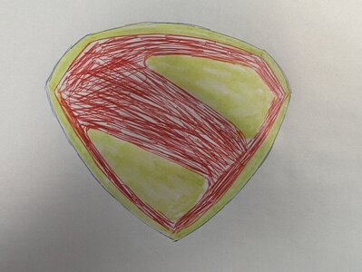
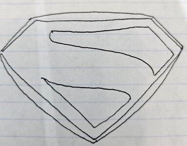
And no, I haven’t seen one posted here that’s 100% accurate, and I haven’t been looking elsewhere, either. So we’ll just have to wait until the suit reveal for y’all to see what I’m talking about I guess!
This is a super, super rough hand drawn sketch I just did in 2 minutes since I was procrastinating from work and just so happened to have a blue legal pad, red pen, and yellow highlighted with me. I think in rough terms, this captures the overall effect that FC and I are seeing:
PXL_20240325_062850478.jpg
The points on the yellow should be slightly sharper, the outline narrower, and obviously things like the middle band of the S should be more even, etc. but hopeful this crude doodle will help people get a better over all impression.
 
This is a super, super rough hand drawn sketch I just did in 2 minutes since I was procrastinating from work and just so happened to have a blue legal pad, red pen, and yellow highlighted with me. I think in rough terms, this captures the overall effect that FC and I are seeing:
The points on the yellow should be slightly sharper, the outline narrower, and obviously things like the middle band of the S should be more even, etc. but hopeful this crude doodle will help people get a better over all impression.
Not a comment on your drawing skills as I can see what you are going for and that's all you are trying to convey. Personally I think that is a terrible concept if that's what they are going for.

Certainly not a fan of the wider centres along the edges. I could get by if the edges were aligned with the round red parts but to have it uneven just seems like a bad artistic choice.

I wonder what FC has to say about your illustration.
 
Conceptually, that’s it. But the border thickness is obviously exaggerated there. The curvature away from the red in the actual shield is very subtle imo.
 
I think the emblam will be like this and it will be a mix of the new 52 suit with the Ross emblem and the fleischer suit.

20240325_164527.jpg
 

I knew a fellow who generally liked the Chris Reeve costume. But he wasn’t a fan of the extra-tall boots — which he called “hooker boots.” :ninja: And that description would apply to this fan art.

Also: “boy shorts"? :crso:
 
I knew a fellow who generally liked the Chris Reeve costume. But he wasn’t a fan of the extra-tall boots — which he called “hooker boots.” :ninja: And that description would apply to this fan art.

Also: “boy shorts"? :crso:
I would make the trunks bigger, lighten the blue and I think a deep cut into the front of the boots would solve the "hooker boots" problem also just changing up the material of the boots. If there was one thing I liked about the the MOS suit was the boots.
 
Make the boots slightly shorter, narrow the neckline a little, then there you go.
The S is the perfect size but it needs a curve.
 
That's a pretty good version of the suit. A few tweeks like mentioned above would suffice. Not a huge fan of the shield shaped buckle belt either, feels somewhat superflous design wise.
 
Thought that was Bobby Cannavale for a second.
 

Users who are viewing this thread

  • Staff online

    Forum statistics

    Threads
    200,560
    Messages
    21,760,102
    Members
    45,597
    Latest member
    Netizen95
    Back
    Top
    monitoring_string = "afb8e5d7348ab9e99f73cba908f10802"