My Mom Made It For Me: The Superman Suit Thread

Do you like the suit?

  • Yes

    Votes: 18 54.5%
  • No

    Votes: 7 21.2%
  • Meh

    Votes: 8 24.2%

  • Total voters
    33
I find the Guardians suits a really bland imagining of a solid design from the comics. The Superman suit rocks, imo. Too many lines for my taste, but I like the sense of being fabric while not being flimsy, the lack of overt padding, the colours.
Idk...it looks more padded and to thick for my taste. Esp those boots.

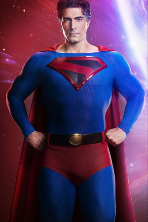
Would've totally been down for a similar COIE Superman look (still amazed MG/CW were able to pull it off as well as they did)
1735013680721.png
 
Ughhh - When are we going to get a proper full-body promo shot of the suit??
 
I dont think GotG costumer was the right person for the Super suit. Its so GoTG....but more basic.
Marvel-Studios-Guardians-of-the-Galaxy-Volume-3-Official-Trailer-01-120122-3b52642d616b4971af5dec2fed483bdd.jpg

HCM_52875_R.jpg

I don't think the designer is the issue here. Gunn wanted the suit to look how it does.
 
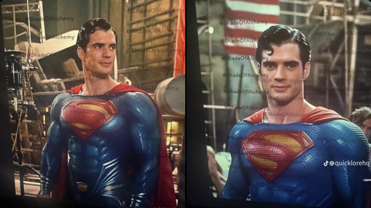
I'm just glad it doesn't look like a CGI nightmare. Henry's suit looked CG even in scenes where it wasn't.
 
I love the look here^ with a less saturated blue. I always think the red should pop a lot more than the blue.

The only thing I don't love is the unnatural curl (why do they keep doing this) and the belt which looks a bit cosplay.

But I love the overall shape of it. No more plastic muscles, slightly loose ala All-Star Superman, with an early 20th century armed forces uniform vibe. I see this and I buy that this what the costume always was in reality, and the simplistic spandex look was artists simplifying it for the page, the truth of it getting lost in translation.
 
Isn't this the BVS version because for me that adaption with the god awful Cavill hair was one of the worse things about that film. They tried to redeem it in the JS:TC but his dodgy CGI mouth ruined it and as you said the Black Adam's version was too late to rectify anything lmaoo. The MOS suit for me wasn't potent in the abs area like it was with this bvs suit and later models. With a brighter tint it would of been era defining but any who its in the past.

Gunn's suit still has people split down the middle i see. My mind will be made up when i see it in all its glory in July.
I hope they show Davids hard work in the gym paid off in a couple of scenes at least. Unfortunately its why this suit doesn't do it for me currently....Too baggy and no muscle definition. I love the S and he cape though.
 
The suit being a bit loose and baggy is good imo. It gives him a more laid-back look, especially if we're going with the trunks. The thing is, the other elements don't really match that aesthetic. The lines and the collar make the suit look much more militaristic. So you end up with this weird costume that is neither here nor there.

It's not ugly to the point of being distracting, but it's not pretty either.

I like the MOS suit for what it is. It fits that universe; it looks good and cohesive. Too bad the movies weren't my cup of tea.
 
The biggest question is why are there 2 suits?
 
I actually don't think there are two suits. After watching the trailer on repeat and going back and looking at the reveal and set pics. It's all the same suit. But in the reveal, he's leaning forward which is distorting the collar. You can see a similar effect when he is in stage industries. It's the same burnt suit. Now that's not to say he doesn't get a cleaned up version. Also when you zoom in real close you can see the ridge of the v neck in the reveal photo. Yes I've been completely obsessing over this since the trailer dropped. 😅
 
I thought that metallic muscular undersuit they had for Snyder's Superman suit(s) was actually a clever idea to not only take the sting & puffy look of using standard sort of padding but it reminded me a little more of how some artists actually draw Superman in regards to how they shade the suit in which the majority of the suit is black/navy, with certain muscle groups popping more with a brighter shade.

I don't particularly care about muscle padding, but if it's done wrong.. well in very extreme cases it looks like Levy's Shazam suit or a couple of Hoechlin's Superman suits. Give me that metallic undersuit any day over looking like the actor is wearing 5 jumpers.

Doubtful it will be an issue with Gunn's Superman as I'm imagine any future changes to Corenswet's suit in any future films the character appears in will still keep with the current motorcycle suit sort of look just with an altered design/color tone.
 
Back
Top
monitoring_string = "afb8e5d7348ab9e99f73cba908f10802"