The Official Superman Fan Art & Manips Thread - Part 2

Status
Not open for further replies.
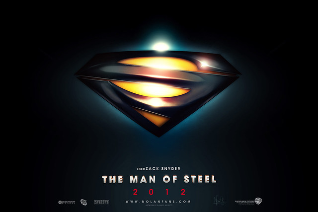
and here's my design, a little closer up:

manofsteel.jpg


here it is without any writing or anything on it:

http://i271.photobucket.com/albums/jj153/ntbone/manofsteel_plain.jpg

I like the design, but the lense flares (on this one and the full body) manip don't make sense....
 
Man. That is so awesome. I have never seen the \S/ altered so radically that I still really liked. that is amazing. I wonder if Zack would be willing to go with a similar design or if he is keeping it classic

Classic.
There's a whole Brand to consider. You will never see a so radical a departure from the classic shield.


:up:

Beautiful artwork, my friend. Very radical and bold, but a very welcome update indeed.
This I could see working for their modern take on the character, and also something I could definitely see them actually doing. Now the original emblem almost seems obsolete for the reboot and I was rooting for that one.
I think we might end up getting something like this. If it's not actually the design from the movie itself having been leaked somehow.

Well... great re-design anyways.
 
I'm seriously in love with this redesign. I hope you don't mind, but I did an alternate version with the bulk of the S tinted red. Not necessarily an improvement, because I like how dimensional yours is.


:super:
 
I'm seriously in love with this redesign. I hope you don't mind, but I did an alternate version with the bulk of the S tinted red. Not necessarily an improvement, because I like how dimensional yours is.


:super:
OHH MY GOD YOUR WORK IS AWESOME!!!This Shield is Beautiful!!!!
 
I'm seriously in love with this redesign. I hope you don't mind, but I did an alternate version with the bulk of the S tinted red. Not necessarily an improvement, because I like how dimensional yours is.


:super:

Simply amazing.
 
My dad is rather bald. I bet he'd make a better Lex Luthor than Billy Zane.

32% on a poll is not that impressive. It just means that of all the bad choices availible, he is the bad choice who has the most loyalty. I never understood why people thing Zane is a good actor when he's pretty much DTV fodder.

I'm totally behind your Dad for Lex Luthor :) From what i've seen of him (nothing) there is no doubt in my mind he'd do a better job than Zane :p

I'm seriously in love with this redesign. I hope you don't mind, but I did an alternate version with the bulk of the S tinted red. Not necessarily an improvement, because I like how dimensional yours is.


:super:

I want this, on my wall, as an official poster... it is absolutely stunning!
 
I'm seriously in love with this redesign. I hope you don't mind, but I did an alternate version with the bulk of the S tinted red. Not necessarily an improvement, because I like how dimensional yours is.


:super:

Do you have a higher resolution version of this?

JB
 
I'm seriously in love with this redesign. I hope you don't mind, but I did an alternate version with the bulk of the S tinted red. Not necessarily an improvement, because I like how dimensional yours is.


:super:

It looks much better red... and I'm surprised at how much I love this. The more I look at it the more I like it. It's clearly Superman's shield, but it has an alien look to it. The only thing is it looks sort of... squashed doesn't it? Other than that, this is amazing.
 
I really like it too, but the rest of the suit might be a bit too busy if it gets the same overhaul. If if didnt though the emblem might stick out too much, if you know what I mean.

But yes, it's quite the re-design.
 
I like the design, but the lense flares (on this one and the full body) manip don't make sense....
it's not a lens flare. in my design, the yellow part is backlit. the \S/ is raised but it's underneath the actual suit. like a diamond shaped hole is cut out of the chest, and the rest of the shield is underneath. a seam (of the hole cut out of the chest) serves as the border for the shield.

Classic.
There's a whole Brand to consider. You will never see a so radical a departure from the classic shield.
surely you're not naiive enough to think they won't change it. it's already changed dozens of times throughout the years (and when you say "classic shield" are you referring to this one?
STAR09375.jpg
) anyway, it WILL be changed, i'd bet my life savings on it.
 
Last edited:
:super: This is an amazing poster for Man of Steel.
I really like the saying on top: "From the creators of "The Dark Knight" and the director of "Watchmen."
thanks man! here's my costume design. i'm no designer, but i just threw it together real quick after making that poster:

supermancostume.jpg
 
thanks man! here's my costume design. i'm no designer, but i just threw it together real quick after making that poster:

supermancostume.jpg

Nice work...I like the neckline quite a bit...
Maybe if that belt and the trunks were transformed into something more alien looking....
 
it's not a lens flare. in my design, the yellow part is backlit. the \S/ is raised but it's underneath the actual suit. like a diamond shaped hole is cut out of the chest, and the rest of the shield is underneath. a seam (of the hole cut out of the chest) serves as the border for the shield.


surely you're not naiive enough to think they won't change it. it's already changed dozens of times throughout the years (and when you say "classic shield" are you referring to this one?
STAR09375.jpg
) anyway, it WILL be changed, i'd bet my life savings on it.

As long as the traditional logo has held on and remained mostly unchanged, I don't see how it's naive to think they'll use it in MoS. And when people talk about the classic logo, they're talking about the one that's been around since atleast the late 40s, not the Fleischer logo.
 
i don't mind a slightly redesigned suit or symbol as long as it's not too far away from the original. not necessarily the donner version but i just don't want to be sitting there thinking what the heck is that suppose to be? :doh:

also i see some of you want superman to look nothing like chris reeves, even with the spit curl, i for one again hope the change is not to dramatic.

i was never a huge fan of the dark knight or nolan and i hope and pray they do not ruin superman. i do not need a total reboot of his character.
 
Status
Not open for further replies.

Users who are viewing this thread

Back
Top
monitoring_string = "afb8e5d7348ab9e99f73cba908f10802"