BvS The Superman suit Thread - Part 1

Status
Not open for further replies.
I'm also mildly bothered that Jim Lee still can't nail the Superman logo/family crest symbol.

Yeah, it looks like it was drawn by someone who doesn't quite grasp the Pen Tool; it's all sharp lines.
 
I'm also in the 'hate the new 52 suit' group.
 
I'm also on the side of the Man of Steel suit. That thing could've been a masterpiece. My only issues with it have to do with how much padding they put on HC. The shoulders, forearms, and abs look unnatural. I hope they decide to "tweak" those areas by reducing the padding.

The New 52 suit doesn't work well to me. Seems like Jim Lee just added armor as an excuse to draw a bunch of extra lines on the suit.

PapYJwb.jpg
 
Last edited:
MoS suit is almost perfect. It only need to be more better blue tone.( and brighter yellow on "hope" symbol.
 
The cape and how it attaches is what makes the 52 suit collar look so godawful to me. It's like, wth is the cape attached to? Is just glued on? Aesthetically, it just doesn't work.
 
Ad far as the New 52 goes I prefer the t-shirt and jeans look over the armored suit.
Action_Comics_Vol_2_1.jpg

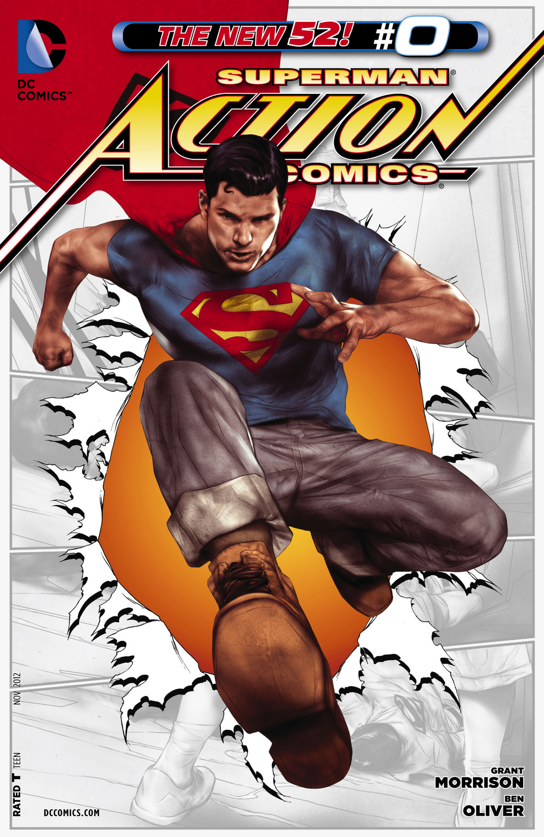
Action_Comics_Vol_2_0.jpg
 
It feeds into slots cut into the shirt, and attaches to his nipples by clamps.
 
Love the MOS design. A shade brighter and it would be perfect to me.
 
The best superhero suit; imo of course.

Your opinion is true and a fact :)

Superman suit is the most iconic super hero suit of all time and MoS version is the best one in life action to date.
 
I can't describe how much I hate the collar on the "new" 52 suit.
I share your pain. That ugly looking thing is what ruins the entire suit for me. I honestly can not bare to look at it. Not to say that the rest of the costume is any good, because it isn't, but I could have forced myself to somehow accept it if it wasn't for that ridiculous collar.
Does anybody know if they have any plans of somehow altering that costume to something a bit more acceptable?
I'm also mildly bothered that Jim Lee still can't nail the Superman logo/family crest symbol.
I cringe everytime I look at that thing. Same with the belt. And I would have even made my peace with all of this were it not for that stupid collar.

In my honest to God opinion, they should have gone with the MOS suit.
 
It's a new design. Designed by Jim Lee.
I've started to see it show up all over merchandise and material in general stores now too. It is incredibly bad. It's like the Electric Supes era logo from the 90s drawn in traditional colors.

I love the MOS redesign. I'd love to see them just lift that.
 
I share your pain. That ugly looking thing is what ruins the entire suit for me. I honestly can not bare to look at it. Not to say that the rest of the costume is any good, because it isn't, but I could have forced myself to somehow accept it if it wasn't for that ridiculous collar.
Does anybody know if they have any plans of somehow altering that costume to something a bit more acceptable?

I cringe everytime I look at that thing. Same with the belt. And I would have even made my peace with all of this were it not for that stupid collar.

In my honest to God opinion, they should have gone with the MOS suit.

I keep hoping they will take a hint from MOS,and at the very least subdue the @#%&! Lines on the suit and get rid of the collar...if bats can go from yellow oval to black bat (pre 52) without anyone batting an eye, surely they can lose the collar....even that recent kids jla DVD looked better than what we have now in the comics.
 
The best superhero suit; imo of course.
the best imo
TASM2 Spidey's suit
Cap's suit in TFA
Multiple IM suits
MOS
Batman Begins

It's disappointing how hard X-Men failed with the movie costumes
 
Status
Not open for further replies.

Users who are viewing this thread

Staff online

Latest posts

Forum statistics

Threads
202,346
Messages
22,089,155
Members
45,887
Latest member
Elchido
Back
Top
monitoring_string = "afb8e5d7348ab9e99f73cba908f10802"