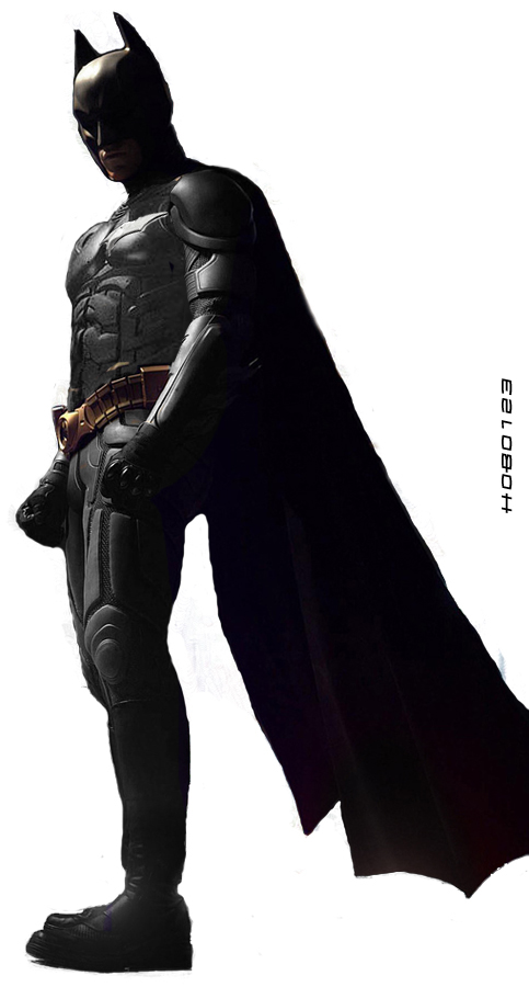
The Dark Knight Batsuit- teh good or teh bad?

They couldn't design the neck without 20 separate pieces? The can't make the ears straight up? These are the things that bug me, design wise. The designers simply made choices I don't like.

some things that look simple in 2 dimensions don't translate as easily into 3d . . . Batman can't logistically walk around with 2 foot long ears straight up in the air as if he were a walking, talking Kelly Jones drawing . . . in regards to the ears, I feel they found a nice middleground . . . they're not insanely tall, but they're not like the little puppy ears that Frank Miller used to render
 
They couldn't design the neck without 20 separate pieces? The can't make the ears straight up? These are the things that bug me, design wise. The designers simply made choices I don't like.

see that is a completely fair and rational statement. its ok to not like something and disagree with creative choices (although i do think its a bit early to judge until we see it , you know, in the movie) but at least you admit its just your opinion.
 
some things that look simple in 2 dimensions don't translate as easily into 3d . . . Batman can't logistically walk around with 2 foot long ears straight up in the air as if he were a walking, talking Kelly Jones drawing . . . in regards to the ears, I feel they found a nice middleground . . . they're not insanely tall, but they're not like the little puppy ears that Frank Miller used to render


I didn't mean make the ears any taller, there's no reason to do that. I just prefer them straight up rather than angled in. The RETURNS cowl actually had the ears angled outward.
 
I didn't mean make the ears any taller, there's no reason to do that. I just prefer them straight up rather than angled in. The RETURNS cowl actually had the ears angled outward.

ahhh, I see . . . I'll be honest the ears kind of bugged me at first too, w/ the Begins costume but I think they look more organic with the shape of the head . . .
 
see that is a completely fair and rational statement. its ok to not like something and disagree with creative choices (although i do think its a bit early to judge until we see it , you know, in the movie) but at least you admit its just your opinion.

It's just that some people try to make it seem like the designers were backed into a corner and just had no other option with certain design elements. That's bollocks of course. The truth is, they made the choices they liked with out consulting me first. Bastards. :woot:
 
It's just that some people try to make it seem like the designers were backed into a corner and just had no other option with certain design elements. That's bollocks of course. The truth is, they made the choices they liked with out consulting me first. Bastards. :woot:

Oh no buddy, they needed to consult me first, I know how it should be done! You know, is very simple, all they have to do is........Zzzzzzzzzzzzz ;) :woot:
 
Dude, have you never seen an Alex Ross Batman?

120037673.jpg


alexross_batman.jpg


Heck, the raised armored plating as Bat symbol worked pretty well for Kingdom Come:

batman.jpg
Yes, I have. It sucks.
 
Posted this in the MANIP thread:

I don't know how well people well people will take to this re-design of the suit. I know some people love TDK suit and some hate it.

So I took into account some of the complaints and some of my own issues. And modified it to what I think would have been a better choice.

I honestly dont know how good it will look online, because the computer screen I was working on is messed up and makes everything look darker...and I haven't been doing this PS manip stuff for a while. So I may be rusty. You guys judge:

doublemt9.jpg


--dk7

Slight modifications to the arm strap (bicep area) and more to the collar/neck.

doublesmallhf8.jpg


--dk7
 
^ cool I like the manip better. mainly for the logo, the collar and the lighter grey hue, the other changes are probably unessercary for me.


The chest on the new suit actually looks more like Nightwing with the bird from shoulder to shoulder. That's um, kinda strange :o
 
^ cool I like the manip better. mainly for the logo, the collar and the lighter grey hue, the other changes are probably unessercary for me.


The chest on the new suit actually looks more like Nightwing with the bird from shoulder to shoulder. That's um, kinda strange :o

Yeah I like this Manip.
 
If the costume designers wanted that piece on the chest to resemble the emblem...why the heck wouldn't they just incorporate the emblem into the suit as a large armored panel?

in the context of begins the suit bruce used wasnt designed with a symbol. he added it along with "stealth" coating. maybe its the same here? maybe from a design standpoint they wanted the impression of a symbol there but maybe they fell fox wouldnt add one himself to a piece of hardware that he certainly didnt build by himself. then he or bruce added the symbol later. maybe the suit wasnt made specifically for bruce like the original suit wasnt? why not wait and see how the suit actually looks in the the context of the motion picture it was designed for? that's all im saying. maybe just maybe we shouldnt second guess a creative team that, thus far, has proven themselves more than capable of making good choices (especially visually. ) maybe give them the benefit of the doubt until we see their finished product? is that unreasonable?

I don't ***** about nearly everything. You won't find me complaining about the IRON MAN costume, for instance, or the Spider-Man suit, or the Superman costume, for the most part.

I hate sewing and I can't draw. Kinda of prevents me from designing.

well you know what they say, those that can't, ***** about it.:oldrazz:

"Disagree with the government? Why don't you become president then lol :whatever:"

"Headaches? Why don't you just perform brain surgery on yourself then lol :whatever: :whatever: lol"

actually its more like "disagree with the government? why dont we sit around and complain about it" or "headaches? let's complain about how much our head hurts but never see a doctor"

or better yet "hate the newly elected government even though they havent even taken office yet and anyway the last time they did a pretty damn good job "

my point is: so much needless whining before we've had so much as a trailer is getting pretty tired. at least some of those who dislike the suit are being constructive with their criticism. look at batscot and dk7 making manips to show how they would change things. thats what im talking about. but the nitpicking about every little detail is so summer of '04.
 
Why hasn't this thread been combined with the other bat suit thread?
 
I was thinking, what if the batsuit, isn't really a batsuit per se. Bare with me. Since the past Batsuit got destroyed, Bruce is deseperatly in need of a new suit, Fox gives him the new armor suit, but it isn't bat-customized, since Bruce is in a hurry, he just patched the insignia quickly as to just make it Batmanish. So we could say it's Batsuit 2.0 Beta :)
 
And there's my proof that it's overdesigned. That David Tyler thinks it's starting to be too much. :).

If at least the cape would wrap around so that the detail was obscured a bit. That would make it a little easier. Besides, who doesn't love those shots in the comics when Bats is standing completely cloaked and looking like a shadowy wraith!


:cool:
 
in the context of begins the suit bruce used wasnt designed with a symbol. he added it along with "stealth" coating. maybe its the same here?

Maybe. Why the hell would the actual film design team make that distinction during the design of this costume, rather than design something that looks good as a Batsuit?

maybe from a design standpoint they wanted the impression of a symbol there but maybe they fell fox wouldnt add one himself to a piece of hardware that he certainly didnt build by himself.

Maybe. But apparently Fox would make a suit with upper pec armor but not lower pec armor. Go figure.

then he or bruce added the symbol later. maybe the suit wasnt made specifically for bruce like the original suit wasnt?

Again, why would Nolan and his design team make this distinction?

why not wait and see how the suit actually looks in the the context of the motion picture it was designed for?

Why, is it going to look different? Are it's design elements going to change?

that's all im saying. maybe just maybe we shouldnt second guess a creative team that, thus far, has proven themselves more than capable of making good choices (especially visually. ) maybe give them the benefit of the doubt until we see their finished product? is that unreasonable?

Oh, so this isn't their finished product, as far as the design of the suit goes?

well you know what they say, those that can't, ***** about it.

Sure you're not thinking of "those that can't do, teach"?

my point is: so much needless whining before we've had so much as a trailer is getting pretty tired.

Then don't come into the threads.

at least some of those who dislike the suit are being constructive with their criticism.

You want constructive criticism? I can do that, I just assumed people had common sense.

look at batscot and dk7 making manips to show how they would change things.

You mean the ones that keep the same basics of the suit that I find ridiculous-looking intact?

thats what im talking about. but the nitpicking about every little detail is so summer of '04

No more "nitpicky" than *****ing about nipples was. See, what you call "nitpicking" I call "Having very real issues with important elements of a beloved character's appearance".

I'm not whining about cape clasps here.
 
My constructive criticism. Maybe someone can photoshop it up.

Cowl: Looks pretty good. Bale has a thin jaw and an elongated head, so I understand that the cowl has to have a certain cut to it.

Neck: When designing a creature of the night, take care to avoid large wide ringlets up the entire neck. These catch light, and when seen, conjure up images of cheesy 1950's "spaceman" concepts, and prove distracting. Jointly, when considering what the front of the cowl/neck should look like "overdesigned ringlet mess with little v things for some reason" is not a good start.

Shoulderpads: Shoulderpads do not need many small interlocking pieces to appear functional.

Gloves: The "glove strike points" were already done in DAREDEVIL. At least do a new take on them. Silver rings do make such accroutements more snazzy-looking, but is hardly a neccessary design element.

Chestpiece: There are several schools of thought on the colors of chestpieces. Here's an easy rule to follow: If you want to make a chestpiece gray, make it gray. There is really no reason to surround an already-armored chestplate with a thick black "retainer" unless your suit is poorly constructed to begin with. This only distracts from the effect the chestpiece visual has and leads to "man bra" jokes. In addition, chestpieces need not have pointless diagonal lines on them to appear functional or armored. If you are daring enough to put a large plating over a light colored chestpiece, you may as well make it a wide Bat-Emblem. This provides an explanation for said emblem and it's size. It is now an armored plating.

Ab plating: Mesh with armor over it is a pretty cool idea. However, abs are not really a key visual element of the Batman costume in most cases, and therefore to not need to made into attention-grabbing "look at me" pieces. Multi-colored abs only distract from the overall effect of a Batsuit, and if the color utilized is gray, make the suit seem like a really, really half-assed attempt at a black and gray color scheme.

Gauntlets: Gauntlets should appear study. While it is a good idea to put little mesh "holes" in gauntlets so that Batman's wrists won't sweat, this reduces the gauntlet's structural integrity and looks weird.

Legs: As evidences by BATMAN BEGINS, it is not neccessary for Batman's legs to resemble a Mayan temple design in order for him to move. This look can prove incredibly distracting. Simple, tastefully placed leg armor is more than enough. Kneepads should not resemble targets. This makes you more likely to be shot in the kneecap.

Boots: If you're going to redesign the rest of the suit, take care to address the boots.

And so forth.
 
well since everybody edit the bat suit so i just felt like doind it to and i am not saying that i made it better btw ignore the half bat symbol

2109482689_1e94032338_o.jpg
 
Maybe. Why the hell would the actual film design team make that distinction during the design of this costume, rather than design something that looks good as a Batsuit?

well they made that distiction in begins so why wouldnt they here?

and because good costume designers dont just make things that "look cool" they serve the directors wishes and the needs of the film. a batsuit designed for a cartoon, a comic, or an action figure or statue is going to have different criteria.

maybe a better example would be a movie or stage prop. often times, when viewed up close or held in hand, they look quite cheap and plain. but in the context of the film or play they serve their intended purpose. if they were designed to sit on someones desk or shelf and stand up to close scrutiny the level of detail and craftsmanship would be completely different.

i once saw an original prop of dekkard's gun from BR. compared to some of the "replicas" ive seen of the same pistol it looked bollocks. you would choose the copy over the original if appearance was your primary concern.

the batsuit is designed to worn by an actor in a motion picture. that is its intended purpose.

and before you say "so why couldnt they make it look good at the same time"
remember not everyone thinks it doesnt in fact look great as is.


Maybe. But apparently Fox would make a suit with upper pec armor but not lower pec armor. Go figure.

who knows? i certainly don't


Again, why would Nolan and his design team make this distinction?

see my response to your first quote above

Why, is it going to look different? Are it's design elements going to change?

i expect it will look very different in the context of the movie when it isnt static under bright studio lights and its shot by wally pfister and its moving on screen. the design elements will, of course, look the same. my point is when it is on screen and it is lit for filming (not magazine covers and kids books etc...) the busyness of the design will likely have a much different effect than it does when staring at a high res static image on your screen. like i said this costume was designed for a film, not a publicity tour. it has to meet the needs of the director cinematographer and the actor wearing it, not some armchair experts staring at every little detail of a still image. let's see it move in action first.


Oh, so this isn't their finished product, as far as the design of the suit goes?

the finished product being the way it moves and looks in the finished movie which no one has actually seen yet.
Sure you're not thinking of "those that can't do, teach"?

i was being facetious :whatever:

Then don't come into the threads.

thats just silly. if you can ***** about how many openings are on his gauntlets surely i can ***** about your *****ing. no?

You want constructive criticism? I can do that, I just assumed people had common sense.

you are confusing common sense with your opinion.

You mean the ones that keep the same basics of the suit that I find ridiculous-looking intact?

yeah. those ones.
you know, the ones where batscot and dk7 changed the suit to something they thought was better. they didnt like it so they made changes. they did something constructive. productive.

what is your point exactly? so you dont like their changes? are you upset that you dont know how to do it or just mad they didnt consult you first? my og point was they expressed their opinion in a way that contributed to the discussion.

No more "nitpicky" than *****ing about nipples was. See, what you call "nitpicking" I call "Having very real issues with important elements of a beloved character's appearance". I'm not whining about cape clasps here.

say what you want but i see nothing that comes even remotely close to nipple territory here. those anatomical accuracies had a much greater effect on the design of those suits than anything you have brought up. and you are not whining about cape clasps, your whining about shoulderpads and kneecaps.

My constructive criticism. Maybe someone can photoshop it up.

Cowl: Looks pretty good. Bale has a thin jaw and an elongated head, so I understand that the cowl has to have a certain cut to it.

Neck: When designing a creature of the night, take care to avoid large wide ringlets up the entire neck. These catch light, and when seen, conjure up images of cheesy 1950's "spaceman" concepts, and prove distracting. Jointly, when considering what the front of the cowl/neck should look like "overdesigned ringlet mess with little v things for some reason" is not a good start.

Shoulderpads: Shoulderpads do not need many small interlocking pieces to appear functional.

Gloves: The "glove strike points" were already done in DAREDEVIL. At least do a new take on them. Silver rings do make such accroutements more snazzy-looking, but is hardly a neccessary design element.

Chestpiece: There are several schools of thought on the colors of chestpieces. Here's an easy rule to follow: If you want to make a chestpiece gray, make it gray. There is really no reason to surround an already-armored chestplate with a thick black "retainer" unless your suit is poorly constructed to begin with. This only distracts from the effect the chestpiece visual has and leads to "man bra" jokes. In addition, chestpieces need not have pointless diagonal lines on them to appear functional or armored. If you are daring enough to put a large plating over a light colored chestpiece, you may as well make it a wide Bat-Emblem. This provides an explanation for said emblem and it's size. It is now an armored plating.

Ab plating: Mesh with armor over it is a pretty cool idea. However, abs are not really a key visual element of the Batman costume in most cases, and therefore to not need to made into attention-grabbing "look at me" pieces. Multi-colored abs only distract from the overall effect of a Batsuit, and if the color utilized is gray, make the suit seem like a really, really half-assed attempt at a black and gray color scheme.

Gauntlets: Gauntlets should appear study. While it is a good idea to put little mesh "holes" in gauntlets so that Batman's wrists won't sweat, this reduces the gauntlet's structural integrity and looks weird.

Legs: As evidences by BATMAN BEGINS, it is not neccessary for Batman's legs to resemble a Mayan temple design in order for him to move. This look can prove incredibly distracting. Simple, tastefully placed leg armor is more than enough. Kneepads should not resemble targets. This makes you more likely to be shot in the kneecap.

Boots: If you're going to redesign the rest of the suit, take care to address the boots.

And so forth.

there you go! excellent job. that is a whole lot more productive than "whah whah whah" and alot more constructive.
 
well they made that distiction in begins so why wouldnt they here?

I'm not talking about in the context of the movie. I'm referring to the actual design team on the film going "Well, Bruce's suit would likely look like this, with diagonal lines, when Fox created it, so why design it any differently?"

and because good costume designers dont just make things that "look cool" they serve the directors wishes and the needs of the film. a batsuit designed for a cartoon, a comic, or an action figure or statue is going to have different criteria.

Yes, because we all know none of this is meant to look or be "cool". That's why the kneepad looks like a target. For the sheer functionality of it.

maybe a better example would be a movie or stage prop. often times, when viewed up close or held in hand, they look quite cheap and plain. but in the context of the film or play they serve their intended purpose. if they were designed to sit on someones desk or shelf and stand up to close scrutiny the level of detail and craftsmanship would be completely different.

That's all well and good. I don't think the suit looks cheap or plain. I think it looks hella-expensive and intricately constructed, just as it will on film. Why would a studio trying to promote a suit promote it with pictures where it looks worse than it will onscreen?

I once saw an original prop of dekkard's gun from BR. compared to some of the "replicas" ive seen of the same pistol it looked bollocks. you would choose the copy over the original if appearance was your primary concern.

Uh, yes. Yes I would. And so would anyone who wanted a prop or replica to look "better" than the actual, substandard one. What does that have to do with this Batsuit? You think THIS isn't the suit that will show up on film?

the batsuit is designed to worn by an actor in a motion picture. that is its intended purpose.

Uh huh. And that has any bearing on anything because...

I expect it will look very different in the context of the movie when it isnt static under bright studio lights and its shot by wally pfister and its moving on screen. the design elements will, of course, look the same. my point is when it is on screen and it is lit for filming (not magazine covers and kids books etc...) the busyness of the design will likely have a much different effect than it does when staring at a high res static image on your screen.

So what? I'm not critiquing what the suit looks like in motion on film. I'm critiquing the suit as a DESIGN, period, and have made no attempt to indicate otherwise

like i said this costume was designed for a film, not a publicity tour. it has to meet the needs of the director cinematographer and the actor wearing it, not some armchair experts staring at every little detail of a still image. let's see it move in action first.

Explain to me his kneepad looking like a target helps the director or the actor. You can make all the excuses for certain elements of this suit that you want, they simply made those elements because someone thought it looked "cool".

thats just silly. if you can ***** about how many openings are on his gauntlets surely i can ***** about your *****ing. no?

Not "how many". The fact that there are openings, period. Yes, you can ***** about my *****ing, but I haven't made any statements about your *****ing about my *****ing being "tired", now, have I?

you know, the ones where batscot and dk7 changed the suit to something they thought was better. they didnt like it so they made changes. they did something constructive. productive.

what is your point exactly? so you dont like their changes? are you upset that you dont know how to do it or just mad they didnt consult you first? my og point was they expressed their opinion in a way that contributed to the discussion.

My point is that I think this new suit looks stupid, in the context of Batman. My point is that when conceiving a new concept for the suit, someone forgot to stop themselves when they had a good thing going.

you are confusing common sense with your opinion.

So it makes good design sense to put random lines on things? Ok...

say what you want but i see nothing that comes even remotely close to nipple territory here. those anatomical accuracies had a much greater effect on the design of those suits than anything you have brought up.

No they didn't. They were tiny little molded "nipples" that were barely noticeable unless you were concentrating on Batman's nipple area. The design elements I speak of are much, much larger, more visible, and far more distracting.

and you are not whining about cape clasps, your whining about shoulderpads and kneecaps.

You're right. Overdesigned costume elements, as opposed to an element that just appeared functional on the prior suit.
 
Christian Bale already has too thin of a neck and too weak of a jaw for Batman, but at least in BB his suit hid that so he really looked like Batman. In the new suit he looks like an egghead with that tiny little form fitted neck, and the grey of the suit is too light and reflective, making the cape stand out so much more. And yah, the first suit was too puffy and made out of foam and bent horribly at all the wrong angles, but you could only really tell from some of the promotional stills, not so much in the movie.
Nolan is saved by Batman always being in the shadows … the less we see of his new “functional” suit the better.

*sigh* Why can’t they just put batman in all black with a cape and pointed ears and boots and brassiers and leave it alone already? No, they have to go off on body armor, and plating, and helmets and swivel necks and grey colored foam and shiny latex and nipples and codpieces, a manbra and all this other crap that never should have happened.

Bumping an old thread like this and complaining in it like you are is trolling. I'm sorry, but there have been more respected trolls on this board.
 
I think the new suit just looks... too futuristic :p. If that's at all possible.

I know it's a new film and all but they should of just kept the BB suit, much cleaner looking :D
 

Users who are viewing this thread

Staff online

Latest posts

Forum statistics

Threads
200,559
Messages
21,759,769
Members
45,596
Latest member
anarchomando1
Back
Top
monitoring_string = "afb8e5d7348ab9e99f73cba908f10802"