Mattchew's WIP thread...

Discussion in 'Fan Art' started by Mattchew, Jan 31, 2008.

  1. Mattchew Registered

    Joined:
    Nov 3, 2005
    Messages:
    4,990
    Likes Received:
    0
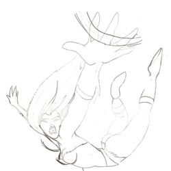
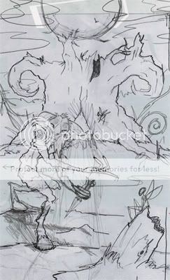
    So I dont want to post WIP pics in my main thread, so I'm gonna just make a WIP thread, cause I still want critiques (got this idea from KAD). Finals will only be posted in my main thread.

    So please critique my WIP's as they're posted... but constructively, please.

    Sticks and stones, and all of that...
     
  2. Mattchew Registered

    Joined:
    Nov 3, 2005
    Messages:
    4,990
    Likes Received:
    0
    So I'm gonna do a pic based on the faun, tree, and fairies in 'Pan's Labyrinth'...

    As some have requested, I'm trying (and I realize this is a babyset) to inject a little depth into my pieces so they're not SO completely flat.

    I tried just a bit with the pose to give a bit of depth between when the legs are planted. Not sure if its really all that successful. I also did three fairies (ones way back on the tree) to sell the distance, which is kinda cheating in a way but im new to this.

    I think I'll be able to fool around with the environment to make the depth of it work, but we'll see.

    Anyway, here is the sketch (looks a bit weird cause its made of 3 sketches photoshopped together)...

    [​IMG]

    Let me know what you think!
     
  3. Mrh7448 I am not a Side Kick

    Joined:
    Mar 29, 2006
    Messages:
    2,029
    Likes Received:
    0
    looking good, nice to see a little more life in your work. I think it's a really good place to start and look forward to seeing the final
     
  4. Joined:
    Oct 1, 2007
    Messages:
    10,912
    Likes Received:
    1
    I like your line work, very clean and bold, good composition also.
    Adding shadow will automaticaly add more depth to the picture, this picture looks like it has depth even without any real shadow because of your perspective and the line work giong from think to thin to emphasis form. If your giong to add shadow I'd make sure the shadow links up or it can ruin an otherwise good picture.
     
  5. Mrh7448 I am not a Side Kick

    Joined:
    Mar 29, 2006
    Messages:
    2,029
    Likes Received:
    0
    oh yeah the other thing that can help with creating depth is varying your line weight. You have a pretty distinctive style and way of drawing but you might want to experiment a little with that.
     
  6. Phig Registered

    Joined:
    Apr 13, 2007
    Messages:
    585
    Likes Received:
    0
    hell yes, looks wicked. can't wait to see more. one thing: i'm not sure with just one twig of the tre overlapping with the moon... could work in the final piece but it confuses the outlines... just a thought.
     
  7. Mattchew Registered

    Joined:
    Nov 3, 2005
    Messages:
    4,990
    Likes Received:
    0
    I think I'm only gonna do outlines on things in the foreground... Let me know what you think of the line weight specifically when im done... id be interested in your comments.

    im posting an update, shortly... let me know if its still and issue for you... i can always shift things around.

    ----------------------------------------------------

    Here's a flat update... of the background:

    [​IMG]

    Shader version of the tree and sky shortly.
     
  8. Artistsean Monkey Boy

    Joined:
    Nov 23, 2005
    Messages:
    7,184
    Likes Received:
    1
    sorry, what is WIP mean?
     
  9. MODOK Registered

    Joined:
    Apr 2, 2006
    Messages:
    350
    Likes Received:
    0
    Work in progress.
    Loving the shaded background Matt!
     
  10. Mattchew Registered

    Joined:
    Nov 3, 2005
    Messages:
    4,990
    Likes Received:
    0
    Thanks...

    so here's an update with a shaded tree and background and the start of the foreground...

    [​IMG]

    id love to hear thoughts on the moon/tree silhouette issue, the saturation of color in the foreground and background... stuff like that.
     
  11. MODOK Registered

    Joined:
    Apr 2, 2006
    Messages:
    350
    Likes Received:
    0
    I like how the light from the moon is filtering through the hole in the front of the tree. I didn't catch that in your initial sketch. It seems to give the tree some depth in my opinion.
     
  12. spidey-dude Y.N.W.A

    Joined:
    Aug 22, 2005
    Messages:
    7,867
    Likes Received:
    6
    OH GOD ANOTHER FRICKIN THREADDD???????


    *subscribes*
     
  13. KAD Registered

    Joined:
    Oct 20, 2004
    Messages:
    4,390
    Likes Received:
    0
    Matt wikd cool

    Looks like you've stepped onto another "plane" of excellence
     
  14. Mattchew Registered

    Joined:
    Nov 3, 2005
    Messages:
    4,990
    Likes Received:
    0
    thanks all... sorry spidey-dude. ;)

    -------------------------------------------------------

    update....

    [​IMG]


  15. Mattchew Registered

    Joined:
    Nov 3, 2005
    Messages:
    4,990
    Likes Received:
    0
    before bed...

    update:

    the faun... temp colors, and no real detailing done.

    [​IMG]

    let me know what you think!
     
  16. Tissues Registered

    Joined:
    Jan 17, 2005
    Messages:
    1,748
    Likes Received:
    0
    Your lines are so clean and nice.
     
  17. Vilya Donut Lord

    Joined:
    Jun 2, 2006
    Messages:
    7,045
    Likes Received:
    6
    Always loved your art, the tree and moon already brings out the mood :up:
     
  18. Mattchew Registered

    Joined:
    Nov 3, 2005
    Messages:
    4,990
    Likes Received:
    0
    thanks all.....

    update on the faun:

    these are still temp colors... the shading is done, but it will end up with a much more cool feeling in the end to tie it into the setting. regardless, ...

    [​IMG]

    Let me know what you think!
     
  19. KAD Registered

    Joined:
    Oct 20, 2004
    Messages:
    4,390
    Likes Received:
    0
    Matt

    Seriously why aren't you in the industry great stuff
     
  20. Mattchew Registered

    Joined:
    Nov 3, 2005
    Messages:
    4,990
    Likes Received:
    0
    Thanks KAD!

    .........................................................

    Update:

    Still very much a WIP... Added the shaded Faun in and the fairies with flat colors....

    [​IMG]

    Now I have to tweak colors to fit all the characters into the setting, shade the fairies, and and environmental stuff like haze and and shadows and stuff...

    In the home stretch... I'll finish tomorrow.

    Let me know what you think!
     
  21. ravana Registered

    Joined:
    Jul 8, 2006
    Messages:
    618
    Likes Received:
    0

    Great subject... and its looking great. Nice blend of your style and the original look.
     
  22. Mattchew Registered

    Joined:
    Nov 3, 2005
    Messages:
    4,990
    Likes Received:
    0
  23. ComicChick I Work Too Much

    Joined:
    Apr 29, 2004
    Messages:
    73,095
    Likes Received:
    7,019
    im jealous of your coloring skills
     
  24. Mattchew Registered

    Joined:
    Nov 3, 2005
    Messages:
    4,990
    Likes Received:
    0
    Doing a picture of Poison Ivy falling...

    Again trying to do stuff thats a bit more dynamic with more depth.

    Here's the sketch:

    [​IMG]

    Let me know what you think.
     
  25. Phig Registered

    Joined:
    Apr 13, 2007
    Messages:
    585
    Likes Received:
    0
    LOVE the exaggerated perspective

    have just been watching afro samurai on dvd which does that so well
     

Share This Page

  1. This site uses cookies to help personalise content, tailor your experience and to keep you logged in if you register.
    By continuing to use this site, you are consenting to our use of cookies.
    Dismiss Notice
  1. This site uses cookies to help personalise content, tailor your experience and to keep you logged in if you register.
    By continuing to use this site, you are consenting to our use of cookies.
    Dismiss Notice
monitoring_string = "afb8e5d7348ab9e99f73cba908f10802"