The Official Costume Thread - - - - Part 13

Status
Not open for further replies.
Yep.

Unitard:

male_unitard.jpg


1900's Circus Strongman:

OldTimeLifter.jpg
Funny, you didn't even recognize that the "circus strongman" is wearing a unitard, but with a belt.
 
If this is what they're going with, it may or may not work, just according to how good the pattern looks.


Unfortunately, yes. They listened to the decons and the decons won. It's a shame.


If you knew anything about my position on the costume, I have said that keeping to the classic as designed by Joe Shuster, Superman's co-creator, is my first choice, but if the deconstructionist sect that is so ashamed of anything traditional just HAVE to get rid of the trunks, then they need to come up with SOMETHING good to break up the huge blob of blue. If SuperDaniel is right in his manips, then they have done that by co-opting design elements from Captain Marvel (as I have mentioned before) with the gauntlets on his forearms-still colored blue but pretty much cribbed directly from Captain Marvel's costume, and by making the waist/belt are a little more ornate to make up for the removal of the trunks. Does it work? It might. Is it better than the trunks? A matter of taste, I suppose.

That's all I need to say in response. Not gonna feed another troll/sock puppet.

Kuro... u, of all people should no better. Superman's very first appearance included stylized wrist cuffs. What the Snyder crew have done here is cobble together elements from different periods of the character and assembled them with some modern tweaks.

I, for one, am not a fan of the texture and find the raised emblem with all the seams around it and the cape attachement to be distracting. I'm absolutely sure that there are no trunks. Anyone who is using Photoshop to pick up the colour from the shadowed area of the area below the belt have completely missed the fact that the suit is a bit reflective and is picking up colour from the cape. I would have preferred the trunks and would like to have lost the texture and the three dimensional trim but it is what it is.

BTW, am I the only one here that thinks his suit looks too plastic? And, while I love the Nolan Bat costume, I've grown tired of the rubber superhero suits. While I hate the SR suit, I'd hoped for the material used in that body suit.

None of this will keep me from seeing the movie, however.

I am starting grown fond of the semi retro emblem, though. I love the traditional one and don't want DC to change to this but I don't mind it for the movies. After all, the movies are a different reality than the comics. Kind of why the loss of the trunks isn't totally upsetting me.
 
Except there's no grey/silver around the \S/ and there's no yellow around the thighs/abdomen areas.

If you look closely there is the silver outlining the shield. Kinda matches the detailing around the cape attachment. But I'm with you on the yellow details, though. I don't see those either.
 
BTW, am I the only one here that thinks his suit looks too plastic?


I've had that same thought. I've been waiting till a full body shot and another look of the costume has been released before I make my final judgement, but the more I look at the promo shot of the suit, the more I dislike the costume.
 
Except there's no grey/silver around the \S/ and there's no yellow around the thighs/abdomen areas.


So what is it around the \S/ shield that a lot us vision impaired people are seeing? I see a silver/greyish/blue piping, that's also present on the neckline and cape attachment. What do you, with your amazing ocular abilities see (or not see as the case may be) that we do not?
 
I still think they should have gone more traditional. I like the suit overall, but I will be missing the gold belt and trunks
 
Funny, you didn't even recognize that the "circus strongman" is wearing a unitard, but with a belt.

I have a feeling there are many details and/or circumstances he willfully ignores so that he can continue to espouse his positions. Don't be surprised.
 
Kuro... u, of all people should no better. Superman's very first appearance included stylized wrist cuffs. What the Snyder crew have done here is cobble together elements from different periods of the character and assembled them with some modern tweaks.

I, for one, am not a fan of the texture and find the raised emblem with all the seams around it and the cape attachement to be distracting. I'm absolutely sure that there are no trunks. Anyone who is using Photoshop to pick up the colour from the shadowed area of the area below the belt have completely missed the fact that the suit is a bit reflective and is picking up colour from the cape. I would have preferred the trunks and would like to have lost the texture and the three dimensional trim but it is what it is.

BTW, am I the only one here that thinks his suit looks too plastic? And, while I love the Nolan Bat costume, I've grown tired of the rubber superhero suits. While I hate the SR suit, I'd hoped for the material used in that body suit.

None of this will keep me from seeing the movie, however.

I am starting grown fond of the semi retro emblem, though. I love the traditional one and don't want DC to change to this but I don't mind it for the movies. After all, the movies are a different reality than the comics. Kind of why the loss of the trunks isn't totally upsetting me.

:up::up::up::up::up::up::up::up::
 
If you look closely there is the silver outlining the shield. Kinda matches the detailing around the cape attachment. But I'm with you on the yellow details, though. I don't see those either.

So what is it around the \S/ shield that a lot us vision impaired people are seeing? I see a silver/greyish/blue piping, that's also present on the neckline and cape attachment. What do you, with your amazing ocular abilities see (or not see as the case may be) that we do not?
It's just the lighting that makes it look that color. Around the collar, etc., is just blue, raised material.
 
Check out the the boots. The raised area that outlines the top. It's just raised, sort of "ribbed", with the same color as the base material.
 
Check out the the boots. The raised area that outlines the top. It's just raised, sort of "ribbed", with the same color as the base material.

I'm not so sure:

Screenshot2011-08-09at70520PM.png


The edge of the S is at the same angle to the light as the edge of the shield and the shield is definitely reflecting more of a silver colour, compared the S. If it was just a raised portion of the red material it would reflect the same as the S...
 
Kuro... u, of all people should no better. Superman's very first appearance included stylized wrist cuffs. What the Snyder crew have done here is cobble together elements from different periods of the character and assembled them with some modern tweaks.

I, for one, am not a fan of the texture and find the raised emblem with all the seams around it and the cape attachement to be distracting. I'm absolutely sure that there are no trunks. Anyone who is using Photoshop to pick up the colour from the shadowed area of the area below the belt have completely missed the fact that the suit is a bit reflective and is picking up colour from the cape. I would have preferred the trunks and would like to have lost the texture and the three dimensional trim but it is what it is.

BTW, am I the only one here that thinks his suit looks too plastic? And, while I love the Nolan Bat costume, I've grown tired of the rubber superhero suits. While I hate the SR suit, I'd hoped for the material used in that body suit.

None of this will keep me from seeing the movie, however.

I am starting grown fond of the semi retro emblem, though. I love the traditional one and don't want DC to change to this but I don't mind it for the movies. After all, the movies are a different reality than the comics. Kind of why the loss of the trunks isn't totally upsetting me.

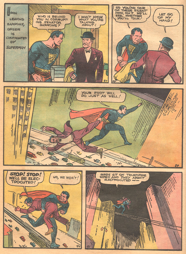
You are right, there is a cuff pattern in some panels of Action #1:

page3.jpg


And in others there is no pattern:

page12.jpg


So yeah, they could have taken it from there...wherever they took them from, they are trying to address that a Superman costume without the trunks needs additional flourishes to work.

I have always maintained that the trunks are the best visual choice but I do think it CAN work without them. Why accepting second best is acceptable to people is beyond me, but that's been the standard with Superman for years now.

SuperDaniel's manip is the most acceptable design I've seen so far.
 
Holy moly I never noticed those cuffs in that comic... Great eye there :up: for me, that makes the cuffs more acceptable in my eyes
 
You are right, there is a cuff pattern in some panels of Action #1:

page3.jpg


And in others there is no pattern:

page12.jpg


So yeah, they could have taken it from there...wherever they took them from, they are trying to address that a Superman costume without the trunks needs additional flourishes to work.

I have always maintained that the trunks are the best visual choice but I do think it CAN work without them. Why accepting second best is acceptable to people is beyond me, but that's been the standard with Superman for years now.

SuperDaniel's manip is the most acceptable design I've seen so far.


Repeat after me...There will be trunks, there will be trunks, there will be trunks. Keep the faith! The suit undoubtably has little flourishes or fillips to make it a visual feast for today's GA, but I don't think these extra touches are in lieu of the trunks. Snyder is picking different elements from 70 years of suits, so where in that 70 years (apart from electric Superman and perhaps some AU stuff) does he draw inspiration for a trunkless Superman? The cuffs on the original Superman are very interesting. Never noticed those before.
 
I've seen the cuffs but never gave them a seconds thought, I always noticed the boots more:

original_1934.gif


s-1934.jpg


That was a good observation by David.

Kinda crazy-I've read the Action #1 story thousands of times, yet still see things in it that I didn't notice before.
 
Why is everyone using that old comic strip as an excuse for the trunks but ignoring the fact that he's not wearing his boots at all? :huh:
 
Personally, I'd like to see an exact replica of that suit in the materials of that day
 
He's wearing the boots but they weren't colored in.
 
Why is everyone using that old comic strip as an excuse for the trunks but ignoring the fact that he's not wearing his boots at all? :huh:

Same reason they're not whining the shield deviates from tradition too. Hypocrisy.
 
Last edited:
He's clearly not weraing any boots, in any of the panels. :whatever:

I mean, I'll lest slide that even the chest \S/ is colored wrong as it's clearly drawn in even though it's yellow, but there is nothing to indicate any boots.
 
Look closer, they were drawn in but not colored.

They're probably clearest on the last panel of this page:

page7.jpg
 
I'd believe that if his shoes were supposed to be ballet slippers, but from the design itself, the comic gets the shoes wrong, so I'm not sure why any mind is being paid to it.

Also, notice how it doesn't have the ever so loved \S/ on the back of the cape? :cwink:
 
I think we just have to accept small changes. The shield has been changed a great many times over the years, but all of them are still Superman. I see the trunks the same way. The more you look at the suit without trunks, the more you get used to it. I like the trunks, but I can get used to them being gone. Once you see the new suit in motion, you won't even notice them missing.

After seeing the rest of the suit, I have faith in the path Snyder's taking.
 
Those comics are from 1938 for god's sake. Coloring wasnt that good back then. He has the boots but he it isnt colored right.
 
Status
Not open for further replies.

Users who are viewing this thread

Back
Top
monitoring_string = "afb8e5d7348ab9e99f73cba908f10802"