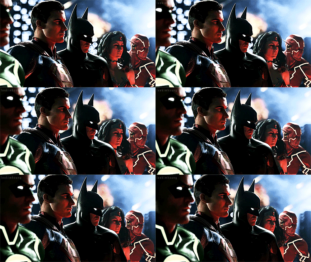
BvS The Superman suit Thread - Part 1

Status
Not open for further replies.
If they have to completely overhaul the suit design, I want something like this.
3697368-2411479714-1600x.jpg

I think this is the first time I've ever seen anyone show that they liked the New 52 suit.
 
Lol. What the hell is that? Super Robocop.
 
Hell no to that Nu52 armor thing. Dear Zod... No. Just no.
 
I like that art because it's animated Cav-el, but a big no to that suit.
 
I definitely want brighter colors. You fix that, and maybe tweak the shield a bit(since the shield is my least favorite part of the new suit) and we're good.
 
Looks like a circus performer. The original colors have much more style. This is just too vibrant. Good for a comic book or cartoon, but not so much for a movie.

since when does dark mean style?... if you want that, go watch a Batman movie... this isn't batman.

i happen to think the brighter colors make him stand out better- plus, Superman is supposed to stand out, to be larger than life.
 
I don't like the new 52 collar. The MOS suit with very minor changes is perfect for me.
I'm so glad they nailed the neckline and the chest logo size. Man that Superman Returns suit sucked
 
since when does dark mean style?... if you want that, go watch a Batman movie... this isn't batman.

i happen to think the brighter colors make him stand out better- plus, Superman is supposed to stand out, to be larger than life.

Well, then too bad for you, because you won´t get your brighter colors. Like me, Zack Snyder thinks darker colors look cooler in this particular universe, so there will be no bright colors in Superman´s costume. This is not a comic book and we´re not in 1978.

The colors used in MOS are perfect for that universe. Imagine him walking around dresssed in vibrant red and blue. He would look like a clown. In comics Superman uses bright colors, but the universe that surrounds him is also bright. Everything is colorful, because it is a comic book. In comics everything stands out way too much, even Batman costumes. It´s one characteristic of that medium. Everything is exaggerated. But this is a movie, and i want something that looks real.
 
Last edited:
FYI, the suit is going to be tweaked... for all we know, the colors will be tweaked, or the overall design may tweaked, we dont know- so take a chill pill. for all we know, he actually may be changing the color scheme for the next film since Batman is going to be a part of it. it would be silly and foolish to have two characters, one inspired by hope and another inspired by fear, have dark costumes... it doesnt make sense. hope is not a darkly lit concept... it's a bright, light-filled concept. that way, it makes them easier to contrast one another

by the way, Superman is a comic book character, so a colorful costume is pretty much a must... second, that is NOTHING like the Donner suit colors. the Donner suit had a cyan blue, neon red, and a light mustard yellow. the manip i made was nothing like that.
 
Man that Superman Returns suit sucked

I can proceed with an entire night of being sh***faced drunk and make a crappy cosplay Super-suit better than the SR abomination. It made me want to vomit.

The MOS suite is a thing of beauty. A'more!
 
FYI, the suit is going to be tweaked... for all we know, the colors will be tweaked, or the overall design may tweaked, we dont know- so take a chill pill. for all we know, he actually may be changing the color scheme for the next film since Batman is going to be a part of it. it would be silly and foolish to have two characters, one inspired by hope and another inspired by fear, have dark costumes... it doesnt make sense. hope is not a darkly lit concept... it's a bright, light-filled concept. that way, it makes them easier to contrast one another

by the way, Superman is a comic book character, so a colorful costume is pretty much a must... second, that is NOTHING like the Donner suit colors. the Donner suit had a cyan blue, neon red, and a light mustard yellow. the manip i made was nothing like that.

Are you sure they said the colors will be tweaked?

Even if that´s the case, don´t expect bright colors. If Snyder wanted to represent hope through colors he would have done it right in the first movie. He specifically said he prefers the darker blue, so i´m not seeing him going against something that he prefers just to please the members of this forum. He is the director, so he is going to do things his way.

You can say it makes no sense all you want, but nobody gives a damn about that besides a very small minority. People wanna see something that looks good, and that´s all. Plus, in this movie the colors of the suit have no philosophical value that we know of, so the principles that you were talking about don´t apply in this case.
 
New posters always know it all.
 
The colors used in MOS are perfect for that universe. Imagine him walking around dresssed in vibrant red and blue. He would look like a clown. In comics Superman uses bright colors, but the universe that surrounds him is also bright. Everything is colorful, because it is a comic book. In comics everything stands out way too much, even Batman costumes. It´s one characteristic of that medium. Everything is exaggerated. But this is a movie, and i want something that looks real.

even in the real world, there are bright colors... you go outside, you will see variances of green, blue, yellow, and such. even look at the clothes that people wear outside- some of the clothes that we call "normal" are ridiculously bright, so one can't necessarily use the "comics are bright so everything has to be bright" perspective. we have examples of today's fashion using colors just as bright, if not brighter, than what we see in comics.

i wouldnt mind something real either, but to say that "bright is unrealistic" is a contradiction, because of today's fashion statement. the main reason that Superman is a brightly colored individual is because of the principles he stands for. there's a reason Batman looks the way he does, and the same goes for Superman. a brighter color tone can word for Superman... no, i dont think Donner bright will cut it anymore, but a brighter tone than what we had in MOS is doable. when that Hardees/Carl's Jr commercial came out, i personally think they had the suit dead spot on IMO... if you compare my last manip to the shots of Supes in that commercial, it's literally the same color tones that i used, just in a slightly desaturated hue
 
I don't see why there needs to be a philosophical reason for brighter colors. They could do that because it looks good.
 
Are you sure they said the colors will be tweaked?

Even if that´s the case, don´t expect bright colors. If Snyder wanted to represent hope through colors he would have done it right in the first movie. He specifically said he prefers the darker blue, so i´m not seeing him going against something that he prefers just to please the members of this forum. He is the director, so he is going to do things his way.

You can say it makes no sense all you want, but nobody gives a damn about that besides a very small minority. People wanna see something that looks good, and that´s all. Plus, in this movie the colors of the suit have no philosophical value that we know of, so the principles that you were talking about don´t apply in this case.

please note i never said it was "going" to be the colors, i just implied that it could be a possibility

i never was expecting something like a donner revision... if they make a brighter blue, i think it would do just fine. my only gripe about the suit in the movie was how dull that blue was

if that be the case, then Batman would of been in a spandex pink costume with a tutu attached... the truth is, color in a movie does play a part, whether you want to believe it or not. if you look at the differences of the color filters of both Batman Begins and The Dark Knight, you would recognize that...
 
There have been plenty of manips throughout the history of this thread where the MoS suit's colors were made richer and more vibrant and it looked incredible. Darker, more muted tones do not give off the uplifting, approachable, and hopeful demeanor that should be inherent in the character.
 
Last edited:
I don't see why there needs to be a philosophical reason for brighter colors. They could do that because it looks good.

are you going to have a brooding, dark, gruff character in brighter colors or dark colors?
are you going to have a character like Superman in bright colors or dark colors?

it's that simple- both the suit and colors indirectly and subtly reflect what the individual stands for.
 
There have been plenty of manips throughout the history of this thread where the MoS suit's colors were made richer and more vibrant and it looked incredible. Darker, more muted tones do not give off the uplifting, hopeful demeanor that should be inherent in the character.

and this is the point that I try to make.

you dont make superman, a superhero that stands for truth and justice, who flies through the sky among the birds, who flies out into space and smiles fro the camera, don a dark suit...

it simply does not make sense for the character at all... just as no one would put a pink tutu on batman.
 
even in the real world, there are bright colors... you go outside, you will see variances of green, blue, yellow, and such. even look at the clothes that people wear outside- some of the clothes that we call "normal" are ridiculously bright, so one can't necessarily use the "comics are bright so everything has to be bright" perspective. we have examples of today's fashion using colors just as bright, if not brighter, than what we see in comics.

i wouldnt mind something real either, but to say that "bright is unrealistic" is a contradiction, because of today's fashion statement. the main reason that Superman is a brightly colored individual is because of the principles he stands for. there's a reason Batman looks the way he does, and the same goes for Superman. a brighter color tone can word for Superman... no, i dont think Donner bright will cut it anymore, but a brighter tone than what we had in MOS is doable. when that Hardees/Carl's Jr commercial came out, i personally think they had the suit dead spot on IMO... if you compare my last manip to the shots of Supes in that commercial, it's literally the same color tones that i used, just in a slightly desaturated hue

The colors that i see around me look nothing like what i see in a comic book. In comic books things are way more vibrant and stylized. Snyder wants a serious tone in his superman movies, so that´s what you´re getting.

This is not about what you like or think it´s right. This is about the director´s vision for this particular universe, and that´s well defined. He can always change the colors, but to go brighter with them would be to go against what he prefers, and i don´t see why that would happen.
 
and i see a possibility of them going brighter because of the inclusion of Batman in the film.
 
are you going to have a brooding, dark, gruff character in brighter colors or dark colors?
are you going to have a character like Superman in bright colors or dark colors?

it's that simple- both the suit and colors indirectly and subtly reflect what the individual stands for.

Everything was given less saturated colors, not just his suit. His suit even stood out a bit in some scenes.
 
Status
Not open for further replies.

Users who are viewing this thread

Back
Top
monitoring_string = "afb8e5d7348ab9e99f73cba908f10802"