BvS The Superman suit Thread - Part 1

Status
Not open for further replies.
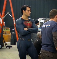
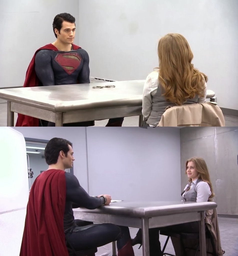
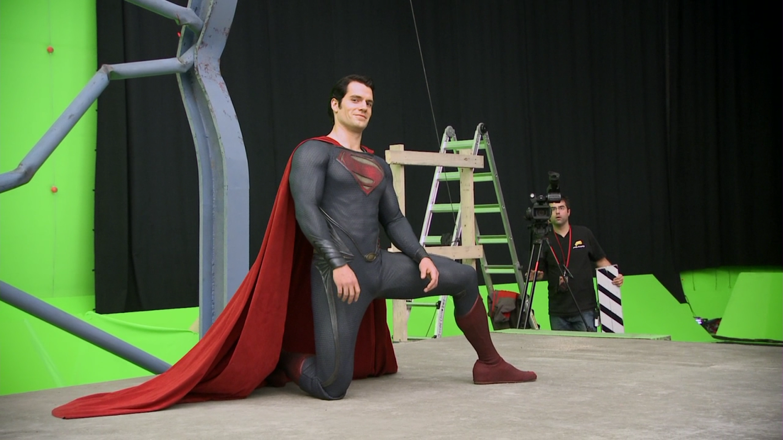
Everything was given less saturated colors, not just his suit. His suit even stood out a bit in some scenes.

i know, and that's what i didn't like... they tried doing something similar in the first sherlock holmes movie, and it looked so terrible...

this nsi why i always up the saturation a bit when i watch MOS. it actually looks normal then...
 
We´ll see. Superman´s suit doesn´t need to get brighter in order to contrast with Batman´s suit. It is already more colorful.
 
after watching the scene with Superman handcuffed, sitting in a chair talking to Lois, i think it does need to be brightened...
 
Looks like a circus performer. The original colors have much more style. This is just too vibrant. Good for a comic book or cartoon, but not so much for a movie.

wasn't his suit based off a circus strong man??

I think that colour pallet it perfect, it should be vibrant.
 
wasn't his suit based off a circus strong man??

I think that colour pallet it perfect, it should be vibrant.

Well, being faithful to the source doesn´t always make for a better movie.

I don´t wanna see Superman walking around looking like a colorful bird, the same way i don´t wanna see Robin walking around with no pants.
 
I think the color of the actual suit is fine. In real life the suit had much more color.
 
I think the color of the actual suit is fine. In real life the suit had much more color.
Not really.

blogger-image--334167670.jpg
 
Look at that kid, wearing a vibrant red shirt in real life. What an idiot.

:awesome:
 
Damn, that cape is so awesome. Look at it spread out behind him. I just love how giant and velvety it is.
 
In reality though that is horrible lighting and probably taken from a cell phone, everyone looks pale in it.
White people tend to be so. :funny:

In any case Henry is standing right next to a vibrant red shirt, the pic can't be that unsaturated.
 
White people tend to be so. :funny:

In any case Henry is standing right next to a vibrant red shirt, the pic can't be that unsaturated.

These guys look sickly pale though, no offense to them but even Cavill looks very pale. I think it is the lighting. They have the look in that picture of "It has been snowing here since October and I haven't seen the sun since" kind of pale.
 
Look at that kid, wearing a vibrant red shirt in real life. What an idiot.

:awesome:

There´s a reason why it´s more common to see someone wearing a vibrant yellow shirt than vibrant yellow pants. It´s because colors don´t produce the same kind of effect in all types of clothes and materials. One color can look amazing in a t shirt but not so much in a jacket.

Superman suit is already excentric enough. No need to make it too vibrant. Vibrance can bring out a lot more the elements of the suit, especially the bad ones. A darker tone helps to keep things a little more discrete and well balanced. Plus, it makes it look less like a cartoon.

Things gotta work within it´s universe. In this universe, brighter colors would contrast way too much with everything around him.

Zack Snyder would have to change the way the whole movie looks in order to change the suit´s colors. But why bother? We´ve had colorful superman suits up until now. Why not enjoy something a little different?
 
Zack Snyder would have to change the way the whole movie looks in order to change the suit´s colors.
Wouldn't be the first time it's happened. It's already occurring with the Spidey franchise. And Zack is changing cinematographers this time around (though said individual has confirmed a return of the muted palette).

But why bother? We´ve had colorful superman suits up until now. Why not enjoy something a little different?
The issue is there are many who are not fans of the bleak visuals. I think it was sort of fitting for the first story, but moving forward I could see a slight shift to a more rejuvenated setting.

There's an entire spectrum of color and I don't think an increase in saturation is anywhere near approaching Avengers-like territory. That sort of comic book look is more thanks to the writing, art/costume design, and directorial tone, more than the colors themselves.

Something akin to the Star Trek reboot would be a welcomed upgrade in my book.
 
Wouldn't be the first time it's happened. It's already occurring with the Spidey franchise. And Zack is changing cinematographers this time around (though said individual has confirmed a return of the muted palette).


The issue is there are many who are not fans of the bleak visuals. I think it was sort of fitting for the first story, but moving forward I could see a slight shift to a more rejuvenated setting.

There's an entire spectrum of color and I don't think an increase in saturation is anywhere near approaching Avengers-like territory. That sort of comic book look is more thanks to the writing, art/costume design, and directorial tone, more than the colors themselves.

Something akin to the Star Trek reboot would be a welcomed upgrade in my book.

It also happened with the old Batman movies. But part of it had to do with the change of directors. And the difference between Batman and Batman Returns comes from Burton having more freedom the second time around.Not sure if Snyder would do that though. It´s not like there´s a big demand for it. And he made the movie he wanted to make. It´s not like he was pushed to do things that way. He had creative control.

Regarding the cinematographer, doesn´t the look of the movie has more to do with the director than the cinematographer himself? It´s not like, for example, Snyder would need Larry Fong in order to achieve the look of Watchmen. Any decent cinematographer would be able to replicate that.
 
In reality though that is horrible lighting and probably taken from a cell phone, everyone looks pale in it.

Yeah. The lighting is horrible because they are basically standing in their own shadows. Look at how their backs are standing against the sunlight and how the shadows beneath cast their own silhouettes. If there is a light-source in this, it's completely blocked out and we all know the MOS-suit texture plays off of different lighting.

IMHO, this is the worst photo to use when trying to argue the suits colors, which has shown to be vibrant in different fixtures and settings.
 
Not really.

blogger-image--334167670.jpg

Those colors are atrocious.


And that "just above is junk" buckle drives me insane.


And to anyone arguing that it looks like that because of the lighting, do remember that it looks JUST like that in the well lit, in studio BTS videos.
 
Damn, that cape is so awesome. Look at it spread out behind him. I just love how giant and velvety it is.

I think it's too long. Would be nice if they shortened it.
 
Yeah. The lighting is horrible because they are basically standing in their own shadows. Look at how their backs are standing against the sunlight and how the shadows beneath cast their own silhouettes. If there is a light-source in this, it's completely blocked out and we all know the MOS-suit texture plays off of different lighting.

IMHO, this is the worst photo to use when trying to argue the suits colors, which has shown to be vibrant in different fixtures and settings.
The suit is undeniably muted. Snyder wouldn't go out of his way to make a colorful costume only to post-process it in a different direction. There are plenty of other shots which showcase the suit under various lighting.

10869456435_0f1c047be3_m.jpg


Henry_Cavill_Man-of-Steel-Flying.jpg


Man-of-Steel-Behind-the-Scenes-Footage.jpg


image.jpg


mosblurayextras-1959.png
 
The "floating buckle" thing is a bit weird. I don't notice it when watching the movie, but objectively I find it difficult to defend.
 
The suit is undeniably muted. Snyder wouldn't go out of his way to make a colorful costume only to post-process it in a different direction. There are plenty of other shots which showcase the suit under various lighting.

10869456435_0f1c047be3_m.jpg


Henry_Cavill_Man-of-Steel-Flying.jpg


Man-of-Steel-Behind-the-Scenes-Footage.jpg


image.jpg


mosblurayextras-1959.png

I'm not arguing the suit has a muted color. Chalk me down as somebody who doesn't really care about the colors AT ALL because I loved the suit and thought it was flat-out AWESOME.

The muted color has been known for a very long time and it's just the way it is but on the other hand, even that photo of Henry standing against the bank-vault has the blue coming out in many spots. The texture and color looks different in the way certain light hits it. I'm no expert in the material, but in many ways, it looks different. It's probably, IMO, one of the things that will change with Supe's suit..the texture.
 
Not for the shortenning of cape!!!!!!!!!!! :argh:
Dat cape is majestic!!!!!
 
The "floating buckle" thing is a bit weird. I don't notice it when watching the movie, but objectively I find it difficult to defend.
It's one of things I'm surprised wasn't talked about more, considering how far fans delve into every detail.

Of the tweaks they plan to make, I hope the midsection is one they work on the most. I've always felt it was a superfluous design element which can be improved upon.
 
Status
Not open for further replies.

Users who are viewing this thread

Latest posts

Forum statistics

Threads
202,433
Messages
22,105,068
Members
45,898
Latest member
NeonWaves64
Back
Top
monitoring_string = "afb8e5d7348ab9e99f73cba908f10802"