Astro13Zombie
Superhero
- Joined
- May 28, 2008
- Messages
- 9,287
- Reaction score
- 1,648
- Points
- 103
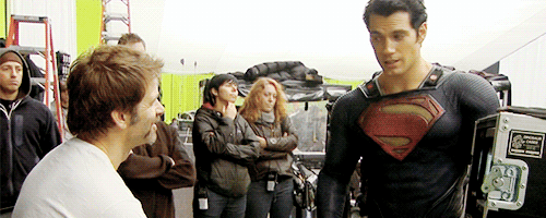
Thinking about them changing the suit makes me feel anxious.
They're messing with goddamn perfection!
They're messing with goddamn perfection!
I actually like a slightly darker red...less visually obtrusive IMO.
Thinking about them changing the suit makes me feel anxious.
They're messing with goddamn perfection!
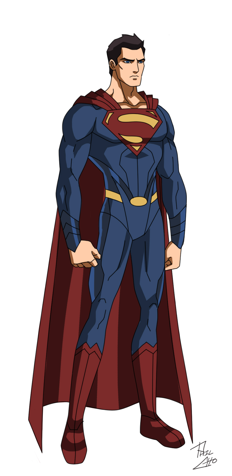
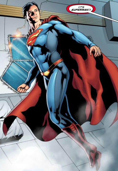
I don't think they'll make major improvements to the waist.I prefer the cape attachment to the MOS suit, but I'm open to them making the belt more substantial like that picture.
 t:
t:Thinking about them changing the suit makes me feel anxious.
They're messing with goddamn perfection!
I don't think they'll make major improvements to the waist.
A new idea came from my mind in terms on the "suit" changing. What if the superman suit was designed/modified (remember it was Kara's ship) by some kind of kryptonian software in the scout ship by Jor-el. What if Superman or STAR labs hacks that software and helps superman to make some improvements in the new suit with some Superman's wishes. Thats of course if the suit is nannobotic.
You know the lack of news make someone to make up ideas
What do you think? Be kind.
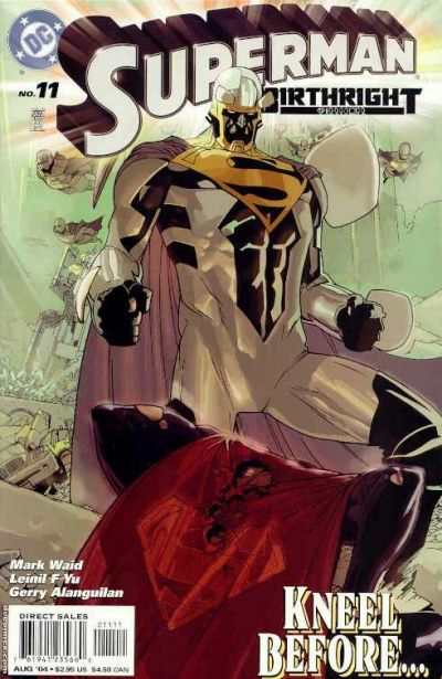
That's pretty close to the MOS suit.
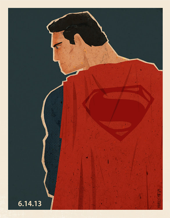
If they have to completely overhaul the suit design, I want something like this.

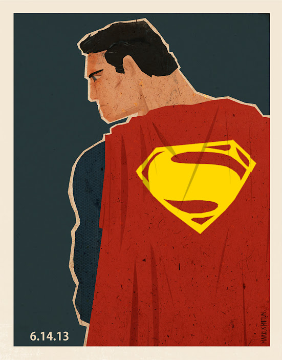
MANIP BY GLASSJAW (1ST ONE) AND THE COLOR CHANGE THANKS TO BATFAN1979.
that's why i always push for the more vibrant blue... since we have green screen, the blue wont be affected by it, and if there are problems with the blue, you can always darken it in post...
that's why, i think, working with bright colors is better because one can always go in and darken the colors to their liking
I actually like this more!!! XD
I hope they change the texture on the red parts of the suit and the gold parts of the belt to be smooth/smoother. I don't know why but it always seemed weird to me that those parts, especially the belt and boots, had the same "chainmail" texture as the main suit.
Not exactly. The body suit has a two-tone thing going on.That's pretty much the Returns suit without the trunks.