You are using an out of date browser. It may not display this or other websites correctly.
You should upgrade or use an alternative browser.
You should upgrade or use an alternative browser.
BvS The Superman Suit Thread - Part 2
- Thread starter Thread Manager
- Start date
- Status
- Not open for further replies.
Bruce Malone
Superhero
- Joined
- May 23, 2009
- Messages
- 8,216
- Reaction score
- 11
- Points
- 33
The suit looks so much brighter!
It's never been about the color of the actual suit but the filter they use once they film it.
We will not know what the finished suit will really look like on screen until we get the first trailer.
In my estimation color wise it probably won't look too different from in MoS.
Herolee10
No More Miracles
- Joined
- Aug 31, 2007
- Messages
- 30,221
- Reaction score
- 6,782
- Points
- 103
I really love how the S looks on this suit. It's just perfect. There were times where the S looked somewhat strange on the MOS suit imho, but this one..looks absolutely perfect.
My only minor complaint is that i miss the yellow Oval that his MOS suit had.
It's ironic; I wanted thicker yellow strand (belt) lines around his waist for his next suit..which we got, but I ended up losing the oval as a result.haha
My only minor complaint is that i miss the yellow Oval that his MOS suit had.
It's ironic; I wanted thicker yellow strand (belt) lines around his waist for his next suit..which we got, but I ended up losing the oval as a result.haha
Saint
Avenger
- Joined
- Jul 16, 2003
- Messages
- 13,591
- Reaction score
- 1
- Points
- 56
I really don't care for the different treatment on the S, as compared to the MOS suit. I think it's the thicker border and "flatter" look that causes it, but it looks like it's lost it's definition and shapeliness.
I also strongly preferred the way the musculature was treated on the original suit. I really disapprove of air-brushed muscle.
I also strongly preferred the way the musculature was treated on the original suit. I really disapprove of air-brushed muscle.
NoLaNitE007
Do u Bleed? Do ya Punk?
- Joined
- Oct 25, 2013
- Messages
- 3,448
- Reaction score
- 0
- Points
- 31
The new tweaked suit is an improvement from the MOS suit. Both suits rock...but the lighter blue is just what the new suit needed with some added improvements around the wrists and torso area.
The new S is slightly smaller than the MOS S, but only slightly, so it is just fine by me.
The brighter gold around the S and the belt area is a nice touch also.
Cavill having shorter hair this time around was a good move as well for a more clean cut look.
The new S is slightly smaller than the MOS S, but only slightly, so it is just fine by me.
The brighter gold around the S and the belt area is a nice touch also.
Cavill having shorter hair this time around was a good move as well for a more clean cut look.
KillerWolf
Possibly partially drunk
- Joined
- May 13, 2014
- Messages
- 18,661
- Reaction score
- 0
- Points
- 31
It seems to me that the "chainmail" pattern in the "S" shield is a bit smaller than on the rest of the suit.


Last edited:
matt47
Avenger
- Joined
- Apr 18, 2013
- Messages
- 12,866
- Reaction score
- 520
- Points
- 73

I haven't tweaked the colors, only brightness and contrast because the picture was overexposed.
The blue doesn't seem to be too different after all.
Things I like from the suit
- The S shield. I used to hate how they changed in but from this pic it looks like it's barely changed (in size). I love the detail on the S and the gold.
- The cuffs/wristbands. Looks a lot better being integrated into the suit rather than in MoS.
- The colours
- The buckle. Sure I'd like the old circle but this buckle is just fine.
Things I don't like so much.
- The side piping. It looks painted on like the muscles (I'll get on that later).
- The muscles. Again, looks painted/brushed on. I much prefer the MoS look. Did the MoS suit have painted/brushed muscles on? Or was it just a body suit?
Casval
Red Comet
- Joined
- Jun 28, 2012
- Messages
- 693
- Reaction score
- 12
- Points
- 38
Did the MoS suit have painted/brushed muscles on?

It was brushed as well.
KillerWolf
Possibly partially drunk
- Joined
- May 13, 2014
- Messages
- 18,661
- Reaction score
- 0
- Points
- 31

I haven't tweaked the colors, only brightness and contrast because the picture was overexposed.
The blue doesn't seem to be too different after all.
It is a bit brighter, but mostly more vibrant:

lukebrodyg
Sidekick
- Joined
- May 7, 2013
- Messages
- 1,257
- Reaction score
- 0
- Points
- 31
Honestly, both costumes are done so well as a whole. I think the muscularity (body suit and or painted) has improved as it looks more anotomically accurate. Something about the midsection of the MOS costume looked a bit odd to me but seems to have been resolved.
Based on the images above, the colors looks almost identical despite what some are aspousing based on a few set photos.
(All of this IMO of course)
EDIT: I will say I prefer MoS hair at this juncture. I like that they've shortened it for BVS but I'm
not a huge fan of the overly gelled style. This ALS photo really shows how drastic that has been done and it just seems overdone.
matt47
Avenger
- Joined
- Apr 18, 2013
- Messages
- 12,866
- Reaction score
- 520
- Points
- 73
CGNefarious
Civilian
- Joined
- May 10, 2014
- Messages
- 276
- Reaction score
- 0
- Points
- 11
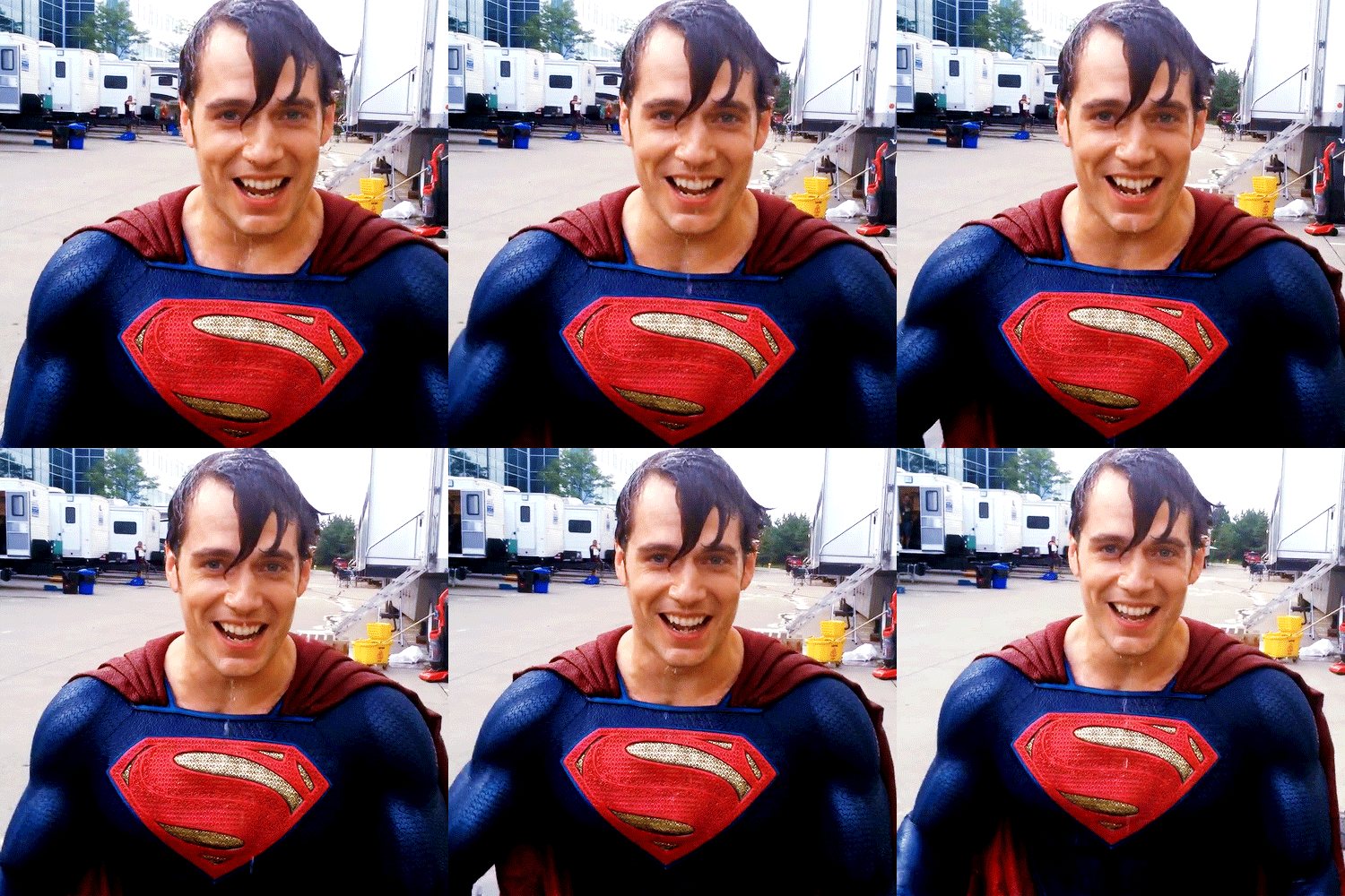
It seems to me that the "chainmail" pattern in the "S" shield is a bit smaller than on the rest of the suit.

Taken out of context this gif is kind of disturbing.
KillerWolf
Possibly partially drunk
- Joined
- May 13, 2014
- Messages
- 18,661
- Reaction score
- 0
- Points
- 31
Wet Superman? Why?
matt47
Avenger
- Joined
- Apr 18, 2013
- Messages
- 12,866
- Reaction score
- 520
- Points
- 73
Taken out of context this gif is kind of disturbing.
Man I have a disgusting mind but even I don't see how that's dirty
Bran The Man
Sumthin', Sumthin' Hero.
- Joined
- Jan 27, 2014
- Messages
- 1,427
- Reaction score
- 571
- Points
- 73
Pay attention to the left corner of the gif.
Brian Braddock
R.I.P. '96 Y.N.W.A.
- Joined
- Jun 5, 2005
- Messages
- 15,646
- Reaction score
- 259
- Points
- 73
Its all about the arm movement. C'mon guys, if there's anyone who can recognise that, its nerds posting on a message board. 

Young Superman
The Last Son of Krypton
- Joined
- Jul 17, 2009
- Messages
- 9,609
- Reaction score
- 4
- Points
- 31

I haven't tweaked the colors, only brightness and contrast because the picture was overexposed.
The blue doesn't seem to be too different after all.
I love this suit now.
KillerWolf
Possibly partially drunk
- Joined
- May 13, 2014
- Messages
- 18,661
- Reaction score
- 0
- Points
- 31
Its all about the arm movement. C'mon guys, if there's anyone who can recognise that, its nerds posting on a message board.
Oh, that... odd, I have a dirty mind, but it haven't crossed my mind at all.
Though I'm not really what one would consider to be a "nerd", so maybe that's why.

 t:
t:Steyin
Bidding you ADIEU!
- Joined
- Nov 12, 2006
- Messages
- 4,417
- Reaction score
- 563
- Points
- 73
It seems to me that the "chainmail" pattern in the "S" shield is a bit smaller than on the rest of the suit.
The MoS suit had 3 different chainmail sizes: one for the blue, one for the red in the emblem and one for the gold/yellow in the emblem.
Also, the armor doesn't seem to be as thick/raised and/or attached like the MoS suit, but rather seems painted on. While the overall suit design is nice and slightly better (I love the new cuffs with Kryptonian writing), the level of detailing and application is such a drop down honestly that it worries me. Perhaps this is more of a stunt suit...I hope.
We'll find out soon enough.
Last edited:
Gu3ree
Sidekick
- Joined
- Dec 25, 2013
- Messages
- 1,647
- Reaction score
- 213
- Points
- 73
His shoulders look bigger this time. Seems they brought the cape line and and neck line down a smidge and looks good.
I did notice the S was slightly smaller, in addition it looks very different from the MOS S. I'm wondering if this time, it won't have a reflecting shine on it.
I did notice the S was slightly smaller, in addition it looks very different from the MOS S. I'm wondering if this time, it won't have a reflecting shine on it.
Skrilla31
Sidekick
- Joined
- Jul 15, 2012
- Messages
- 1,399
- Reaction score
- 5
- Points
- 33
the new suit is better than the one in MOS.
plus i really like the square buckle because it makes it look more like a belt.
the lack of trunks looked weird on the MOS suit to me but on this one i don't miss them at all. it works fine.
plus i really like the square buckle because it makes it look more like a belt.
the lack of trunks looked weird on the MOS suit to me but on this one i don't miss them at all. it works fine.
- Status
- Not open for further replies.
Similar threads
- Replies
- 785
- Views
- 92K
- Replies
- 1K
- Views
- 99K
- Replies
- 999
- Views
- 106K
- Replies
- 1K
- Views
- 110K
- Locked
- Replies
- 1K
- Views
- 67K
Users who are viewing this thread
Total: 1 (members: 0, guests: 1)
Staff online
-
Lily Adler🎄 Peppermint Mocha 🍫
-
SwordOfMorningSuper Moderator
-
squeeknessI'm a poor lost puppy


