Mysteryman
Avenger
- Joined
- Jan 31, 2011
- Messages
- 15,352
- Reaction score
- 2,876
- Points
- 103
Not to mention,It is essential to show it in theaters to the general public during the Christmas period.
Excellent Marketing.
Xenforo Cloud upgraded our forum to XenForo version 2.3.4. This update has created styling issues to our current templates.
Starting January 9th, site maintenance is ongoing until further notice, but please report any other issues you may experience so we can look into.
We apologize for the inconvenience.
Not to mention,It is essential to show it in theaters to the general public during the Christmas period.
Corenswet had hinted last month that he would be present in Brazil.Best case scenario, we'll get it this weekend per CCXP (despite James Gunn and Peter Safran not attending).
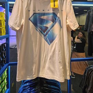
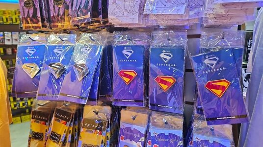
Which one of the two?I like the font.
Both fonts, but especially the first, with its simplicity/austerity, its compressed look and wide inter-letters, inevitably remind me of the titles of Nolan's Batman films and MOS.
The font is the same, the logos are twoWhich one of the two?
With test screenings comes the inevitable "I've seen it and it's the best thing ever" posts.I honestly doubted the film would make the July 2025 release date. And now he's screening it for people already. Gunn really knows how to crank out his stuff, guy's like a conveyor belt.
You might want to get your eyesight checked, in addition to your training for future lie detector tests.The font is the same, the logos are two
I would say that after this we can also avoid commenting on each other given your rudeness.You might want to get your eyesight checked, in addition to your training for future lie detector tests.
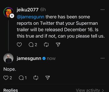
He said nope to both questions.
The pins one, it looks like it's part of the logo haha.I like the font.
This trailer is probably one of the most anticipated trailers for me in recent time givin' that I have exactly zero clue what to even expect, and that in itself makes my heartbeat tick up a notch and is the reason why I love all of this to begin with. With Man of Steel, we kind of had a lot of time to chew on stuff and what we saw was the typical Zack Snyder flare. This time around, it's more of a secrecy to how James is going to tackle Superman. Exciting.This is the most important trailer in recent memory. Lets go!
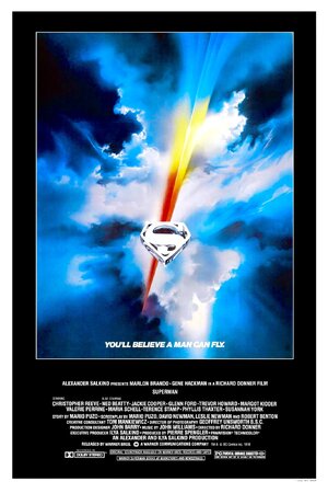
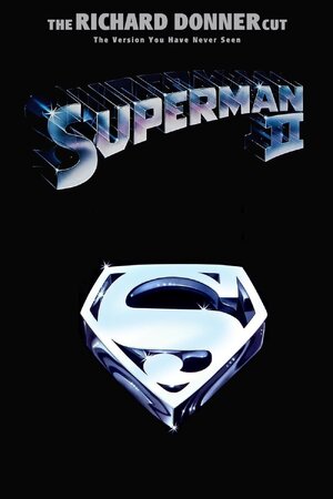
I don't think that will be used for the movie (it has no trademark logo), but it's just an homage to the Donner's movies.
View attachment 114120
View attachment 114119
For me it's the other way around For MOS I remember being very surprised by the Terrence Malick vibe, muted colors and shaky cam, bc it was unlike anything Snyder had done before. With Gunn's Superman, I'm expecting it to look great, but essentially like an extension of his GOTG visuals, considering it's the same cinematographer. Although I'd love to be surprised and for it to also look like this big departure with an experimental new lookThis trailer is probably one of the most anticipated trailers for me in recent time givin' that I have exactly zero clue what to even expect, and that in itself makes my heartbeat tick up a notch and is the reason why I love all of this to begin with. With Man of Steel, we kind of had a lot of time to chew on stuff and what we saw was the typical Zack Snyder flare. This time around, it's more of a secrecy to how James is going to tackle Superman. Exciting.
To be fair, each of the Guardians of the Galaxy movies is a slight departure from the previous one, both tonally and stylistically.For me it's the other way around For MOS I remember being very surprised by the Terrence Malick vibe, muted colors and shaky cam, bc it was unlike anything Snyder had done before. With Gunn's Superman, I'm expecting it to look great, but essentially like an extension of his GOTG visuals, considering it's the same cinematographer. Although I'd love to be surprised and for it to also look like this big departure with an experimental new look