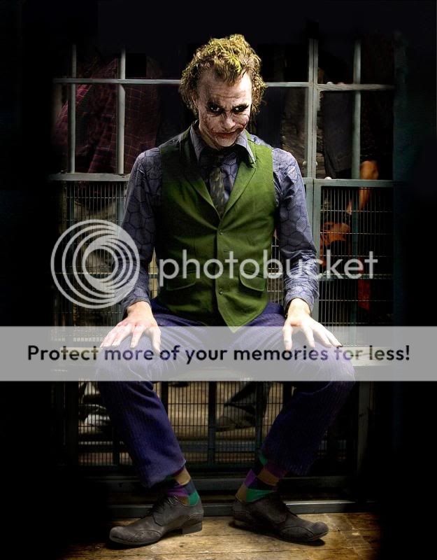
The Dark Knight The Dark Knight Teaser Poster!

Status
Not open for further replies.
Better question: Is the general public gonna know what the heck that is?

This is my issue here, the only good indication is the black, but up until this movie Joker never had that. So are the avergae movie goers going to know it is the Joker that is being referenced to.

I think it is ok, but I'm still quite let down after the viral marketing made u go through so much. I agree there is some certain symmetry there that the bat symbol can also be used to look like Joker's smiling mouth, and I guess that's what makes it ok for me.
 
http://www.superherohype.com/news/topnews.php?id=6571

85w24oz.jpg

I think there is something in the right eye.
 
We have got so much stuff recently were in overload, even without the teaser poster we should be happy.

darkknightopenervd9.jpg

eyes.jpg
 
Have you heard of a movie called Iron Man? Those fans are getting everything but a BJ and I hear that's coming in March.

A film that doesn't come close to this film in terms of production, cast or pedigree.

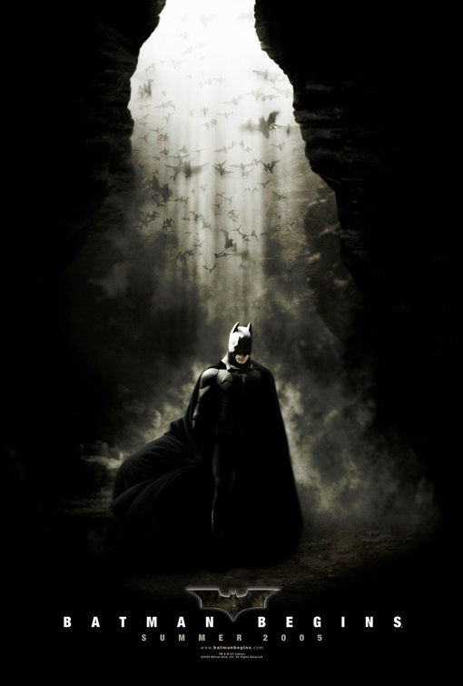
B/c it's a great iconic shot with superb, moddy lighting and this one looks like a 5 year old went ape**** on a wall with his pen set.

That is the point and why it works much better then original. The first has it's problems with coloring and the background. This one is intended to be a mess. This one is intended to mock. This one looks perfect.
 
i gotta agree that batman begins poster is pretty lame
 
I do agree that the 'Why So serious?' tag; the general public is not gonna get it. They'll get the Batman sign, but not what the tagline has to do with TDK.....

Agreed. Joe Public will not immediately think 'Joker' at all when they see this. Hell, many might not even think 'Batman.' This poster reeks of a complete lack of imagination, seriously this must've taken five seconds to think of.
 
I don't get it. You guys complain if something is meant for the public instead of the fanboys, yet you also get worried about the general public not knowing what it is.
 
As awesome as that Begins poster is it wasn't the teaser, this was the teaser.... and it blows this TDK one away.

batman_begins_ver2.jpg
 
This is my issue here, the only good indication is the black, but up until this movie Joker never had that. So are the avergae movie goers going to know it is the Joker that is being referenced to.

I think it is ok, but I'm still quite let down after the viral marketing made u go through so much. I agree there is some certain symmetry there that the bat symbol can also be used to look like Joker's smiling mouth, and I guess that's what makes it ok for me.

Read the comics as well as watch Batman: The Animated Series. Especially the first couple appearances of Joker(from the comics), he did have the black rings around his eyes.
 
Ive been looking for that BB poster, it absolutely smokes this TDK one.

I hope this isn't a foretelling of the movie to come; a kick-ass teaser poster for BB and it turned out to be a kick-ass movie, and the opposite for TDK.........

...i must say, i've been avoiding TDK spoilers religiously, unlike i did with BB but this movie is getting way to much hype/promo stuff way too soon. I have a bad feeling that this thing will be the next SM3... :csad:
 
I'll take the BB poster over the TDK poster any day
 
i agree that it is perfect, but it is still a little bit of a let down...maybe if i had cake i would feel better :oldrazz:
 
Same reation to this as the teaser trailer then then :whatever: :whatever: :whatever:

No wonder Noaln doesn't want to release anything from this movie...

If you don't like it don't look at it... simple as.

We get this, prologue, and a teaser trailer - all in one month. Noaln could make the entire movie and marketing based on your ideas... and pissy fanboys would still moan :o
 
I like it. It's a teaser poster. It's supposed to tease the hell outta you, making you want more.
 
Who the hell voted for 10? They obviously know nothing about Graphics. Im surprised there heads didnt come off when they saw the SR or SM3 posters, if this impressed them...

I voted 10 and I am...wait for it...here it comes...oh...OH.. A GRAPHIC DESIGNER!!!!! I guess I must know NOTHING about graphics then, huh?

Is it obvious that it was done in a computer? A bit but the average person won't know the difference. Is it an excellent design? Yep. It is simple, bold, and straight foward. I suspect most people will be able to figure out what it means. If not, then the final poster will beat them over the head.

I really wonder what people were expecting? This is exactly what I expected, some modification of the Bat symbol.
 
10? Come on, guys; grow up and exert you independence. 10? For a brick wall and a bit or mock-spray paint? You're being insulted.

This is a rare instance where I agree with regwec. A 10? You guys are as insane as the Joker. Its a 6 at best. Put this next to the BB teaser and you'll see the lack of an impact this teaser has in comparison.
 
Pretty cool to look at, has an eerie feel to it.

I'm loving it!
 
Insulted? be glad you're getting anything at all.
No- I would rather they didn't give us anything than make us jump through hoops for something completely uninspiring. I don't mind, because nobody forced me to hang around for the crappy virals, but there is no need for me or anyone else to be grateful for an advertising exec doing a crappy job.
 
The poster is meh.. it looks alright, sure. But there are manips that people here at the hype have done that look much better.
 
Status
Not open for further replies.

Users who are viewing this thread

Staff online

Latest posts

Forum statistics

Threads
200,556
Messages
21,759,319
Members
45,595
Latest member
osayi
Back
Top
monitoring_string = "afb8e5d7348ab9e99f73cba908f10802"