The Navigator
Avenger
- Joined
- Jul 22, 2004
- Messages
- 15,735
- Reaction score
- 1
- Points
- 31
F**king awesome.  One of my favourites.
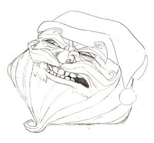
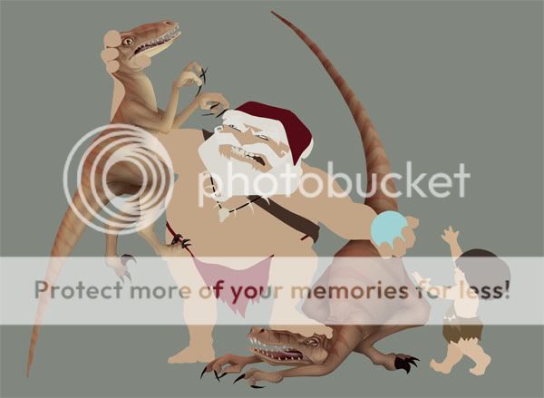
One of my favourites. One of my favourites.I tweaked Mrs. B and the Colonel, and I think it looks a bit better. As for debris, I just think it is so busy already I don't know how to add more without making it overkill. I threw in some pebbles here and there, but that's about as much as I could push it.
The pic has been replaced, so you can see these changes now in the orginal post (although you may need to refresh).
Thanks, buddy!
when I saw "Santa B.C" I thought of santa/caveman. then I read the rest.")
The play on 'Santa B.C.' is great, the visual will no doubt be awesome - but I think the concept of the title is strong enough to stay separate! It's immediately obvious what the joke is...
On the other hand, if its not obvious to other people then why are you sending them a card in the first place!? And not b-slapping them for being so dense?
")
looks great, and i love it.... however i do have one criticism... ms butterworth/aunt jamima... feels like shes missing her lover half.. and like part of her should be sticking out of the other side of hamburglar... and instead.. sorta makes it look like she's got fire blowing out her ass...
thats the only thing that bothers me... everything else is fantastic
Intentional or not... that's hilarious!
F**king awesome.
I think it looks better. I like seeing a bit more of both. I think you're right any more it would look too cluttered, but what you did add works and helps give it a little more of a grounded feel.
Looks awesome as always! BTW anybody know where the Avvy thread went ? I would like to get an avatar of one of youre masterpiece's Matt. (With your permission of course)

Thanks a lot I think I'm going to use your tin-man !( Always loved him)
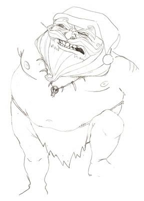
santa looks really good, I like the way you did him, cool and funny, great work so far.
Without further ado...


Flat color on my 'Santa B.C.' themed christmas card.
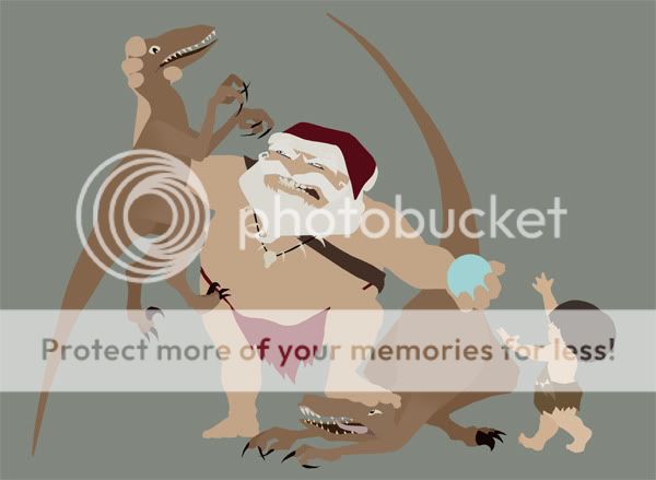
More updates coming...
DEAR LORD!!! That is the most fantastic thing I have ever seen! It is so insanely far beyond anything that I could have imagined. Wow.... just... just.... WOW!!!
Best compliment! Very nice to hear!It's already that time of year? I always look forward to this.
 You'll notice I'm trying like mad to get the artwork done ASAP so I can get these in the mail at some point in 2009.
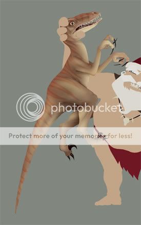

Love the two pics side-by-side. Shows just how far you've come! As I said on DA the fire in the food fight piece isn't quite there I don't think, but with every challenge I've seen you come up against, you've nailed it next go - so I've sure we'll be seeing some awesome flames from you soon. So its not surprising to see such a vast improvement in your work!
Also, when I said 'Intentional or not... that's hilarious!'.. I wasn't commenting on the pic... but responding to spideyboy's comment - referring to her 'lower portion' as her 'lover half'...
Originally Posted by spideyboy_1111
... feels like shes missing her lover half...
Like I said, typo or not, I'm loving that comment.
yeah... i didnt notice the typo till just now.
Love the two pics side-by-side. Shows just how far you've come!
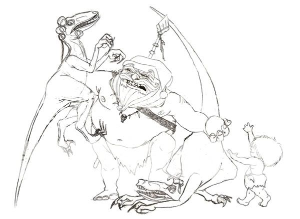
More paint work on my Santa BC piece.
I may tweak the right raptor a bit more, but you get the idea....
Thoughts?
nice!
Ridiculously awesome as always.
Have you ever had written a tutorial on how you do these projects? I've been messing around with Photoshop CS4 (is that what you use?) for ages and I've never been able to get the end results you do. More a matter of your skill >>>>>>>>>>>mine x 304, but a tutorial on how you work would be awesome if you've ever got the time.
I'll second that! I haven't looked back on your older stuff if quite some time. You really should be proud of how much you've advanced.
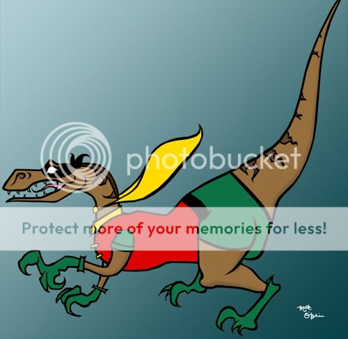
Nice. I love the raptors' expressions. The left one especially seems as if he's thinking "This is a bad day!"