BvS The Batsuit Thread - Part 2

Status
Not open for further replies.
No, the suit has to look good too. Even with those modifications, the actor would still look ridiculous in that suit.

Two things
First - I think that picture proves exactly the opposite.
Second - No-one is seriously suggesting this for the next movie.
 
I think we now have the one answer to how the new costume should look like:


AdamWestArkhamOrigins.jpg

I just realized, that's the Adam West skin from the upcoming Arkham City : Origins game, isn't it?
Cool.
Can't wait to see it in action.
 
Adam West's costume looks silly for a couple of easily remedied reasons. Firstly, the oval is stuck over the solar plexus rather than the sternum, making the torso look weirdly foreshortened. Secondly, the cowl was insufficiently sculpted, with detail painted on and soft ears.

It's rather frustrating because it was fairly close to a decent depiction of the Silver Age Batsuit. I think Robin's costume did its job pretty well, and most of the villains looked great. Remember that the modern, green-suited Riddler costume comes from Frank Gorshin's.
 
I think we now have the one answer to how the new costume should look like:


AdamWestArkhamOrigins.jpg

Very cool atempt to "bad-ass" the Adam West suit! No question about Batman's mobility in that suit.
 
a mix of New 52 & Batman Inc. suit would be pretty badass:

Bat12.jpg


e2_258682_0_BatmanIncorporated1B.jpg


personally, i would love to see the yellow oval around the bat symbol make a comeback
 
a mix of New 52 & Batman Inc. suit would be pretty badass:

Bat12.jpg


e2_258682_0_BatmanIncorporated1B.jpg


personally, i would love to see the yellow oval around the bat symbol make a comeback

I agree till I saw your yellow oval comment.... May I ask why? :oldrazz: Only reason because I'm not a fan of it and can't see how a yellow oval will scare of the thugs of Gotham..
 
Nothing on Batman's suit would, in isolation, scare anyone. The mask and cape are the only elements which are in themselves possessed of any kind of foreboding connotation. The mounted symbol is no less 'scary' than the plain black splat, but it does have advantages as a distinct and recognisable icon.
 
The Adam West suit actually looks kinda badass... Obviously its just because Bruce is huge and menacing in that picture, but still it looks kinda cool.

I like the new 52 suit, but I'd make a few modifications on the belt, I'd like a Jim Lee style cowl too
 
I love when this happens, I actually made these concepts using Phil-cho's original work. He makes some great art like this, it looks an authentic Character sheet for an animated series. I've actually been toying with this more since I lost my original files for fun so I wasn't going to post them but I figured why not.

batman__bruce_wayne_Concept_zps5aca2812.jpg

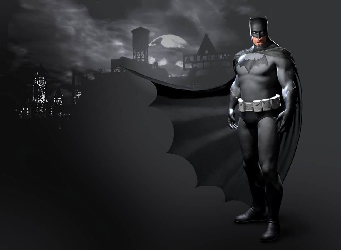
For Batman I didn't change the New 52 look much I just feel adding some black in the belt ties the uniform together. I picture the material being similar to the Arkham Games a bodysuit with a mesh layer, design to take impacts, with a tough looking fabric covering it. The cowl, gloves, and boots are more armored thicker. For symbol I could go either way. I prefer the one on the left but the others do add nice contrast.

robin__tim_drake_concept_zps027ea891.jpg

For robin I picture the same thing in terms of material as Batman but leaner and more acrobatic. I love the idea of Robin having a hood, though he wouldn't wear it much, I see it as an optional feature the he only wears when it's cold, raining, wants to look more intimidating, or if he's near someone who might recognize him.

They are beautiful, my favourites are the first Batman and the first Robin
 
I like Batman & Robin's suits :up: Robin with a hood from Arkham City :up:
 
All those seams keep me from loving Batman's costume. Robin, on the other hand, looks great. I love the hood.
 
I agree till I saw your yellow oval comment.... May I ask why? :oldrazz: Only reason because I'm not a fan of it and can't see how a yellow oval will scare of the thugs of Gotham..

i miss the yellow oval. first time i was introduced to Batman and became a fan, he had the yellow oval so i guess it's more nostalgia than nothing.

but also, it would be nice to see a change from the suit used in the Nolan films
 
Okay I'll give you the points because of nostalgia.

Maybe start with the yellow oval then move onto the black bat in the squeals? or the other way around?

I think I'd accept that idea.
 
i like them both, but the oval-less bat makes no damn sense. it has no reason to exist on any costume.
 
Just goes to show you, it helps if the right person is wearing the suit. I've always thought that suit would have looked a lot less cheesy if some built like that had worn it. Just give him a plain black bat, and a cylinder utility belt, and we'd have a real-life version of Dick Sprang's Batman.
EDIT: Maybe one of you talented photomanipulators can give that a shot?

Here ya go:
0f0k.jpg


And here's some alternate versions:
d8ow.jpg
apjd.jpg
pxks.jpg
 
This manip is pretty much just the year one suit essentially


pxks.jpg
BonusPrecoBatman.jpg


Which was pretty much used in the batman dead end fan film


bat01.jpg
 
I agree till I saw your yellow oval comment.... May I ask why? :oldrazz: Only reason because I'm not a fan of it and can't see how a yellow oval will scare of the thugs of Gotham..

I grew up with it in the Burton films, BF and TAS. For that reason, I will always have a preference for it.
 
:up: If Batman decided to wear a symbol, the reason would probably be that he wanted it to be seen and recognised. An eye-catchingly stylised bat mounted on a bright background is much more rational than an abstract black splat on a black (or dark grey) suit.
 
One of the things I love about these Adam West re-styles, is that the cape length cleary shows the scalloped bottom, and the scalloping is more pronounced. Never cared for a length that has the cape bunched up on the ground at Batman's feet.
Also the "material" of the suit's body is thicker than the tights West wore, giving an impression of durability.
And damn....removing the lines on the nose bridge and eyebrows, makes the cowl just about perfect.
 
Last edited:
Here ya go:
0f0k.jpg

Very nice, I like it a lot. Could you maybe make the symbol smaller and the buckle look like a regular belt buckle? (Like the one in the pic of the DC Direct figure below) Solely in the interest of making it as close to Sprang's version as possible. I would like to make it my laptop's wallpaper.


Pic from Michael Crawford's action figure review site.
 
Last edited:
I like to think that oval or not, Batman instantly instills fear because he pops out of nowhere, as while your eyes try to adjust to the reality of him being a man in an elaborate suit, for a split-second you actually believe it's a six-foot humanoid bat thing giving you the death glare. :oldrazz:
 
I love the pic in post #48, but would like to see a smaller black bat insignia like in the early comics. Also, the belt could be a bit narrower with wider cylinders closer together.

The cowl is awesome!
 
Last edited:
Status
Not open for further replies.

Users who are viewing this thread

Staff online

Latest posts

Forum statistics

Threads
202,332
Messages
22,086,854
Members
45,887
Latest member
Elchido
Back
Top
monitoring_string = "afb8e5d7348ab9e99f73cba908f10802"