• Xenforo is upgrading us to version 2.3.7 on Thursday Aug 14, 2025 at 01:00 AM BST. This upgrade includes several security fixes among other improvements. Expect a temporary downtime during this process. More info here

BvS The Batsuit Thread - Part 5

Status
Not open for further replies.
For some reason i see them combining the Bermejo cowl w/ the actual suit looking like a more streamlined Arkham Origins suit. If that's the case I'll be one happy camper.

I have a feeling it'll look like that too. The Arkham Origins suit needs a few minor changes to be perfect, but it's pretty damn close. They'd be smart to take note on that suit. The Origins cowl is great too. But I could definitely get into a suit with the Noel cowl and like you said, a streamlined Origins suit. That sounds awesome. .

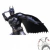
And is it just me or does the toy of Batman Noel make the suit look way worse than the way it looks when Bermejo draws it?
 
I love Bermejo's work, I most liked his batsuit rendition in the DC/ Wildstorm crossover book Batman/ Deathblow: After the Fire.
 
whats not to like about the bermejo design as inspiration for the new suit? it's black and grey, it's cloth that looks sturdy and protective, the belt is a dirty yellow that dosent stand out to much and looks like he can carry something in it, the cape wraps around his shoulders. so what? they based the look of the joker by bermejos design (not to a hundret percent) and it turned out great.
 
It's just that the Bermejo design looks very crude to me.
 
The problem is that it is ugly and poorly designed. He makes Batman look like a He-Man monster.
 
The problem is that it is ugly and poorly designed. He makes Batman look like a He-Man monster.

I agree. It's one of the ugliest Batsuits I've ever seen. Maybe it's just the way Bermejo draws it, but I've never liked it.
 
Agreed. It's really ugly and crude, most people forget that in Batman: Noel, Bruce is depicted as the "scrooge". Meaning ugly, cynical, and mean. The batsuit reflected that. The Berjemo cowl also looks really similar to Bale's cowl...how can people miss that lol

tdkr-batman-hot-toys-faces.jpg


2012-12-23+23.16.40.jpg
 
I'd much much prefer if they went off the Arkham Origins suit, I love that suit. Slim it down and make it a bit more streamlined, and its perfection.

If they do go HEAVILY off the Bermejo design, this here doesn't look too shabby at all.
3285240-batman___lee_bermejo_by_diegoaddan-d489thn.jpg
 
I also don't prefer Batsuits with the big neck pieces that attach to the cape. Unless it is an alternate world set way in the past I think it just looks weird.
 
I looked at the Injustice Bat suit and the only way it's similar to the Nolan suit is the smaller mouth area. I think they will go with the traditional wider mouth like in Bermejo design.
 

Attachments

  • injustice__gods_among_us___batman_by_cornerscout-d62n3cr.jpg
    injustice__gods_among_us___batman_by_cornerscout-d62n3cr.jpg
    60.2 KB · Views: 23
this here doesn't look too shabby at all.
3285240-batman___lee_bermejo_by_diegoaddan-d489thn.jpg
It's one of the worst designs we have yet seen from a practical point of view. As well as being a aesthetically troubling, the cape sprouting from underneath the shoulders would imply that the entire section including the chest and neck was one solid piece. That exacerbates all the problems with the old sculpted rubber suits that led to the infamous "Bat-turn".
 
Last edited:
The Bermejo cowl is similar to the bobblehead Nolan cowl in TDK, it's just improved in every conceivable way
 
i'd much much prefer if they went off the arkham origins suit, i love that suit. Slim it down and make it a bit more streamlined, and its perfection.

If they do go heavily off the bermejo design, this here doesn't look too shabby at all.
3285240-batman___lee_bermejo_by_diegoaddan-d489thn.jpg
awesome!!
 
arkham-origins-cowl-arkham-origins.jpg-155973d1366052660


My favorite cowl...I really hope they go with this over the Bermejo cowl.
 
Yeah that's a gorgeous cowl. I say they combine Bermejo's and Origins' cowls into a perfect one. The mouth area on the Origins suit is so awesome.

I can live with the Bermejo suit, but the cowl is easily the best part. i don't like the way the cowl attaches to the cape, I don't like the spikes on his gauntlets or his boots, I don't like the armor is broken up on his chest and legs
 
I also don't prefer Batsuits with the big neck pieces that attach to the cape. Unless it is an alternate world set way in the past I think it just looks weird.

Could you provide a visual example of such a design?
 
BSY4iZI.jpg


I like the look too. I don't mind the eye opening being like that but I certainly hope what they do adapt from the Nolan series is the suctioning/tightness of the mask to the actors face to make it look as seamless as possible.

As much as I love the Burton Batman I never liked how the eye and mouth piece opening was so protruding and loose if that makes sense and that's something the Bermejo design has (at least for the eyes). That's the only thing I'd really change.

Woohoo! Yes!
 
Agreed. It's really ugly and crude, most people forget that in Batman: Noel, Bruce is depicted as the "scrooge". Meaning ugly, cynical, and mean. The batsuit reflected that. The Berjemo cowl also looks really similar to Bale's cowl...how can people miss that lol

It doesn't really look any different from how he's drawn Batman in other comics to me.
 
It doesn't really look any different from how he's drawn Batman in other comics to me.

You're not looking closely. The actual body of his suit is pretty radically different from most comic suits. It's got the same basic color scheme, but that's the only similarity really. No other artists have seams on their suits that look like Bermejo's. His suit is actually really unique. I don't like it, but I can at least recognize that it's not like how Batman is always drawn
 
10563381175_70150e1f94_o.gif


One day blue and grey will make a comeback.:word:
 
Last edited:
You're not looking closely. The actual body of his suit is pretty radically different from most comic suits. It's got the same basic color scheme, but that's the only similarity really. No other artists have seams on their suits that look like Bermejo's. His suit is actually really unique. I don't like it, but I can at least recognize that it's not like how Batman is always drawn

That isn't what I said. I was saying that his Noel suit doesn't seem to look any different from other times he's drawn Batman like in the Lex Luthor comic or Wednesday Comics. They looked just as ugly in those comics to me.
 
Status
Not open for further replies.

Users who are viewing this thread

Back
Top
monitoring_string = "afb8e5d7348ab9e99f73cba908f10802"