The Daily Planet - Superman News and Speculation Thread (🚨TAG SPOILERS🚨)

Status
Not open for further replies.
I'm with you guys as well about Reeve and Kidder. I just wasn't feeling it. Cain and Hatcher are definitely for my taste the best live action Clark and Lois chemistry, especially at the Daily Planet. I have never felt like any of the films have ever gotten Clark and Lois at the Daily Planet remotely right.

As this is supposed to be a younger Lois and Clark, we desperately need that competitive buddy comedy dynamic as they investigate the main plot together, overlaid with a will they or won't they sexual tension. Early Lois and Clark should almost have a "**** or fight" dynamic. :funny:
So agreed. Their DP dynamic is number one on my wish list!
 
Gotta give it to DC studios: when they announced the slate I thought "there's not way all these movies get released". But it feels like they're actually moving forward with all the projects. Pretty cool.
 
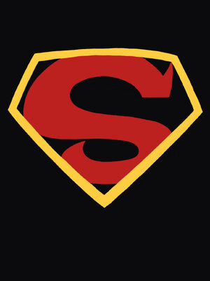
Gotta be honest, I'm starting to get attached to the notion of this updated KC symbol.

GHY1mQ5aUAA2r9O

GHZbr8tbYAAgLBq


It's just so sleek and elegant, y'all!
 
To be honest, I don't know if I'll ever get used to that emblem. Nothing about it really says Superman for me.

Plus, it doesn't help that it looks nothing like an S.
 
To be honest, I don't know if I'll ever get used to that emblem. Nothing about it really says Superman for me.

Plus, it doesn't help that it looks nothing like an S.
It looks enough like an S to me. It's the basic, recognizable symbol just tweaked in a distinct way. Adds a little extra flavour to the design, especially if you're going very classic otherwise.
 
I ain't mad at it at all. I want it be big on the chest too.
 
It looks enough like an S to me. It's the basic, recognizable symbol just tweaked in a distinct way. Adds a little extra flavour to the design, especially if you're going very classic otherwise.

I'd have a easier time seeing it as an S if it looked more like the emblem from "My Adventures with Superman".

km6hNYLjQWP4cXzM2VS5B3-1200-80.jpg


The current template looks like nothing more than a simple STOP sign.
 
I ADORE My Adventures With Superman but the KC shield (with yellow OR black) >>>> that show’s shield all day every day imo. It’s simpler. Simpler is usually better when it comes to these things, I find.
 
To be honest, I don't know if I'll ever get used to that emblem. Nothing about it really says Superman for me.

Plus, it doesn't help that it looks nothing like an S.

I'm with you, it needs something at the bottom I think, if it just had something to represent the lower half of an S, then I would be slightly warmer to it.

Truth be told I think the Kingdom Come logo basically looks like nothing really. I only see similarities with an S if I actually try to see them, otherwise I can just as easy see it as an F or an E for example.

I know it's not supposed to be an S, but it's supposed to look close enough to an S that the people would confuse it with one & the KC logo doesn't IMO.
 
I ADORE My Adventures With Superman but the KC shield (with yellow OR black) >>>> that show’s shield all day every day imo. It’s simpler. Simpler is usually better when it comes to these things, I find.

Wouldn't simpler involve using the traditional class S emblem instead?

If Gunn really decides to go with a KC inspired S, I can honestly say that my anticipation for seeing David as Superman has gone from a solid 10 to a simple 4.5.

Plus, isn't the KC emblem meant to symbolize the tragic loss that Superman experienced in that continuity? I'm not sure how that could be applied to a younger and happier Superman.
 
Wouldn't simpler involve using the traditional class S emblem instead?
From a design standpoint? No, not even a little. Simpler = fewer lines/curves. Easier to draw. And it's bolder, sleeker.

If Gunn really decides to go with a KC inspired S, I can honestly say that my anticipation for seeing David as Superman has gone from a solid 10 to a simple 4.5.
That's a sad and weird notion to me, but your prerogative!

There is no choice of \S/ that could ever bring down my anticipation of a new live-action Supes flick that much.
 
If Gunn really decides to go with a KC inspired S, I can honestly say that my anticipation for seeing David as Superman has gone from a solid 10 to a simple 4.5.

Plus, isn't the KC emblem meant to symbolize the tragic loss that Superman experienced in that continuity? I'm not sure how that could be applied to a younger and happier Superman.

That's... pretty insane but more power to you, I guess lol

And I imagine it'll just have different context here since it's not related to the comic. We also don't know if the crest has black in it which I believe is what symbolizes that.
 
From a design standpoint? No, not even a little. Simpler = fewer lines/curves. Easier to draw. And it's bolder, sleeker.


That's a sad and weird notion to me, but your prerogative!

There is no choice of \S/ that could ever bring down my anticipation of a new live-action Supes flick that much.

Well, I hope I'm wrong about the final result. I just don't see anything that says Superman in emblem that's being thrown around right now. It feels more like someone trying to use Superman without having the actual rights to his trademark.

I still look forward to seeing David as Clark though.
 
Well, I hope I'm wrong about the final result. I just don't see anything that says Superman in emblem that's being thrown around right now. It feels more like someone trying to use Superman without having the actual rights to his trademark.

I still look forward to seeing David as Clark though.
It’s literally been an iconic Superman symbol for 25 years though. :huh: It’s not like it’s just from that one comic and nothing else. It’s on t-shirts (I have one), tattoos, action figures, has been brought back in comics, shows, etc.
But to each their own! Hopefully it grows on you. :)
 
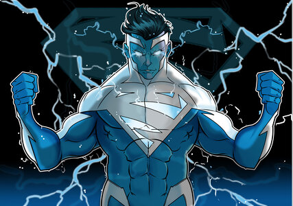
To kill my enthusiasm for this, we would have to quite literally get something like this.

dflxhr2-47f9c2ae-2e9c-47c0-bc73-57e5ad6e4572.jpg
The logo we are apparently getting is fine.
It wouldn't have been my first choice, but it's acceptable.
 
Yeah whatever design they go for, both for the 'S' and the suit... that's not something I want to let dictate my anticipation for the film.

Unless it's something that obviously illustrates something about the story. Like announcing a black suit.

I don't think the KC symbol alone indicates anything other than an attempt to use a logo that's different than other films.

I don't love it. I wouldn't have chosen it. But I'll get on board.
 
I think it will borrow from mos, in that it will be a kryptonian symbol. I think that's pretty obvious.
 
It’s literally been an iconic Superman symbol for 25 years though. :huh: It’s not like it’s just from that one comic and nothing else. It’s on t-shirts (I have one), tattoos, action figures, has been brought back in comics, shows, etc.

But to each their own! Hopefully it grows on you. :)

But isn't that symbol primarily associated with the KC version? Have you seen any other versions wear that symbol?

What's depressing about this is that I really thought we were finally going to get the definitive costume with David's Superman. I'll likely have to wait until they cast a new actor for Superman again before my wishes come true.

Honestly, I think there's a better chance of Henry's Superman growing on you then this symbol growing on me.lol
 
Status
Not open for further replies.

Users who are viewing this thread

Staff online

Latest posts

Forum statistics

Threads
202,435
Messages
22,105,463
Members
45,898
Latest member
NeonWaves64
Back
Top
monitoring_string = "afb8e5d7348ab9e99f73cba908f10802"