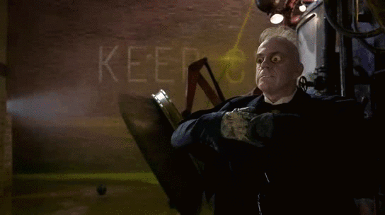
Just found these somewhat cool pics. It's a company that makes leather replicas of TDKT suits for motorcyclists.
Like many here, I'm not a fan of how complicated and overwrought the Nolan-era suits were (and forget about the sausage-fingers gauntlets from BB)... but I think they look a lot better as form molded leather than the rubberized versions we got in the films.
I particularly like how they illustrate a plausible reality for how the hell Batman could get the outfit on by himself. Just one of the many things I didn't find realistic about TDKT was that the rubber suit looked impossible to suit up.
For my buck, they also got the boots done about a zillion times better than I remember them from the actual movies.
According to one of the costume designers, the boots were the one element of the suit that the design team felt like they couldn't nail - they used different boots for different shots. If you look closely, they are changing constantly throughout the series. (Also watch the first scene in TDK between Alfred and Bruce in the urban lair for some stunningly sloppy consistency in the edits)
I definitely think that motorcycle armor grade leather for the gauntlets, boots and cowl, nanotube/kevlar weave armor, with a possible gabardine oversuit over the armor (to reduce glare and lull enemies into a false sense of security) are the ways to go in terms of material. I'm also a big proponent of reinforced leather for the belt as opposed to molded plastic =P The one thing I thought TDKT got right in terms of material is whatever that supposed memory fabric was for the cape, as well as whatever metal was used for the blades on the gauntlet.
Also, I'm really hoping we get the batarang!
Note, they have a lot of the suit components in great detail, in many positions, so this is a great source for people who want to make manips.


")


 OnTheAirWakandan Ambassador
 DKDetectiveElementary, Dead Robin (he/him)
 SwordOfMorningSuper Moderator
 Fantasy Wes Ball To Direct Live-Action Legend of Zelda Movie For Sony Pictures (12 Viewers)

