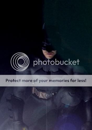
BvS The Batsuit Thread - - - - Part 13

Status
Not open for further replies.
BatFan1979, the body is pretty close to what you me and CosBlade did on the last run. I think if you put the belt you've been using in there, we'd be very close. Maybe you can mess with the cowl? I think the body on the one above is pretty sweet though, as far as something that would compare to Cap goes. I put him next to Superman here. I bet you could finish this one off into one unholy mother ****er of a B/S pic.

bvs1.jpg


(also I'm pretty sure it's the same cowl we used on the other tweaks of Vigilant's model, just viewed from the front)

Do you have a higher resolution image you can send me? Something at least 1 MB or so?
 
Breathtaking! It looks GLORIOUS. For all those who say black and gray "spandex" looks "campy" in real life, or point to the Dead End suit, or just don't believe in the traditional suit in general, this should be exhibit A.
 
People abuse the **** out of this word.

Especially when it's not even accurate.

The black and gray suit would be too campy in live action? I'm sorry... WHAT?!

Yeah, I don't even know what that means.

What this means boys is that it looks cartoonish or in some cases comedic. For example, the Fat Albert movie and Scooby Doo.

To Bathead, the shade of grey is in the eye of the beholder. Your vision of medium may not be the same as others. To me, the BB suit is a very dark grey to me, but others may say it's black. The TDK/R suit is a really nice shade of grey, but some may say it's too light. It just depends on the person. Ask Superman fans about the shade of blue in the MOS suit and see where that goes. Then, like I said before since some people only like to take pieces out of what someone says to make an argument ( just saying, we all know at least one person that does that on the Hype), lights and shadows play a big part in it as well. It doesn't matter if you shoot a film with a handheld camera or an Imax, because either one can look better than the other if you know what you're doing. So, yes, fan films still count. I have seen a couple of them that were actually shot pretty well, but the light shade of grey in Batman's suit just did not fit, imo. I stand by my opinion.
 
Sometimes I think people assume a gray suit would be all or mostly spandex. It doesn't have to be. The kind of material used makes a big difference in the cheese factor.
 
Bill Figer designed most of it. But Bob Kane added (however minor):
the finalised batsymbol
the finalised gloves
the finalised cowl
and I think the belt

All of which were not in Finger's original for Detective #27.

Source?

Because the curious thing is, Bob Kane's own statements in his autobiography Batman & Me* regarding his contributions to the Detective #27 design suggest none of this.

The truth is now all too well known:


Raise the Finger

Batman created by Bill Finger... and Bob Kane

Happy 100th Bill Finger

*
If you really want a laugh, checkout the backdated sketch Bobby tries to sneak in as 'it was all my idea' proof... so Mr. Kane, your telling us you drew up the essential Batman look in 1934 but forgot about it. And that when you presented your red suited domino masked bird-man design to Bill Finger he suggested changes that "coincidentally" matched the drawing you "drew five years earlier" and have now conveniently rediscovered? Yeah right.

Oh, and by the way... that cover Kane "drew" for Detective #27, he swiped it from Alex Raymond's Flash Gordon:

 
Last edited:
Don't know if this has been posted, but I would love a Batsuit that looked similar to this
25c7b617b6a14051d56ffa19973aece7.jpg
 
I also think that people need to give up on the idea that we're going to ever see super martial artist Batman from the comics. 1. Most actors who can actually act aren't martial artists and 2. the suits are too big and bulky to do fancy martial arts moves.

1) The "fighting" we see in action movies is not, in fact, real, but carefully choreographed. Christian Bale appeared to be able to fight like a ninja in Equilibrium; in TDK/R, he just bobbed around like a drunken sailor. That was okay, though, because he was apparently able to send assailants crashing to the floor just by lightly nudging their shoulders.

2) Some of us have spent the last 10,000 pages arguing for a less "big and bulky" suit.

People abuse the **** out of this word.

Yes. Along with "hyperbole" and "aesthetic", it is the most misused word on the Hype. Those two tend to be the hallmarks of the pretentious dumbo, however.


Raise the Finger

Batman created by Bill Finger... and Bob Kane

Since Finger also created The Joker and Catwoman amongst others, it is interesting to reflect what the Batman mythos would be like if it was all created by Bob Kane. Batman would probably be seen as a less cool version of The Question or Sandman (Wesley Dodds).
 
1) The "fighting" we see in action movies is not, in fact, real, but carefully choreographed. Christian Bale appeared to be able to fight like a ninja in Equilibrium; in TDK/R, he just bobbed around like a drunken sailor.

Sounded like one too...

Don't know if this has been posted, but I would love a Batsuit that looked similar to this
25c7b617b6a14051d56ffa19973aece7.jpg

It has. It's my personal favorite of anything posted here thus far.

If you search back a little bit, you'll find tons of manips that actually improve upon the design.
 
I have the dark feeling that all Bob Kane wanted to do was make a SUCCESSFUL comic book character. I think Bill is the one who gave Bats the personality/atmosphere/design/rogues gallery (along with Jerry Robinson)

batman_without_bill_lettered.jpg


:word:
 

I think this is the best version of the new suit that Ive seen so far! I mean, its amazing honestly! Could so easily be made, but still incorporates some of the more comic-book aspects that have been missing this far in the films. In looking at it next to Superman again it looks very believable...it holds its own against the MOS suit. Again, i would only bring down the thinkness of the neck slightly maybe and MAYBE darken the grey of the suit just a bit. I would totally love this on the big screen though!

I mean if this was tweaked just a bit and it had originally had Cavill in the shot, i probably would have believed it was the production suit! Great work Vigiliant on a true work of 3D modeling art and BA on the flecking of it. Now Id really like to see a pose of that 3D model to reenact the photo that Kevin Smith described...on a rooftop with Superman hovering behind. Maybe mimicing that one image that has popped up on here several times showing Bats looking down off a building with Supes hovering beside him. Vigilant, how hard would it be for you to produce a pose of the 3D Batman like that? We could manip in Supes and Afflecks face, but your beautiful model would make it so perfect! I bet we could fool a lot of people, media included, with a picture like that...if we were mean people thay is...
 
Last edited:
... it is interesting to reflect what the Batman mythos would be like if it was all created by Bob Kane.
There would have been nothing of interest to reflect on because Kane's red suited bird-man would have have ended up in Vin Sullivan's trashbin and that would have been the end of it.

Now this... this is interesting: The Original Batman
 
That is bat s#*t crazy... and totally awesome. But he got the issue number wrong :( I'm such an nitpicker :rolleyes:

And it reminds me of the DavidY1 sculpt from way back:

f39ab434.jpg
 
Are people still *****ing about the nipples that can barely be seen?
BatmanValKilmer.jpg


Nothing "barely" about 'em... those things are full out Farrah Fawcett on a cold beach, so yes the *****ing continues.
 
I just laugh at how people are in much more of an uproar about the nipples to the puzzly. One suit looks great except for some nice and firm nipples. The other looks like **** overall....but he can turn his head and stuff. :oldrazz:
 
Slightly off topic, IMHO the BB Bat-Suit is the best big screen Bat-Suit so far.
BatmanChristianBale.jpg

P/S Like TheFlamingCoco said the BB suit would have looked a lot cooler if it would have been black and gray instead of all black.
So far...but it could it could have been something special:

BatsBegins6.jpg
 
I just laugh at how people are in much more of an uproar about the nipples to the puzzly. One suit looks great except for some nice and firm nipples. The other looks like **** overall....but he can turn his head and stuff. :oldrazz:
Well that and that it's more than just a little latex fetishy... but I'm in equal uproar over both, not one more than the other - they both deserve whatever criticism they get.
 
We're in an expectation phase now similar to 2005/2006 when talk of the Begins suit was just that - talk... other than manips of course, and this is the one that was leading the charge:

IntimidationGame.jpg

from the BatScot archives

Not my personal ideal mind you, but that chain mail look, not black rubber, was what most people were hoping for.
 
And as 'creature of the night' goes, this concept is a fav:

f80e0763.jpg


... just needs a bit more gray.
 
The BB suit was awesome nolan should have just made the head turnable and few tweaks hear an their with some glowing eye lens .
 
Last edited:
Status
Not open for further replies.

Users who are viewing this thread

Back
Top
monitoring_string = "afb8e5d7348ab9e99f73cba908f10802"